

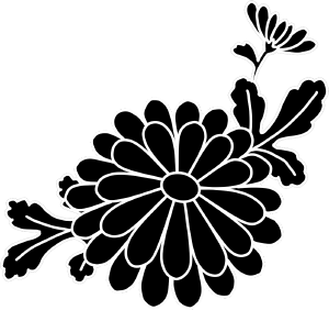
It is the material which I produced when I draw a kimono of Kyoto Yuzen.
I think it is easier to fiddle to put the image directly than the brush.
The adjustment was made a brush material for a troublesome oneself, but did not use the brush so much after all. Leave it on the set just in case.
京友禅の着物地を描く際に制作した素材です。
ブラシよりも画像を直接置いていじる方が楽だと思います。
調節が面倒な自分のためにブラシ素材にしましたが結局あまりブラシは使いませんでした。念のためセットにしておきます。


Color カラー


Monochrome モノクロ


Other materials by ぬけがら|nukegara


Popular “Material catalog” materials


New materials


-
 MVP ◆This user has contributed greatly to the management of the community, by posting many great responses to the questions asked. Once every three months, MVPs are determined based on the points earned during that period and will be recognized accordingly.
 -
 New Valuable Player (NVP) ◆These are the next-best contributors to the community after MVPs. This is awarded to users who have not yet won an MVP award, based on the number of points they have earned.
 -
 Official Expert ◆Chosen out of all MVP awardees, who are already proof of excellence, this is a testimony of outstanding correspondence in the community. After careful screening, they are appointed by CELSYS and assume their position.Note: Formally called “Evangelists”
 -
 Official Moderator of CELSYS ◆Moderators are official CELSYS staff members who are fluent in Japanese as well as various other languages. Moderators are not experts on the software or illustration, so they are not able to directly answer your questions. However, moderators provide communication and language support to ensure that everyone can smoothly communicate with each other.
 -
 CELSYS official accountThe Official Administrator Account