

At the same time as you can change the layer mode like a normal grade map,
Even if you use it as a background in normal mode, I made it with the aim of creating a cute color that looks like a magazine cover.
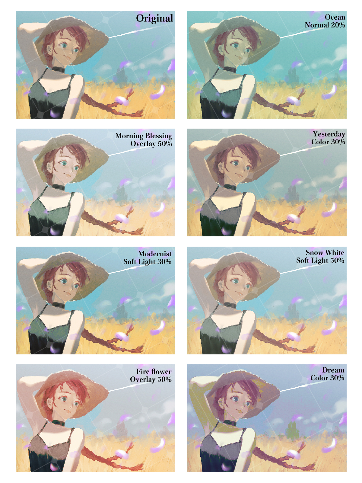
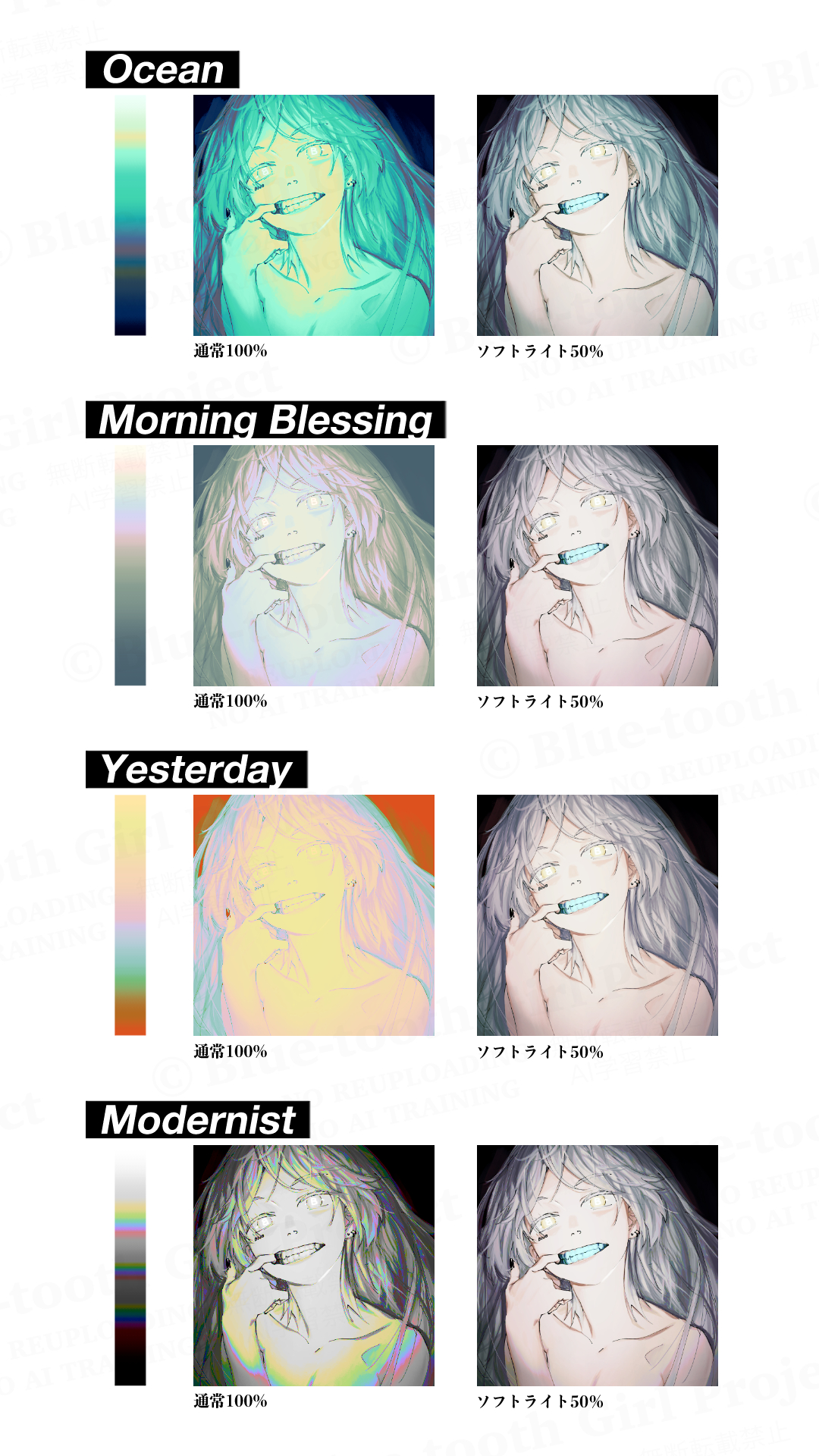
Layer modes are usually recommended around soft light, overlay, color, and hard light.
All maps have a large number of colors, so it is also recommended when you want to easily increase the amount of information.
There are 18 species in total.


・For unification of uneven color
・ For finishing characters and creating an atmosphere
・Increase the amount of information for rich images
・ For creating an atmosphere such as Webtoon and doujinshi covers
・ When you want to calm the balance of colors in a highly saturated picture
・ On the contrary, when you want to create a pop and bright production

↑ While unifying the disparate color balance, increase the amount of information on hues,
The overall tone is slightly astringent, but it is finished with a rich feeling.

↑ It is also recommended to put 100% normal mode on the background!
You can create a stylish HP-like design with just one gradient map.
It is especially compatible with typography.


I'm sorry that there is no image before processing, but you can also use it like this ↓

Grayish normal 100%

Pops normal 100%

Cherry normal 100%
I hope it will help you create!
普通のグラデマップ同様レイヤーモードを変更して使えるのと同時に、
通常モードで背景等に使っても雑誌の表紙みたいになって可愛い色合いを目指して作りました。
レイヤーモードは通常、ソフトライト、オーバーレイ、カラー、ハードライトあたりがおすすめです。
どのマップもカラー数が多いので、手軽に情報量を増やしたい時にもおすすめです。
全18種あります。
<こんな時におすすめです↓>
・色ムラの統一に
・キャラの仕上げや雰囲気づくりに
・情報量を増やしてリッチな画作りに
・Webtoonや同人誌の表紙などの空気感作りに
・彩度の高い絵の色のバランスを落ち着かせたい時に
・逆にポップで明るい演出を作りたい時に
<使用例①>
↑バラバラだった色バランスを統一しつつ、色相の情報量を増やして、
全体のトーンをやや渋めに抑えながらもリッチな感じに仕上げています。
<使用例②>
↑背景に通常モード100%でかけるのもおすすめです!
グラデーションマップひとつでおしゃれなHPみたいなデザインが作れます。
特にタイポグラフィとの相性が良いです。
<マップ一覧>
<通常モード100%のマップのサンプル>
<使用例おまけ>
加工前の画像がなく申し訳ないですが、こんな使い方もできます↓
Grayish normal 100%
Pops normal 100%
Cherry normal 100%
創作のお役に立てれば嬉しいです!


Other materials by ぬけがら|nukegara


Popular “Gradient set” materials


New materials


Badges
-
 MVP ◆This user has contributed greatly to the management of the community, by posting many great responses to the questions asked. Once every three months, MVPs are determined based on the points earned during that period and will be recognized accordingly.
 -
 New Valuable Player (NVP) ◆These are the next-best contributors to the community after MVPs. This is awarded to users who have not yet won an MVP award, based on the number of points they have earned.
 -
 Official Expert ◆Chosen out of all MVP awardees, who are already proof of excellence, this is a testimony of outstanding correspondence in the community. After careful screening, they are appointed by CELSYS and assume their position.Note: Formally called “Evangelists”
 -
 Official Moderator of CELSYS ◆Moderators are official CELSYS staff members who are fluent in Japanese as well as various other languages. Moderators are not experts on the software or illustration, so they are not able to directly answer your questions. However, moderators provide communication and language support to ensure that everyone can smoothly communicate with each other.
 -
 CELSYS official accountThe Official Administrator Account