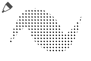
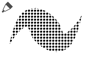
■ Angle is a halftone point tone of 90 degrees.
■ 600DPI/seamless/monochrome/2-value/color can be changed.
Because there are a lot of ■ brushes, it is recommended to put only the one often used in the brush palette.
Compared to the commonly used 45-degree tones, the dot sequence is a 90-degree tone.
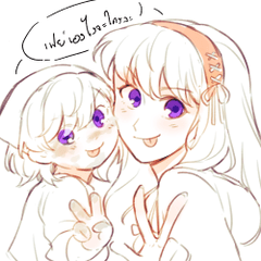
It is often used for comical backgrounds like this.
The impression is a little unique compared with the 45 degree tone ○
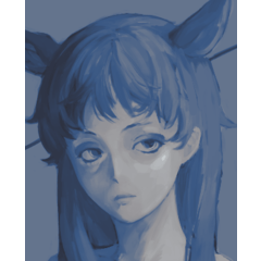
* The image is a 45 degree tone substitute.
1. set as reference layer line drawings (OK even in a folder with line drawings)
2. Draw Tones new layer
Point
If there is a gap in the line, it becomes easy to overflow.
If the line is not connected, it is OK if I select it with auto select tool and draw it.
-It is easy to paint when you pull the line over the outside of the balloon.
You can apply the same settings as above and check area scaling under tool property to avoid lines.
A white border margin between the background and the person. (Until 20px)
(The image uses a 45-degree tone.)
Brush [tool property] > [sub tool detail] > [brush tip]
By switching from [circular] to [material], you can be a window to the edge.
It is a texture that is very fine and tone scraping.
(It is registered in advance.) The default setting is circular. )
If you want a simple brush, duplicate the brush.
It does not moire even if it is the same number of lines.
The tone has been rasterize.
Please do not reduce the rotation of the tool property because it causes moire.
Because there is a possibility of moire when I shrink it when I print it, I recommend production in scale.
Because the pattern shifts when I paint it after using a moving tool, please draw it in a new layer.
○ Other Tone Brushes
https://assets.clip-studio.com/ja-jp/detail?id=1772102
https://assets.clip-studio.com/ja-jp/detail?id=1808513
https://assets.clip-studio.com/ja-jp/detail?id=1739477
https://assets.clip-studio.com/ja-jp/detail?id=1772203
https://assets.clip-studio.com/ja-jp/detail?id=1772274


