

It is a cute pop splash brush with a different atmosphere from real droplets.
I made it because I wanted a splash brush with a round feel.
リアル系の飛沫とは違う雰囲気の、かわいいポップな飛沫のブラシです。
丸い感じの飛沫のスプラッシュブラシが欲しくて作りました。
All brushes have "brush tip color change" checked by default, so the splashes will be colorful.
If you change the "Hue, saturation, and lightness" under the "brush tip color change" checkbox, the color will change, such as the overall color will be the same color.
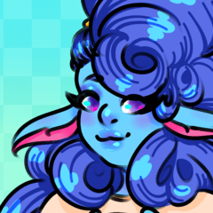
brush tip image Mr./Ms. pull
Mr./Ms. pull is an image of an A4 size 350dpi canvas exported at 566 pixels × 400 pixels.
As a guideline for the size, I made a checkerboard of 500×500 pixel light blue squares and placed them on the background of the material.

"Pop Splash Brush 1" has 20 types of brush tip image "black".
Since the brush density is set randomly, it is a type that appears in shades with one color. The color of the layer below shows through.

"Pop Splash Brush 2" has 20 types of brush tip images "black" and 20 types of "white" with main color and sub color.
Since no brush density is set, overlapping colors and layer below colors do not show through.
brush tip image has the same shape, only that the colors are black and white.

"Pop Splash Brush 3" is a brush tip of 20 different images with a gray base, black shadows, and white highlights to create a slightly three-dimensional effect.
I think the unique color change between main color and sub color is interesting.
If you draw with sub color, you will not get a three-dimensional effect.
If the main and secondary colors are the same, drawing with main color will not give a three-dimensional effect.


Depending on the main and secondary colors, it is easy to get a dull color that does not give a very three-dimensional effect.
I feel that if the sub color is white, it is easier to create a three-dimensional effect.
By default, brush tip image orientation is random.
If you want to align the direction of shadows and highlights, click
Set "Flip left and right" and "flip vertical" in "brush tip" to "None",
If you uncheck "Random" in "direction of particle" in "spraying effect",
brush tip I think the orientation of the image will no longer change, and the direction of the shadows and highlights will be aligned.
It's fun to draw in a colorful state, as if you were sprinkling paint.
I hope you find it useful. m(_ _)m
For the Mr./Ms. pull of the brush introduction, I used the material "Line Kirigami 1 (Content ID: 2095352)".
どのブラシも、初期設定で「ブラシ先端色の変化」にチェックが入っているので、飛沫がカラフルになります。
「ブラシ先端色の変化」のチェックの下の「色相、彩度、明度」を変えると、全体的に同系色になるなど、色の変わり方が変わります。
ブラシ先端画像のサンプル
サンプルは、A4サイズ350dpiのキャンバスを、縦566×横400ピクセルで書き出した画像です。
サイズの目安に、500×500ピクセルの水色の四角を市松模様にして、素材の背景に置きました。
「ポップ飛沫ブラシ1」はブラシ先端画像「黒」20種。
ブラシ濃度がランダム設定なので、1色で濃淡が出るタイプです。下のレイヤーの色が透けます。
「ポップ飛沫ブラシ2」は、ブラシ先端画像「黒」20種と「白」20種で、メインカラーとサブカラーが出ます。
ブラシ濃度は何も設定していないので、重なった色や下のレイヤーの色が透けないタイプです。
ブラシ先端画像は、色が黒と白というだけで、形は同じです。
「ポップ飛沫ブラシ3」は、ブラシ先端画像20種を、ベースは灰色、影は黒、ハイライトは白で、少し立体感が出るようにしたものです。
メインカラーとサブカラーで、独特な色の変化が面白いと思います。
サブカラーで描くと立体感は出ません。
メインとサブの色が同じ場合、メインカラーで描いても立体感が出ません。
メインとサブの色によっては、あまり立体感が出なかったり、くすんだ色になりやすいです。
サブカラーを白にすると、立体感が出やすい気がします。
初期設定は、ブラシ先端画像の向きはランダムです。
影とハイライトの向きを揃えたい場合は、
「ブラシ先端」の 「左右反転」と「上下反転」を「なし」にして、
「散布効果」の「粒子の向き」の「ランダム」のチェックを外すと、
ブラシ先端画像の向きが変わらなくなり、影とハイライトの向きが揃うと思います。
カラフル状態でぐりぐり描くと、ペンキをぶちまけた感じで楽しいです。
お役に立ったら嬉しいです。m(_ _)m
ブラシ紹介のサンプルに、「ラインの切り紙1(コンテンツID:2095352)」の素材を使用しました。
Category 1 カテゴリ1


Other materials by 鈴原りえる


Popular “Material catalog” materials


New materials


Badges
-
 MVP ◆This user has contributed greatly to the management of the community, by posting many great responses to the questions asked. Once every three months, MVPs are determined based on the points earned during that period and will be recognized accordingly.
 -
 New Valuable Player (NVP) ◆These are the next-best contributors to the community after MVPs. This is awarded to users who have not yet won an MVP award, based on the number of points they have earned.
 -
 Official Expert ◆Chosen out of all MVP awardees, who are already proof of excellence, this is a testimony of outstanding correspondence in the community. After careful screening, they are appointed by CELSYS and assume their position.Note: Formally called “Evangelists”
 -
 Official Moderator of CELSYS ◆Moderators are official CELSYS staff members who are fluent in Japanese as well as various other languages. Moderators are not experts on the software or illustration, so they are not able to directly answer your questions. However, moderators provide communication and language support to ensure that everyone can smoothly communicate with each other.
 -
 CELSYS official accountThe Official Administrator Account