
Precision pastel like color set (プレシジョン・パステルライク・カラーセット) プレシジョン・パステルライク・カラーセット
Content ID:1738018
-
5,832

Because there was no satisfactory thing in the point of the ease of use in the thing being up to assets by a color set of the pastel color, I made my own. It is the one that I of the analog color mania thinks about the color set which is easy to use digitally and was created. This is almost an arithmetic creation, so it is fundamentally different from the actual pastels of analog art materials. Pay attention to that point. パステルカラーのカラーセットで、アセッツにアップされているものの中で、使いやすさの点で満足のいく物が無かったので、自作しました。アナログ絵の具マニアの僕が、デジタル的に使いやすいカラーセットを、と考えて作成したものです。これはほぼほぼ算術的に作られたモノですので、実際のアナログ画材のパステルとは原理的に全く異なります。その点ご注意を。
The pale hue is generally a pastel color in Japan.
I say.
But the actual "pastels" of analogue paints
It is not necessarily a pale shade of paint.
That aside haha.
As long as I looked around the assets,
For the pale-colored color set,
"Color set that is easy to use, accurate and convenient."
I did not find anything that satisfies the conditions.
So, in the hope that elsewhere nowhere not akabe,
After all, I decided to make it myself ^ ^.
This color set
I think I created the ease of use, the clarity, the accuracy, and the convenience.
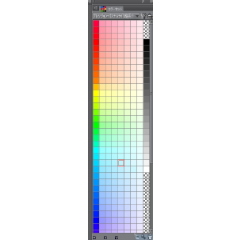
By the way, the leftmost column
There is a reason to become "colored" not a pale color.
To begin with, "pale color" is basically "what kind of hue?" 」
It is difficult to discriminate.
In this color set,
The leftmost of the column shows the hue
In other words, what color is this on the hue ring? Is, I understand at first glance.
"Precision pastel like hue circle display Ⅲ",
(※ In the 15-inch display of my notebook PC, but only)
If you adjust the width of the how to show to set size small (2)
It can be shown as shown in the figure below.

This is because the left column is from red to orange, yellow to green and cyan,
And the right column went from cyan and blue to purple, from the bottom to the top, to the red,
, It is displayed in a counterclockwise circular loop of hue.
It is a must for convenience if accustomed.
In addition, the person of "precision pastel like portrait display"
"How to show" in set size (3)


Because the size of the display is different in individual people,
Please choose the how to show according to your preference.
The right-hand gradient from black to white
Brightness 0% to 100%, 5% increments
I put it as a bonus (laughs) monochrome color.
(Note: This color set has been created in HSV space, not in the RGB space)
Pastel-like (only in the "pastel" way "laughs) about the color,
Because of the hue "rainfall", the darkest color of 100% saturation is displayed on the left most
Next to it, the saturation is displayed from 40% to 10%, but seven floors in 5% increments.
For hue, basically divide 0 to 360 in arithmetic by 15 increments,
On top of that, we have added a "hue that is not necessary for practical use in drawing a picture".
Feel and use, when you get feedback
Because it will be helpful in creating a brush up ver,
Please feel free to make a message.
「淡い色合い」のことを、日本では一般的に「パステルカラー」
と言ったりします。
ですが、実際のアナログ絵の具の「パステル」というものは
必ずしも淡い色合いの絵の具ばかりではありません。
それはさておき(笑)。
僕がアセッツを見て回った限りにおいて、
『淡い色のカラーセット』については、
「使いやすくて、正確性が高く、便利なカラーセット」
という条件を満たすものはなかなか見当たりませんでした。
ですので、他所様頼みではらちがあかないと考えて、
結局、自分で作ることに致しました^^。
このカラーセットは、
「使いやすさ」「わかりやすさ」「正確さ」「利便性」に気を配って作成したつもりです。
ちなみに、一番左の縦列が、
淡い色でなく「極彩色」になっているのには、理由があります。
そもそも「淡い色」というのは、基本的に「どういう色合いなのか?」
というのが判別しづらいものです。
このカラーセットでは、
縦列の一番左を見れば、「色合い」、
つまり「これが色相環上のどの色なのか?」が、ひと目で判ります。
「プレシジョン・パステルライク 色相環状表示Ⅲ」の方は、
(※あくまで僕のノートPCの15インチディスプレイにおいては、ですが)
「表示方法」を「サイズ指定 小(2)」にして幅を調節すると、
下図のように表示させることができます。
これは、左の列が、下に向かって赤からオレンジ、黄色を経て緑とシアンへ、
そして、右の列は、下から上に向かってシアンと青から紫を経て、赤へ、
と、反時計回りに、円環状にループした色相環状の表示になっています。
慣れれば便利なハズです。
また、「プレシジョン・パステルライク 縦長表示」の方は、
「表示方法」を「サイズ指定 中(3)」にすると、
個々人でディスプレイのサイズなどは違うでしょうから、
表示方法については、お好みに応じて、使い分けて下さい。
右端の「黒から白へのグラデーション」は、
明度0%から100%までを、5%刻みで、
モノクロカラーを オマケ(笑)としてつけています。
(註:このカラーセットは、RGB空間ではなく、HSV空間で作成されています)
パステルライク(あくまでも「パステル『ふう』」笑)カラーの方に関しては、
色合いの「めやす」のために、彩度100%の一番濃い色が一番左に表示され、
その横に、彩度40%から10%までが、5%刻みで七段階表示されています。
色相については、基本的に、0~360までを算術的に15刻みで分割し、
その上で「絵を描く上で実用上必要欠くべからざる色相」をプラスしてあります。
使用感など、感想をいただけると
ブラッシュアップver を制作するうえで参考になりますので、
どうぞお気軽にメッセージなどなさってください^^。
Category 1 カテゴリ1

Update history
2019/03/06 the duplicate color of the Hue ring display was corrected now. 2019/03/06現在、色相環状表示の方の重複した色を、修正いたしました。
Old version


Other materials by 優希ノ綾飛


Popular “Material catalog” materials


New materials


-
 MVP ◆This user has contributed greatly to the management of the community, by posting many great responses to the questions asked. Once every three months, MVPs are determined based on the points earned during that period and will be recognized accordingly.
 -
 New Valuable Player (NVP) ◆These are the next-best contributors to the community after MVPs. This is awarded to users who have not yet won an MVP award, based on the number of points they have earned.
 -
 Official Expert ◆Chosen out of all MVP awardees, who are already proof of excellence, this is a testimony of outstanding correspondence in the community. After careful screening, they are appointed by CELSYS and assume their position.Note: Formally called “Evangelists”
 -
 Official Moderator of CELSYS ◆Moderators are official CELSYS staff members who are fluent in Japanese as well as various other languages. Moderators are not experts on the software or illustration, so they are not able to directly answer your questions. However, moderators provide communication and language support to ensure that everyone can smoothly communicate with each other.
 -
 CELSYS official accountThe Official Administrator Account