

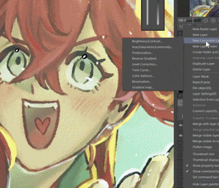
I've been feeling more anxious about posting my art online to instagram or tiktok nowadays, but I was always too lazy to try to find a image overlay, download nightshade, or make a material image myself, so I made a gradient instead.
I saw how ibis paint and artists online did it so I took some inspiration from them.
On the thumbnail, it looks like there's no difference, but if you zoom in to this image, you can see there's a small amount of colorization (at about 5~10% opacity)

 I personally think 5% looks better than 10% since I want it to be as invisible as possible, but I showed 10% just to show how it actually looks when it's more visible.


No Disturbance 5% Opacity Disturbance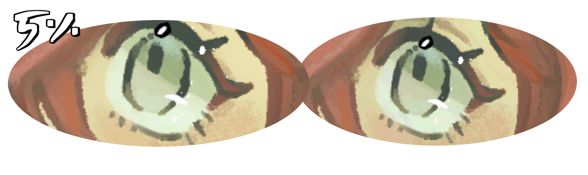 You can see there's some changes, but the changes aren't very big :)
 You can see there's some changes, but the changes aren't very big :)
 Here is the disturbance at about 10% opacity (what I used on the thumbnail)
No Disturbance 10% Opacity Disturbance

I've also made other gradients for fun (so that when you download this it isn't just a singular gradient)
It's "Disturbance", "Warm Disturbance", "Cool Disturbance", and "TV Stereo" respectively. It kind of look scary when you first use it...
 I personally think 5% looks better than 10% since I want it to be as invisible as possible, but I showed 10% just to show how it actually looks when it's more visible.
You only really see the difference when you zoom in really close (feel free to zoom in) 

Now the real question is whether this works as I advised, since I made this a gradient instead of a material image... I can't speak on whether it actually works or not (because I don't know how to train AI), but I can give you ways to enhance it ^^
1) Using liquidfy ->

Because all the AI Disturbance filters I saw were images, I didn't know how well a gradient that's perfectly aligned to the drawing would work, so... if you felt up for it, you could use liquidfy to make a completely unique mess of colors. I also feel like it's easier to do than importing an image... --;;
2) Drawing something on top before adding the gradient, then merging all visible to new layer ->

(It works especially well when you have an area that looks really unaffected by the gradient.)
You can do this with anything, you could draw it yourself, make random scribbles, or it could be a design, like what I made a few days ago...

(10%)
Content ID: 2246101

You can also use text, it gives a pretty cool effect ^^ it could act like an easter egg for anyone who's looking at it as well ->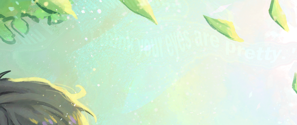

(I used 5% opacity here btw)
...
In the end, if it doesn't work, you could just treat this as like a color enhancer that you put on soft light so that it's a bit more colorful or more interesting to look at ^o^ I think it should work though
I hope I helped...
Gradient


Other materials by Danabochi


Popular “Material catalog” materials


New materials


Badges
-
 MVP ◆This user has contributed greatly to the management of the community, by posting many great responses to the questions asked. Once every three months, MVPs are determined based on the points earned during that period and will be recognized accordingly.
 -
 New Valuable Player (NVP) ◆These are the next-best contributors to the community after MVPs. This is awarded to users who have not yet won an MVP award, based on the number of points they have earned.
 -
 Official Expert ◆Chosen out of all MVP awardees, who are already proof of excellence, this is a testimony of outstanding correspondence in the community. After careful screening, they are appointed by CELSYS and assume their position.Note: Formally called “Evangelists”
 -
 Official Moderator of CELSYS ◆Moderators are official CELSYS staff members who are fluent in Japanese as well as various other languages. Moderators are not experts on the software or illustration, so they are not able to directly answer your questions. However, moderators provide communication and language support to ensure that everyone can smoothly communicate with each other.
 -
 CELSYS official accountThe Official Administrator Account