【1】It's OK if you just look at this
【2】Basic usage
1. layer template configuration
* Place the image you want to process in the "Put image here" folder.
*The layer template is A4 vertical (600dpi) (width 4961px× height 7016px).
If you save it as it is, it will be 100MB or more.
If necessary, reduce the resolution and campus size, delete layer unnecessary, save only the result as output, etc.
2. "Base" folder
* Please use it as an aid when editing materials.
3. "Gray Gradient" folder
* In the initial state, "Gray gradient (width 3) 25%" and "Gray gradient (height 2) 25%" are "displayed".
4. "Black Gradient" folder
5. "Silk" folder
* By default, "Silk (vertical) 25%" and "Silk (horizontal) 25%" are "displayed".
6. "White Spots" folder
7. "Blackheads" folder
8. "Flare" folder
* Strictly speaking, it is not a flare, but an expression between flare and white flying.
9. "Fading" folder
* In the initial state, "20% fading" is "displayed".
10. "Torn" folder
"Tear" sample
11. "Folded" folder
Sample of "Fold 1 (horizontal)"
Sample of "Fold 2 (vertical)"
12. "tonal correction (Saturation 0)" folder
13. tonal correction (gradient map) folder
* By default, "gradient map 1" is "Display".
14. Retro-style processing material collection auto action
* If you add it with "Add auto action set", the auto action "Retro style blur" and "Retro style blur (for width 1000px or less)" are included.
* With the image in the "Put image here" folder selected, execute the "Retro style blur" auto action.
* During the execution of the auto action, a screen for entering the "area to blur" of "gaussian blur" will be displayed.
The initial value "15" is the value when it is A4 (600dpi, width 4961px), so if the image is smaller than this, adjust it while looking at the image size and preview result.
If the width of the image is "3000px", "area to blur" will be about "8" and the blur will be the same.
* If the width of the image is "1000px or less", use "Retro-style blur (for width 1000px or less)".
* After auto action execution, a "retro-style blurred" layer and a "overlay" layer are created.
【3】Actual usage (preparation before processing)
(1) Select "New" > "File".
(2) On the "New" screen, select "Illustration" in "use of work", select "A4" Vertical (width 21.00× height 29.70) in "Canvas", any resolution, "Color" in "basic expression color", and click [OK].
(3) Drag and drop "Retro-style Processed Material layer template" from the material palette to the layer palette.
(4) With the "Put image here" folder selected and opened in the layer palette, select "File" > "Import" > "Image".
(5) Select the image file you want to process and click [Open].
(6) In the state immediately after opening the image (with the image object selected with the "Operation" > "object" tool), select "Canvas" in "Position adjustment" in the "tool property" palette.
The image moves so that the center of the image is flush with the center of the canvas, and the width of the image is scaled to fit the width of the canvas.
If the height of the image is more than 1.4 times the width, it will protrude from the canvas, in which case you need to adjust it manually.
【4】Actual usage (blur the image)
(1) Select the layer of the image opened in item [3] and execute "Retro-style blur" or "Retro-style blur (for width 1000px or less)" in the "Retro-style processing material collection auto action" set.
* The how to add of the auto action set is written in the description column of the separate material "move auto action", so please refer to that.
(2) In the gaussian blur window, click OK.
(3) In the change layer name window, click OK.
The "Retro Blurred" and "overlay" layers are created and the original image layer is changed to "Hidden".
【5】Actual usage (gray gradient, black gradient setting)
(1) Add gradient shadows from the top, bottom, left and right and center.
Change it to "show"/"hide" arbitrarily.
【6】Actual usage (silk grain)
(1) It is a layer of silky expression.
Change it to "show"/"hide" arbitrarily.
【7】Actual usage (white spot)
(1) This is a layer with a white dot drawn at the position corresponding to the layer name.
Please change or move to "Show" / "Hide" arbitrarily.
【8】Actual usage (darkening)
(1) It is a layer painted black with a spray brush.
Please change or move to "Show" / "Hide" arbitrarily.
【8】Actual usage (flare)
(1) It is a layer painted white with a spray brush.
Please change or move to "Show" / "Hide" arbitrarily.
【9】Actual usage (fading)
(1) It is a layer fill white throughout.
Change it to "show"/"hide", duplicate, and change the opacity arbitrarily.
【10】Actual usage (tearing)
(1) It is a layer with a torn-looking image drawn at the position corresponding to the layer name.
Please change or move to "Show" / "Hide" arbitrarily.
* If you display "Torn" and show layer "For overlay" in item [14], the image of the "overlay" layer will be displayed dimly at the torn part.
To prevent this, create selection (*1) with the "Tear" layer and remove or mask the relevant part of the "overlay" layer.
*1 Select "Layer" > "selection from layer" > "create selection".
【11】Actual usage (folding)
(1) It is a layer with vertical folds and horizontal folds drawn.
Please change or move to "Show" / "Hide" arbitrarily.
【12】Actual usage (tonal correction (saturation 0))
(1) It is a tonal correction layer to set "Saturation" to "0".
No operation is required.
【13】Actual usage (tonal correction(gradient map))
(1) It is a layer that changes the image to sepia color.
There are the following four colors, so please change them to "show" / "hide" arbitrarily.
gradient map 1... brown
gradient map 2... Red-brown
gradient map 3... Dark brown
gradient map 4... olive
【14】Actual usage (if you want to express the color of the original image)
(1) If you want to keep the color of the original image, change the "For overlay" layer to "Display".
【15】Actual usage (output)
(1) If you output it as it is, it will output to the margins, so create selection (*4) with the "overlay" layer, etc., and select any format > "merge layers and export" > "File".
*4 Select "Layer" > "selection from layer" > "create selection".
(2) On the "Export Settings" screen, select "selection" in "output range" in "output image", and then click "OK".
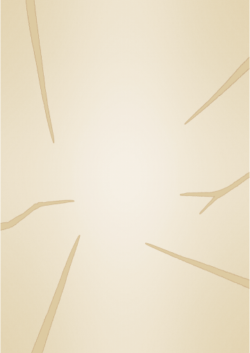
【16】Example
(Original image)
more than
【1】これだけ見ればOK
【2】基本的な使い方
1.レイヤーテンプレートの構成
※「ここに画像を入れる」フォルダーに加工したい画像を配置します。
※レイヤーテンプレートはA4縦(600dpi)(幅4961px×高さ7016px)で作成しています。
そのまま保存すると100MB以上のサイズとなります。
必要に応じて解像度やキャンパスサイズを縮小、不要なレイヤーを削除、結果だけを出力保存するなどしてください。
2.「ベース」フォルダー
※素材編集時の補助として使用してください。
3.「灰色グラデーション」フォルダー
※初期状態で「灰色グラデーション(横3)25%」と「灰色グラデーション(縦2)25%」が「表示」になっています。
4.「黒グラデーション」フォルダー
5.「絹目」フォルダー
※初期状態で「絹目(縦)25%」と「絹目(横)25%」が「表示」になっています。
6.「白点」フォルダー
7.「黒ずみ」フォルダー
8.「フレア」フォルダー
※厳密にはフレアではなく、フレアと白飛びの間のような表現です。
9.「褪色」フォルダー
※初期状態で「褪色20%」が「表示」になっています。
10.「破れ」フォルダー
「破れ」のサンプル
11.「折れ」フォルダー
「折れ1(横)」のサンプル
「折れ2(縦)」のサンプル
12.「色調補正(彩度0)」フォルダー
13.「色調補正(グラデーションマップ)」フォルダー
※初期状態で「グラデーションマップ1」が「表示」になっています。
14.レトロ風加工素材集オートアクション
※「オートアクションセットを追加」で追加すると、「レトロ風ぼかし」、「レトロ風ぼかし(幅1000px以下用)」というオートアクションが入っています。
※「ここに画像を入れる」フォルダーに入れた画像を選択した状態で、「レトロ風ぼかし」オートアクションを実行してください。
※オートアクションの実行中に、「ガウスぼかし」の「ぼかす範囲」を入力する画面が表示されます。
初期値「15」はA4(600dpi、幅4961px)の時の値となりますので、画像がこれより小さいサイズの場合、画像のサイズやプレビュー結果を見ながら調整してください。
画像の幅が「3000px」の場合、「ぼかす範囲」が「8」くらいで同等のぼかし具合となります。
※画像の幅が「1000px」以下の場合、「レトロ風ぼかし(幅1000px以下用)」を使用してください。
※オートアクション実行後に「レトロ風ぼかし済み」レイヤーと「オーバーレイ用」レイヤーが作成されます。
【3】実際の使い方(加工前の準備)
(1)「ファイル」>「新規」を選択します。
(2)「新規」画面で、「作品の用途」で「イラスト」を選択し、「キャンバス」で「A4」の縦(幅21.00×高さ29.70)、任意の解像度、「基本表現色」で「カラー」を選択し、[OK]をクリックします。
(3)素材パレットから「レトロ風加工素材集レイヤーテンプレート」をレイヤーパレットにドラッグ&ドロップします。
(4)レイヤーパレットの「ここに画像を入れる」フォルダーを選択、開いた状態で、「ファイル」>「読み込み」>「画像」を選択します。
(5)加工したい画像ファイルを選択して、[開く]をクリックします。
(6)画像を開いた直後の状態(「操作」>「オブジェクト」ツールで画像オブジェクトを選択した状態)で、「ツールプロパティ」パレットの「位置調整」で「キャンバス」を選択します。
画像の中心がキャンバスの中心と同じ位置になるよう画像が移動し、画像の幅がキャンバスの幅に合うよう拡大/縮小されます。
画像の高さが幅の1.4倍より長い場合、キャンバスからはみ出てしまいますので、その場合は手動で調整してください。
【4】実際の使い方(画像をぼかす)
(1)項目【3】で開いた画像のレイヤーを選択して、「レトロ風加工素材集オートアクション」セットの「レトロ風ぼかし」または「レトロ風ぼかし(幅1000px以下用)」を実行します。
※オートアクションセットの追加方法は、別素材「レイヤーを移動するオートアクション」の説明欄に書いてありますので、そちらをご参照ください。
(2)「ガウスぼかし」ウィンドウで、[OK]をクリックします。
(3)「レイヤー名の変更」ウィンドウで、[OK]をクリックします。
「レトロ風ぼかし済み」レイヤーと「オーバーレイ用」レイヤーが作成され、元の画像レイヤーが「非表示」に変更されます。
【5】実際の使い方(灰色グラデーション、黒グラデーションの設定)
(1)上下左右や中央からグラデーションの影を付けます。
任意に「表示」/「非表示」に変更してください。
【6】実際の使い方(絹目)
(1)絹目調の表現のレイヤーです。
任意に「表示」/「非表示」に変更してください。
【7】実際の使い方(白点)
(1)レイヤー名に対応する位置に白い点が描かれたレイヤーです。
任意に「表示」/「非表示」に変更、移動してください。
【8】実際の使い方(黒ずみ)
(1)スプレーブラシで黒く塗ったレイヤーです。
任意に「表示」/「非表示」に変更、移動してください。
【8】実際の使い方(フレア)
(1)スプレーブラシで白く塗ったレイヤーです。
任意に「表示」/「非表示」に変更、移動してください。
【9】実際の使い方(褪色)
(1)全体を白く塗りつぶしたレイヤーです。
任意に「表示」/「非表示」に変更、複製、不透明度を変更してください。
【10】実際の使い方(破れ)
(1)レイヤー名に対応する位置に破れたような画像が描かれたレイヤーです。
任意に「表示」/「非表示」に変更、移動してください。
※「破れ」を表示して、項目【14】の「オーバーレイ用」レイヤーを表示すると、破れた箇所に「オーバーレイ用」レイヤーの画像が薄く表示されてしまいます。
これを防止するために、「破れ」レイヤーで選択範囲を作成(※1)し、「オーバーレイ用」レイヤーの該当部分を削除またはマスクするようにしてください。
(※1)「レイヤー」>「レイヤーから選択範囲」>「選択範囲を作成」を選択します。
【11】実際の使い方(折れ)
(1)縦の折り目と横の折り目が描かれたレイヤーです。
任意に「表示」/「非表示」に変更、移動してください。
【12】実際の使い方(色調補正(彩度0))
(1)「彩度」を「0」にする色調補正レイヤーです。
操作不要です。
【13】実際の使い方(色調補正(グラデーションマップ))
(1)画像をセピアカラーに変更するレイヤーです。
以下の4色がありますので、任意に「表示」/「非表示」に変更してください。
グラデーションマップ1…茶色
グラデーションマップ2…赤茶色
グラデーションマップ3…こげ茶色
グラデーションマップ4…オリーブ色
【14】実際の使い方(元の画像の色味を残した表現にしたい場合)
(1)元の画像の色味を残した表現にしたい場合は、「オーバーレイ用」レイヤーを「表示」に変更します。
【15】実際の使い方(出力)
(1)そのまま出力すると余白まで出力してしまうため、「オーバーレイ用」レイヤーなどで選択範囲を作成(※4)し、「ファイル」>「画像を統合して書き出し」>任意の形式を選択します。
(※4)「レイヤー」>「レイヤーから選択範囲」>「選択範囲を作成」を選択します。
(2)「書き出し設定」画面で、「出力イメージ」の「出力範囲」で「選択範囲」を選択し、[OK]をクリックします。
【16】作例
(元画像)
以上


 MVP ◆This user has contributed greatly to the management of the community, by posting many great responses to the questions asked. Once every three months, MVPs are determined based on the points earned during that period and will be recognized accordingly.
 New Valuable Player (NVP) ◆These are the next-best contributors to the community after MVPs. This is awarded to users who have not yet won an MVP award, based on the number of points they have earned.
 Official Expert ◆Chosen out of all MVP awardees, who are already proof of excellence, this is a testimony of outstanding correspondence in the community. After careful screening, they are appointed by CELSYS and assume their position.Note: Formally called “Evangelists”
 Official Moderator of CELSYS ◆Moderators are official CELSYS staff members who are fluent in Japanese as well as various other languages. Moderators are not experts on the software or illustration, so they are not able to directly answer your questions. However, moderators provide communication and language support to ensure that everyone can smoothly communicate with each other.
 CELSYS official accountThe Official Administrator Account