

A DIY toolkit for making stained glass by hand. Now feat. gradient maps.

A set of materials for making handmade stained glass art!
This kit includes:
- Five brushes/tools for drawing lead cames (the material in the frames that hold the glass pieces in place)
- A brush for highlighting and shadowing glass.
- A thick pencil for soft sketching details
- A grayscale palette for blocking glass
- Five pre-made window frames
- A pre-made light beam image material
- A set of 21 preset gradient maps for coloring glass
How to use:
Making stained glass windows looks complicated, but it's actually not that difficult once you understand what you're doing. Most of it is actually just geometry and using rulers, lines, and grids.
"Oh no, math," I hear you, but you don't actually need numbers. I made a small tutorial to show how simple (or at least, doable) it can be!

First things first, decide what motif or pattern you want to feature as the centerpiece in your window. Try not to pick something too complex, the simpler the shape, the easier it is to design the window.
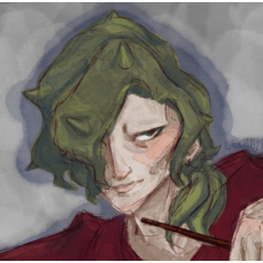
For this example, I decided to use my old friend Khadija the demon snek.
Step 1. Once you've designed your pattern, use the Lead Came Liner brush on a vector layer to put down the lineart. At this stage, only draw the outline. Draw at a large resolution and leave plenty of space to work inside your outline.
Step 2. Make a new raster layer under the lineart and use the Detail Pencil to sketch in the most important details of your pattern. This doesn't have to be super clean or perfect, and you shouldn't include too many details. Reduce your design to only its most basic shapes for best results.

Step 3. Choose a bright color and make another layer underneath. Use the pencil to sketch in the basic lines for the cames. The idea is to make angular shapes, mostly triangles and rectangles, to segment your design into smaller pieces. They shouldn't be perfectly straight, just free-hand sketching works. Imagine little broken pieces of glass being put together like a mosaic.
Step 4. Once you're satisfied with the placement of the lines, go back to the vector layer and add them to the lineart. I often find at this stage that the pattern starts to get hard to distinguish, with so many lines everywhere, so I lightly used the pencil to color in the areas where the details are for reference on a low opacity layer underneath.

Step 5. Choose one of the pre-made frames or design your own window and resize the frame and your vector until it's placed where you want. Again, working at high resolutions will make your life easier. I worked on a 2000px 600 dpi canvas and lowered the size at the end, but it doesn't have to be THAT big. Just enough that you can work on the inside of the cames later.
Step 6. I recommend using the CSP default symmetrical ruler for this part. Place it down the center of the window and use the Lead Came Line Tools/Rulers to add frames however you like. Many stained glass windows come in various sections, and very complicated ones often have different designs in each. For this example I just chose some simple, elegant shapes and added them to the frame. The different rulers have slightly different traits. The 90 degree ruler forces the edges of the line tool to snap with the direction of the line, while the regular one always straightens right angles. One of the curved ones thins automatically at different angles; try them out and see what works best.

Step 7. The most annoying step by far is adding the rest of the window panes. This might take a little while, but the process is exactly the same as before. Aim for angled shapes with curves, segment the window up more or less equally but don't aim for perfection or symmetry. Part of the charm is in the imperfection. When you're done placing all the lines, I recommend going back to all the junctions and rounding the insides of each corner. The idea here is that the metal cames have been welded together, so they're often lumpy or have adhesive materials to keep the glass in place.

Step 8. You can do either of these steps first. Set the vector layer as the reference layer and use a raster layer with a clipping mask or a selection underneath to start filling in the colors of the background and your design.
8A. Your design will probably have unique colors so you'll need to make your own palettes. Here's how I set mine up.

Khadija is mostly a green snake, with brown spots and a beige underbelly, so my main palette consists of only three colors. Because green is the biggest section of the design, I picked three other shades of green, then picked two brown and two cream. Once you're satisfied you have enough, start filling in cames with the fill tool or a blocking pen. Avoid using the same color for adjacent cames.
8B. Because of the different colors you use for your main design, it's easier to work with grayscale for the background. On a different layer, I've included a grayscale palette with several values to pick from. Again, try not to use the same color in adjacent panes, though you can if you want to.

Step 9. Using a gradient map or a palette, replace the grayscale with colors of your choice. I find that using a gradient map with a large variety of hues in it makes the best contrast. You can also use specific-color palettes or gradients to make sure the colors aren't too similar. You can use the included maps or your own gradients.
Step 10. Once the background is taken care of, you can adjust the motif colors with a correction layer so they blend in better with the background you chose. Here I used an Addition gradient map layer to soften and warm Khadija's palette.

Step 11. Wheeze, almost done!This is another tedious part, alas. Using the shadow/highlight brush included, outline the edges of each glass pane on a multiply layer. I recommend using a darker main color and lighter sub color for shadows, then setting the layer to your chosen opacity. Don't go for perfection, and try to keep your light source in mind. Wherever the metal would block light, the shadow should be a bit darker/bigger than a part of the glass where the light would hit it directly.
Step 12. Switch your main color to something lighter than the sub color and create a new addition (glow) layer. For this part, you want to sort of dab the highlight brush into the center of each glass panel, and you don't want it to be perfectly smooth or neat. Stained glass is often warped or textured, so you want to be painterly about it. You don't have to highlight EVERY pane either, just the ones you think would be hit most strongly by your light source.

13. Depending on your light source and the conditions of the surrounding space, you may want to add light beams or glow, as well as shadows under the main frame sections. Use the shadow brush where needed, and then you can manually add light beams or use the included light material and mesh transform to your specified needs on an addition/glow layer. Feel free to adjust the colors and brightness, or try different lighting techniques.

That's it, finally! You have a nice stained glass window, and now you can experiement with the process to make unique compositions and techniques!
"Have fun, hiss~"
Stained Glass Kit


Update history
12/3/23 Fixed a tagging issue; Added gradient map set
12/4/23 Free distribution has ended.


Other materials by Hadi42


Popular “Material catalog” materials


New materials


Badges
-
 MVP ◆This user has contributed greatly to the management of the community, by posting many great responses to the questions asked. Once every three months, MVPs are determined based on the points earned during that period and will be recognized accordingly.
 -
 New Valuable Player (NVP) ◆These are the next-best contributors to the community after MVPs. This is awarded to users who have not yet won an MVP award, based on the number of points they have earned.
 -
 Official Expert ◆Chosen out of all MVP awardees, who are already proof of excellence, this is a testimony of outstanding correspondence in the community. After careful screening, they are appointed by CELSYS and assume their position.Note: Formally called “Evangelists”
 -
 Official Moderator of CELSYS ◆Moderators are official CELSYS staff members who are fluent in Japanese as well as various other languages. Moderators are not experts on the software or illustration, so they are not able to directly answer your questions. However, moderators provide communication and language support to ensure that everyone can smoothly communicate with each other.
 -
 CELSYS official accountThe Official Administrator Account