

This gradient set consists of five colors that are based on seven rules using pastel colors. All 88 species. パステルカラーを使用し7つのルールに基づいて選んだ5色で構成されたグラデーションセットです。全88種。
Anyone can easily ease and use pastel colors for illustration and design.
Because some rules have been created based on
Please use it according to the use and atmosphere.
Use as a gradient
Grisaille is used for coloring and filtering of the gradient map.
-Remove the five colors and use them in the color scheme of the illustration.
You can use pastel colors in such a way.
Dual 10 colors
This gradient set is
Pastel colors that can be used when you want to make a colorful and harmonious impression
Dual is 11 species of complementary colors.
It is made up of five colors.
Pastel colors that can be used when you want to make a colorful and harmonious impression
Dual is 11 species of complementary colors.
It is made up of five colors.
In addition to main color
Consists of the approximate color of the main color and its approximate color complementary colors.
Because there are a lot of approximate color, complementary colors make the illustrations more effective.
Consists of the approximate color of the main color and its approximate color complementary colors.
Because there are a lot of approximate color, complementary colors make the illustrations more effective.

Triad 13 Colors
This gradient set is
Pastel colors that can be used when you want to make an impressive design
Triad color scheme is 13 species.
It is made up of five colors.
Pastel colors that can be used when you want to make an impressive design
Triad color scheme is 13 species.
It is made up of five colors.
In addition to main color
From the arrangement that the apex becomes a triangle when I see it in a hue ring
Tone is selected.
This color scheme is effective when you want to make a color scheme less familiar.
From the arrangement that the apex becomes a triangle when I see it in a hue ring
Tone is selected.
This color scheme is effective when you want to make a color scheme less familiar.

14 Complementary colors
This gradient set is
The pastel color that can be used when you want to vividly
It is 14 kinds of complementary colors.
It is made up of five colors.
The pastel color that can be used when you want to vividly
It is 14 kinds of complementary colors.
It is made up of five colors.
In addition to main color
Two tones of the same solid phase and two main color complementary tones are set.
Using this color scheme, you can make an effective color scheme that strongly impresses the colors.
Two tones of the same solid phase and two main color complementary tones are set.
Using this color scheme, you can make an effective color scheme that strongly impresses the colors.

16 Color Split Complementary
This gradient set is
Pastel colors that can be used when you don't want to be as vivid as a complementary
Split complementary color scheme is 16 species.
It is made up of five colors.
Pastel colors that can be used when you don't want to be as vivid as a complementary
Split complementary color scheme is 16 species.
It is made up of five colors.
In addition to main color
Two tones of hue, adjacent to the right and left, are set.
If you want to avoid the geara of complementary colors and hue contrast when using this color scheme
It can be an effective color scheme.
Two tones of hue, adjacent to the right and left, are set.
If you want to avoid the geara of complementary colors and hue contrast when using this color scheme
It can be an effective color scheme.

Compound 10 Colors
This gradient set is
I want to impress not too vivid, but want to some extent the contrast
Of pastel colors that can be used at times
It is a compound color scheme 10 species.
It is made up of five colors.
I want to impress not too vivid, but want to some extent the contrast
Of pastel colors that can be used at times
It is a compound color scheme 10 species.
It is made up of five colors.
In addition to main color
The complementary and interpolated are set.
Using this color scheme, the balance of calm and saturation is good.
I can color scheme.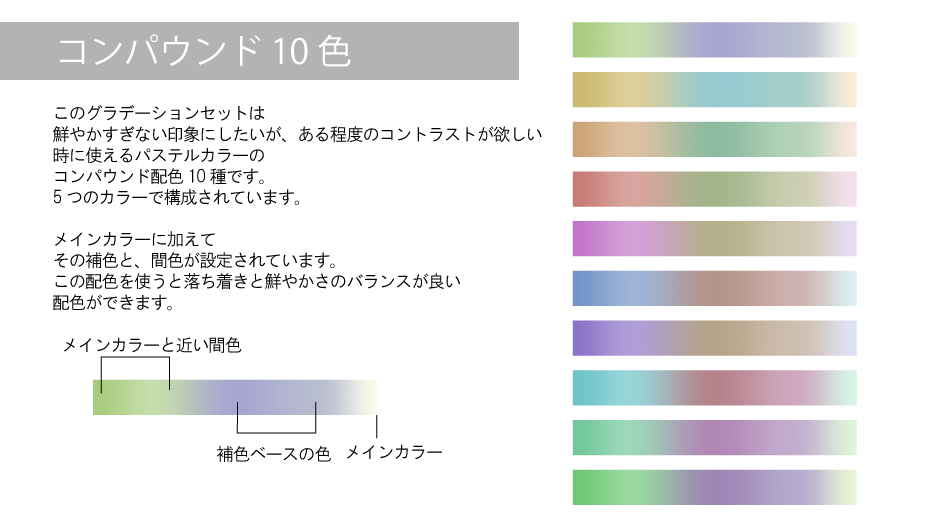
The complementary and interpolated are set.
Using this color scheme, the balance of calm and saturation is good.
I can color scheme.

Similar colors 13 colors
This gradient set is
Pastel colors that you can use when you want to make a calm impression
It is a similar color scheme 13 species.
It is made up of five colors.
Pastel colors that you can use when you want to make a calm impression
It is a similar color scheme 13 species.
It is made up of five colors.
In addition to main color
The hue that is nearby is set to four colors.
When this color scheme is used, it is quiet, but it gives a sense of harmony.
The hue that is nearby is set to four colors.
When this color scheme is used, it is quiet, but it gives a sense of harmony.

Square color Scheme 11 colors
This gradient set is
Pastel colors that can be used when you want to make a colorful impression
Square color scheme is 11 species.
It is made up of five colors.
Pastel colors that can be used when you want to make a colorful impression
Square color scheme is 11 species.
It is made up of five colors.
In addition to main color
The hue that is in the two complementary relations is set.
With two pairs of complementary colors, illustrations are more effective.
The hue that is in the two complementary relations is set.
With two pairs of complementary colors, illustrations are more effective.

tonal correction layer gradient map in the original picture
Layer combine mode
Comparison (Ming) An example of repeated opacity of 40%
Comparison (Ming) An example of repeated opacity of 40%

An example of tonal correction layer gradient map in the original picture
Clipping hard light layer over the original picture
Example of running Square 1 in a gradient tool
Example of running Square 1 in a gradient tool

An example of tonal correction layer gradient map of a layer combine mode in the original picture

誰でも簡単にラクしてパステルカラーをイラストやデザインに使用できます。
いくつかのルールに基づいて作成されていますので、
用途や雰囲気にあわせてご活用ください。
・グラデーションとして使用する
・グラデーションマップとしてグリザイユ画法の色付けやフィルタ加工に使用する
・5つのカラーを抜き取ってそれらをイラストの配色に使う
などの方法でパステルカラーを使用できます。
二重分割補色11色
このグラデーションセットは
カラフルかつ調和の取れた印象にしたい際に使えるパステルカラーの
二重分割補色配色11種です。
5つのカラーで構成されています。
カラフルかつ調和の取れた印象にしたい際に使えるパステルカラーの
二重分割補色配色11種です。
5つのカラーで構成されています。
メインカラーに加えて
メインカラーの近似色と、その近似色の補色によって構成されます。
近似色の割合が多いので、補色が活きイラストをより効果的に彩ります。
メインカラーの近似色と、その近似色の補色によって構成されます。
近似色の割合が多いので、補色が活きイラストをより効果的に彩ります。
トライアド13色
このグラデーションセットは
印象的なデザインにしたい時に使えるパステルカラーの
トライアド配色13種です。
5つのカラーで構成されています。
印象的なデザインにしたい時に使えるパステルカラーの
トライアド配色13種です。
5つのカラーで構成されています。
メインカラーに加えて
色相環で見た時に頂点が三角形になるような配置から
トーンを選択しています。
この配色はあまり見慣れない配色にしたい場合効果的です。
色相環で見た時に頂点が三角形になるような配置から
トーンを選択しています。
この配色はあまり見慣れない配色にしたい場合効果的です。
補色14色
このグラデーションセットは
鮮やかにしたい時に使えるパステルカラーの
補色配色14種です。
5つのカラーで構成されています。
鮮やかにしたい時に使えるパステルカラーの
補色配色14種です。
5つのカラーで構成されています。
メインカラーに加えて
同一色相の2トーンとメインカラーの補色2トーンが設定されています。
この配色を使うと色を強く印象づける効果的な配色ができます。
同一色相の2トーンとメインカラーの補色2トーンが設定されています。
この配色を使うと色を強く印象づける効果的な配色ができます。
分割補色16色
このグラデーションセットは
補色ほど鮮やかにしたくない時に使えるパステルカラーの
分割補色配色16種です。
5つのカラーで構成されています。
補色ほど鮮やかにしたくない時に使えるパステルカラーの
分割補色配色16種です。
5つのカラーで構成されています。
メインカラーに加えて
その補色と左右に隣接した色相の2トーンが設定されています。
この配色を使うと補色のギラつきを避け、かつ色相コントラストが欲しい時
効果的な配色ができます。
その補色と左右に隣接した色相の2トーンが設定されています。
この配色を使うと補色のギラつきを避け、かつ色相コントラストが欲しい時
効果的な配色ができます。
コンパウンド10色
このグラデーションセットは
鮮やかすぎない印象にしたいが、ある程度のコントラストが欲しい
時に使えるパステルカラーの
コンパウンド配色10種です。
5つのカラーで構成されています。
鮮やかすぎない印象にしたいが、ある程度のコントラストが欲しい
時に使えるパステルカラーの
コンパウンド配色10種です。
5つのカラーで構成されています。
メインカラーに加えて
その補色と、間色が設定されています。
この配色を使うと落ち着きと鮮やかさのバランスが良い
配色ができます。
その補色と、間色が設定されています。
この配色を使うと落ち着きと鮮やかさのバランスが良い
配色ができます。
類似色13色
このグラデーションセットは
落ち着いた印象にしたい際に使えるパステルカラーの
類似色配色13種です。
5つのカラーで構成されています。
落ち着いた印象にしたい際に使えるパステルカラーの
類似色配色13種です。
5つのカラーで構成されています。
メインカラーに加えて
近くにある色相が4色設定されています。
この配色を使うと地味ですが、調和のとれた安定感が出ます。
近くにある色相が4色設定されています。
この配色を使うと地味ですが、調和のとれた安定感が出ます。
スクエア配色11色
このグラデーションセットは
カラフルな印象にしたい際に使えるパステルカラーの
スクエア配色11種です。
5つのカラーで構成されています。
カラフルな印象にしたい際に使えるパステルカラーの
スクエア配色11種です。
5つのカラーで構成されています。
メインカラーに加えて
2つの補色関係にある色相が設定されています。
補色が2対ある事で、イラストをより効果的に彩ります。
2つの補色関係にある色相が設定されています。
補色が2対ある事で、イラストをより効果的に彩ります。
色調補正レイヤーのグラデーションマップを元絵に
レイヤー合成モードを
比較(明)不透明度40%で重ねてみた例
比較(明)不透明度40%で重ねてみた例
色調補正レイヤーのグラデーションマップを元絵に重ねてみた例
元絵の上にハードライトレイヤーをクリッピングし
スクエア1をグラデーションツールで実行した例
スクエア1をグラデーションツールで実行した例
色調補正レイヤーのグラデーションマップを元絵にレイヤー合成モードを通常で重ねてみた例
Category 1 カテゴリ1


Other materials by やわはら


Popular “Material catalog” materials


New materials


Badges
-
 MVP ◆This user has contributed greatly to the management of the community, by posting many great responses to the questions asked. Once every three months, MVPs are determined based on the points earned during that period and will be recognized accordingly.
 -
 New Valuable Player (NVP) ◆These are the next-best contributors to the community after MVPs. This is awarded to users who have not yet won an MVP award, based on the number of points they have earned.
 -
 Official Expert ◆Chosen out of all MVP awardees, who are already proof of excellence, this is a testimony of outstanding correspondence in the community. After careful screening, they are appointed by CELSYS and assume their position.Note: Formally called “Evangelists”
 -
 Official Moderator of CELSYS ◆Moderators are official CELSYS staff members who are fluent in Japanese as well as various other languages. Moderators are not experts on the software or illustration, so they are not able to directly answer your questions. However, moderators provide communication and language support to ensure that everyone can smoothly communicate with each other.
 -
 CELSYS official accountThe Official Administrator Account