

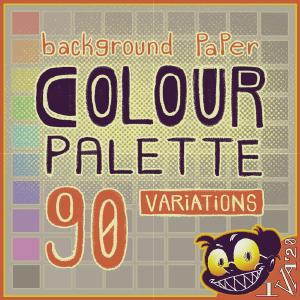
「あなたの目のためだけに」。長い期間のあなたの白いsceenを見てあなたの目を緊張しないでください、あなたの目にいくつかの救済を与えるために、この背景用紙を使用してください。 "For your eyes only". Don't strain your eyes looking at your white sceen for long periods, use this background paper to give your eyes some relief.
基本
これは 、自動アクションセット プラス カラーパレット(別名.「カラーセット」)は 、夜明けとレンダリング中にすべてのレイヤーの下部に「背景用紙」フォルダを作成します。長期間描画しながら、あなたの目に簡単な時間を与えるために。
詳細
カテゴリ :[🌞 デイモード]と[🌜 ナイトモード]は 、あなたのclipstudioペイントのテーマに依存/参照していない、彼らは私が飽和と輝度によって色を分離するために使用される用語です。 clipstudio のペイントテーマに関係なく、どちらのモードからでも選択できます。


使用方法
1. 自動操作をインポートする [ 背景紙 ] セット2. 任意のモード&色合いから好みの色合いを選択します。3. 必要に応じて、フォルダの不透明度を調整するか、フォルダの表示をオフにします。
(ビジュアルについては、下記の gif を参照してください)

1. 「背景用紙」フォルダで、塗りつぶしレイヤーを 選択 し、ロック を解除 します2. ツールを操作ツールに変更する3.メインカラーが選択されていることを確認する4.色相/彩度/明るさを変更するために、カラーホイールポイントまたはカラースライダーを操作します
(ビジュアルについては、下記の gif を参照してください)

- 私は、あなたが誤って塗りつぶしレイヤーを選択することなく、塗りつぶしレイヤーの不透明度を調整できるように、フォルダに塗りつぶしレイヤーを配置します。 色を変えた後に塗りつぶしレイヤーをロックすることを強くお勧めします。私は明るさを変更するために塗りつぶしレイヤーをロック&ロック解除することは面倒であることを学んだので、私は、フォルダなしで自動操作を作成することを気にしませんでした。
- 私は色合いを彩色しにしなかったため、色が暗いほど、その暗闇の他の色合いのバージョンと区別がつかないようになります。色の中で少なくとも5%の彩度レベルがありますが、色合いの暖かいまたはクールな雰囲気を与えるためだけに。 私は高い飽和度を持っているとは思わない(すなわち>20%)背景の紙は、レンダリング目的や目のために良いです.
- 「背景用紙」フォルダは、すべてのレイヤーの一番下に自動的に移動します。エラー ウィンドウが表示された場合は 、[OK] をクリックします。
- 背景用紙が見えない場合は、その上のどこかにキャンバスを覆うレイヤーがあります。
BASICS
This is an autoaction set plus colour palette (aka. "color set") that creates a "Background Paper" folder in the bottom of all your layers while dawing & rendering. To give your eyes an easy time while drawing for long periods.
SPECIFICS
The categories: [🌞Day Mode] and [🌜Night Mode] don't depend/refer to your clipstudio paint theme, they're terms I used to separate the colours by saturation and luminance. You can pick from either mode regardless of your clipstudio paint theme.
HOW TO USE
1. Import the autoaction [ Background Paper ] set2. Select the hue you like from any of the modes & hues3. Adjust the opacity of the folder or turn off the visibility of the folder if you need to.
(see gif below for visuals)
1. in the "background paper" folder, select the fill layer and unlock it2. change your tool to the Operation tool3. make sure your main colour is selected4. manipulate your colour wheel point or colour slider to change the hue/ saturation/ luminosity
(see gif below for visuals)
- I put the fill layer in a folder so that you can adjust the opacity of the fill layer, without accidentally selecting the fill layer. I highly advise to lock the fill layer after changing the colour. I didn't bother creating the autoaction without the folder, because I've learnt that locking & unlocking the fill layer just to change the brightness is bothersome.
- Because I desaturated the hues, the darker the colour gets the more indistinguishable it is from the other hues' versions of that darkness. Although there's at least 5% saturation level in the darkest of the colours just to give that warm or cool vibe of the hue. I don't believe having a high saturation (ie. >20%) for the background paper is good for rendering purposes and/or for the eyes.
- The "Background Paper" folder automatically goes to the bottom of all your layers. If an error window occurs, just click OK.
- If you can't see the background paper, then there's a layer somewhere above it that's covering the canvas.
自動操作セット autoaction set

カラーパレット/カラーセット colour palette/ color set


"carmina"さんの別の素材


"素材集"の人気素材


新着素材


-
 MVP ◆質問に対して適切な回答を数多く投稿し、コミュニティの運営に大きく貢献したユーザーです。MVPは3ヶ月に一度、その間に獲得したポイントを元に決定し、表彰を行っています。
 -
 NVP (New Valuable Player) ◆MVPに次いでコミュニティの運営に貢献したユーザーです。これまでMVPの受賞経験のない方から、獲得したポイントを元に決定し、表彰を行なっています。
 -
 公式エキスパート ◆優れた回答者の証であるMVP受賞者の中からさらに選ばれた、コミュニティで最も優良な回答者の証です。審査を経て当社から依頼し就任いただいています。※旧名称「エバンジェリスト」
 -
 セルシス公認モデレーター ◆モデレーターは、日本語とその他の言語が話せるセルシス公認のスタッフです。ソフトウェアや創作のエキスパートではないので、直接疑問を解決することはできませんが、みなさんがスムーズにコミュニケーションできるように、言葉やコミュニケーションの側面からサポートします。
 -
 セルシス公式運営に関連した公式アカウントです。