


✧ Luminous Touch 한정 10cp->290p (✧ Luminous Touch 한정 10cp->290p) ✧ Luminous Touch 한정 10cp->290p
Content ID:2314028
-
63


I recommend applying it to drawings that require a lot of layered touches rather than line art.
We recommend applying all layers together.

Emphasize the touch darkly to create contrast.
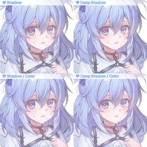
- Shadow: Basic
- Deep Shadow: Deep Shadow
- Shadow / Color: Default / Color Specification
- Deep Shadow / Color: Deep Shadow / Color Specification

Highlights the touch brightly to create contrast.
- Soft Highlight: Basic
- Bright Highlight: Emphasizes clear brightness
- Glowing Highlight: Highlights that seem to be in light
- Soft Highlight / Color: Basic / Color Specification
- Bright Highlight / Color: Specify a vivid brightness accent color
- Glowing Highlight / Color: Highlights or color designations that appear to be in the light.
Soft Highlights and Bright Highlights without specifying colors produce similar effects

◐ VALUE — Value Shift
- Value Shift / Color: Emphasize different touches according to value
※ Actual application results may vary depending on the original layer, selected area, color, and settings.
- Post-playback numerical adjustment

- When well applied
-> If you feel like a line layer has formed on the remaining line art or touch, it means the application is done well.
-> If not, move the slidebar below to adjust the value.

- If there is too much white X.
- Adjust transparency and change colors

/ Auto-action without color
-> Adjust the transparency of layers designated in yellow for use

/ AutoAction with color
-> Adjust the transparency of layers designated in yellow for use
-> Adjust the color by placing your desired color into the paint can, on a layer designated as hot pink.
-> Adjust the transparency of yellow layers or folders

선화 위주의 그림보다는 터치를 많이 쌓아 그리는 그림에 적용하는 걸 추천드립니다.
모든 레이어가 합쳐진 상태에서 적용을 추천드립니다.
터치를 어둡게 강조해 대비를 만듭니다.
- Shadow : 기본
- Deep Shadow : 깊은 그림자
- Shadow / Color : 기본 / 색 지정
- Deep Shadow / Color : 깊은 그림자 / 색 지정
터치를 밝게 강조해 대비를 만듭니다.
- Soft Highlight : 기본
- Bright Highlight : 선명한 밝기 강조
- Glowing Highlight : 빛이 감도는 듯한 강조
- Soft Highlight / Color : 기본 / 색 지정
- Bright Highlight / Color : 선명한 밝기 강조 색 지정
- Glowing Highlight / Color : 빛이 감도는 듯한 강조 / 색 지정
색을 지정하지 않는 Soft Highlight와 Bright Highlight는 비슷한 효과를 줍니다
◐ VALUE — Value Shift
- Value Shift / Color : 밸류에 따라 다른 터치 강조
※ 실제 적용 결과는 원본 레이어, 선택 영역, 색상 및 설정에 따라 달라질 수 있습니다.
- 재생 후 수치 조절
- 잘 적용된 경우
-> 선화 혹은 터치가 남은 부분에 선이 한겹 생긴 듯한 느낌이 들면 적용이 잘된 상태입니다.
-> 만약 그렇지 않다면 아래 슬라이드바를 움직여 수치를 조절해주세요.
- 흰색이 너무 많아진 경우 X
- 투명도 조절 및 컬러 변경
/ color 가 붙지 않은 오토액션
-> 노란색으로 지정된 레이어의 투명도를 조절하여 사용
/ color 가 붙은 오토액션
-> 노란색으로 지정된 레이어의 투명도를 조절하여 사용
-> 핫핑크색으로 지정된 레이어에 원하는 색을 페인트통으로 넣어 색 조절
->노란색 레이어 혹은 폴더의 투명도를 조절하여 사용
Category 1 카테고리 1


Other materials by alba_pura


Popular “Material catalog” materials


New materials


-
 MVP ◆This user has contributed greatly to the management of the community, by posting many great responses to the questions asked. Once every three months, MVPs are determined based on the points earned during that period and will be recognized accordingly.
 -
 New Valuable Player (NVP) ◆These are the next-best contributors to the community after MVPs. This is awarded to users who have not yet won an MVP award, based on the number of points they have earned.
 -
 Official Expert ◆Chosen out of all MVP awardees, who are already proof of excellence, this is a testimony of outstanding correspondence in the community. After careful screening, they are appointed by CELSYS and assume their position.Note: Formally called “Evangelists”
 -
 Official Moderator of CELSYS ◆Moderators are official CELSYS staff members who are fluent in Japanese as well as various other languages. Moderators are not experts on the software or illustration, so they are not able to directly answer your questions. However, moderators provide communication and language support to ensure that everyone can smoothly communicate with each other.
 -
 CELSYS official accountThe Official Administrator Account