
【Dull Color Mixing】High Precision gradient set / LabColorPalette (【くすまない混色】高精度グラデーションセット / LabColorPalette) 【くすまない混色】高精度グラデーションセット / LabColorPalette
Content ID:2261293
-
108

For those who are worried about the grisaille painting method and color selection, "The brightness (Value) has changed when I put color on it ...".
Based on the Lab color space (LCh model), which is faithful to human vision, it is a revolutionary color set with completely fixed brightness.
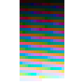
All the horizontal rows of the palette are "colors that appear to be the same brightness to the human eye." If you choose the same row color, changing the hue from yellow to blue will not disturb the brightness.
In consideration of practicality, three types of "low saturation", "medium saturation", and "high saturation" (480 colors each) with fixed saturation are recorded in 9 patterns with a number of hues (24, 16, 8) that match the color set display. It is overwhelmingly powerful when you want to arrange colors without ever disturbing the light and dark balance of the screen!
グリザイユ画法や色選びで「色を乗せたら明度(Value)が変わってしまった…」と悩む方へ。
人間の視覚に忠実な「Lab色空間(LChモデル)」に基づき、明度を完全に固定した画期的なカラーセットです。
パレットの横一列はすべて「人間の目に同じ明るさに見える色」。同じ行の色を選べば、黄色から青へ色相を変えても明度が狂うことはありません。
実用性を考慮し、彩度を固定した「低彩度」「中彩度」「高彩度」の3種類(各480色)をカラーセットの表示に合わせた色相数(24、16、8)で9パターン収録。画面の明暗バランスを絶対に崩さずに色を配置したい時に、圧倒的な威力を発揮します!
🎨 【 Contents】
24 hues × 9 color set consisting of 20 levels (5 to 100 lightness), 16 hues× 20 levels (5 to 100 lightness), 8 hues × 20 levels (5 to 100 lightness).
【Changelog】
April 14 2026 Some people said that too many hues would make it difficult to choose colors, so we added 16 hues and 8 hues to match CLIP STUDIO's color set display.
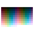
Low saturation (Chroma=15): Earthy and pastel colors that blend in with the screen. There is no breakdown in all hues, and the luminosity looks most stable.
Medium saturation (Chroma=35): The basic vibrancy that is ideal for painting the base of an illustration.
High saturation (Chroma=65): For vivid accents. (* Colors that exceed the display limit of the monitor are automatically adjusted to the maximum saturation that can be displayed while maintaining the brightness completely.)
💡 【 Recommended usage example (use in grisaille painting method)]
The real value of this palette is that it "never destroys the brightness below".
In the most layer below, draw a gray shade (Value).
Make a new layer on top of it and layer the combine mode separately for Hue and Saturation . (* [Color] mode is not recommended because the brightness fluctuates slightly in digital calculations.)
Choose a color from this color set and paint it. If you change the colors in a horizontal row of palettes, you can add a completely different hue while maintaining the same brightness.
⚠️ [ Important: Why you can see "U-shaped unevenness" in the monochrome display] If you display this palette in monochrome with standard CLIP STUDIO features (such as black color layers and monochrome display colors), you will see a bright and uneven U-shape from yellow to green. This is not a palette defect, but a software specification that happens because the CLIP STUDIO's monochrome conversion function is calculated with digital RGB luminance, not the human eye (Lab). In terms of human vision, it functions mathematically accurately as the same brightness, so please use it as it is with peace of mind without worrying about unevenness in the monochrome display.
【🎨 収録内容】
24色相 × 20段階(明度5〜100)、16色相 × 20段階(明度5〜100)、8色相 × 20段階(明度5〜100)で構成された、9つのカラーセットです。
【変更履歴】
April 14 2026 色相が多すぎると色選びに悩んでしまうという声があったので、CLIPSTUDIOのカラーセット表示に合わせて、16色相と8色相を追加しました
低彩度(Chroma=15): 画面に馴染むアースカラー・パステルカラー。全色相で破綻がなく、最も明度が安定して見えます。
中彩度(Chroma=35): イラストのベース塗りに最適な基本の鮮やかさ。
高彩度(Chroma=65): 鮮やかなアクセント用。(※モニターの表示限界を超える色は、明度を完全に維持したまま、表示可能な限界の彩度へと自動調整されています)
【💡 おすすめの使用例(グリザイユ画法での活用)】
このパレットの真価は「下の明度を絶対に壊さない」点にあります。
一番下のレイヤーで、グレーの陰影(Value)を描き込みます。
その上に新規レイヤーを作り、合成モードを [色相] と [彩度] に分けて重ねます。(※[カラー]モードはデジタルの計算上、明度がわずかに変動してしまうため非推奨です)
このカラーセットから色を選んで塗ります。パレットの横一列の中で色を変えれば、同じ明るさを持ったまま、全く別の色相を乗せることができます。
【⚠️ 重要:モノクロ表示で「U字のムラ」が見える理由】 クリスタ標準の機能(黒のカラーレイヤーや、表示色のモノクロ化など)でこのパレットをモノクロ表示すると、黄色〜緑にかけてU字型に明るく浮き出るムラが見えます。 これはパレットの欠陥ではなく、**「クリスタのモノクロ変換機能が、人間の目(Lab)ではなく、デジタルのRGB輝度で計算されているため」**に起こるソフトウェアの仕様です。 人間の視覚上は、同一の明度として数学的に正確に機能していますので、モノクロ表示でのムラは気にせず、安心してそのままご使用ください。
For horizontal 24-color display 横24色表示用


horizontal 16-color display 横16色表示用


For horizontal 8-color display 横8色表示用


Other materials by しゅうぎく


Popular “Material catalog” materials


New materials


-
 MVP ◆This user has contributed greatly to the management of the community, by posting many great responses to the questions asked. Once every three months, MVPs are determined based on the points earned during that period and will be recognized accordingly.
 -
 New Valuable Player (NVP) ◆These are the next-best contributors to the community after MVPs. This is awarded to users who have not yet won an MVP award, based on the number of points they have earned.
 -
 Official Expert ◆Chosen out of all MVP awardees, who are already proof of excellence, this is a testimony of outstanding correspondence in the community. After careful screening, they are appointed by CELSYS and assume their position.Note: Formally called “Evangelists”
 -
 Official Moderator of CELSYS ◆Moderators are official CELSYS staff members who are fluent in Japanese as well as various other languages. Moderators are not experts on the software or illustration, so they are not able to directly answer your questions. However, moderators provide communication and language support to ensure that everyone can smoothly communicate with each other.
 -
 CELSYS official accountThe Official Administrator Account