
Neko Rina's minimalist Workspace (Neko Rina's minimalist Workspace) Neko Rina's minimalist Workspace
Content ID:2128579
-
1,282
Colorful workspace for users with a small screen especially Colorful workspace for users with a small screen especially
After much tweaking I've come up with a layout to make the most out of my small tablet.
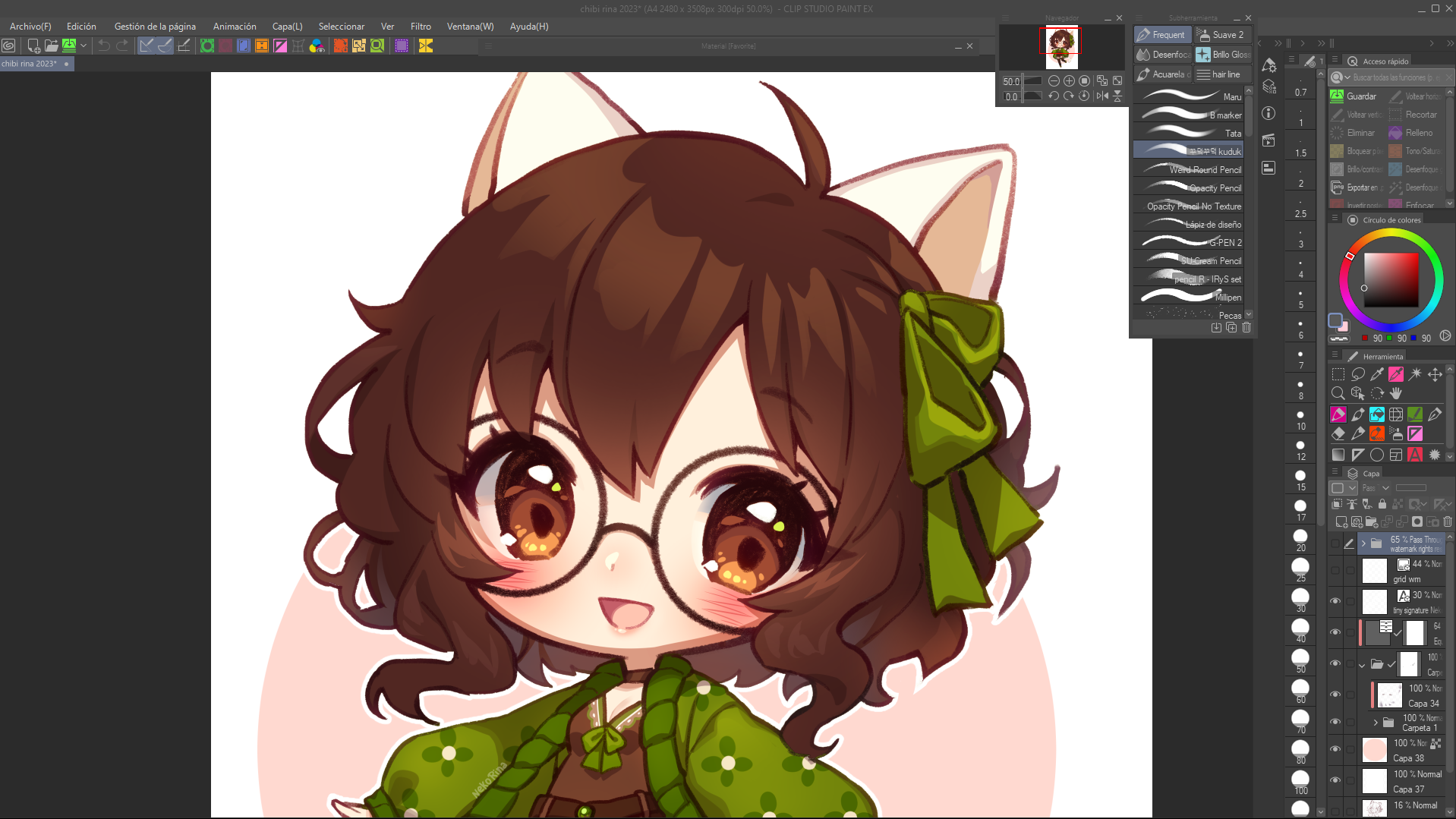

For reference, I use this workspace on a 13 inches monitor.
PREVIEW

- Suitable for small screens (13 inches or below). But it also works fine for bigger devices too
- For right-handed users. (If you're left-handed and you find this layout uncomfortable, just move all the panels to the left.)
FEATURES
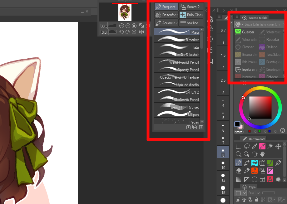
- I use the Subtool panel to gather my most used brushes.
- And a Quick Access panels for my most used shortcuts or options that take too long to find when browsing around menus.

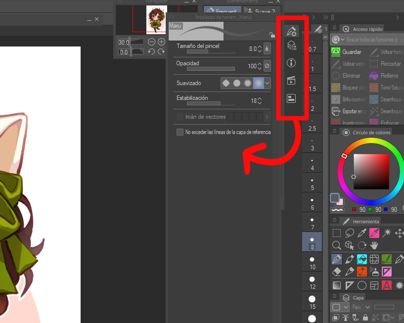
- For panels that I only need sometimes, such as Tool's Properties, Information, Auto-Actions, I keep them hidden. You can click on them to pop them up whenever you need them. They will hide again when you click anywhere else on the screen.

- For options or tools that I use rarely (enable/disable timelapse, snap to ruler, change canvas size, select by color gamut...), I keep them up on the command bar

This workspace is meant to keep your most used tools and options visible for easy access and reduce the size of most of the interface elements to maximize the space for the canvas and draw comfortably.
Hope you like it!♥
After much tweaking I've come up with a layout to make the most out of my small tablet.


For reference, I use this workspace on a 13 inches monitor.
PREVIEW

- Suitable for small screens (13 inches or below). But it also works fine for bigger devices too
- For right-handed users. (If you're left-handed and you find this layout uncomfortable, just move all the panels to the left.)
FEATURES
- I use the Subtool panel to gather my most used brushes.
- And a Quick Access panels for my most used shortcuts or options that take too long to find when browsing around menus.

- For panels that I only need sometimes, such as Tool's Properties, Information, Auto-Actions, I keep them hidden. You can click on them to pop them up whenever you need them. They will hide again when you click anywhere else on the screen.

- For options or tools that I use rarely (enable/disable timelapse, snap to ruler, change canvas size, select by color gamut...), I keep them up on the command bar

This workspace is meant to keep your most used tools and options visible for easy access and reduce the size of most of the interface elements to maximize the space for the canvas and draw comfortably.
Hope you like it!♥

