

This one line drawing pen これ1本線画ペン
Thank you for browsing!

It was troublesome to change the pen one by one when drawing manga, so I made almost my own pen. The pen tried to leave a little analog feeling, but it may Thailand rustle a little more.
Since it is only for line art, it cannot be painted in color.
It will be a square of about 1600, drawn with pen size 4.
The lines overlap and I erase them with the eraser (or transparent color without changing the pen), but I haven't changed the pen size.
・ The stabilization is strong. If you are not good at it, please reduce it. (Especially for those who continue to draw round lines)
・The intensity changes slightly depending on the pressure of the pen. (It's really a little)

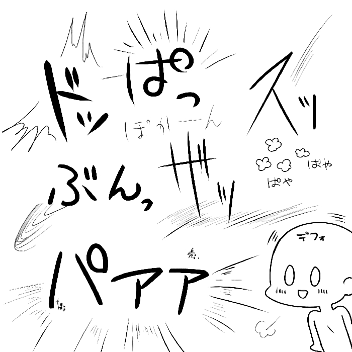
Reference such as written characters (sorry, the image quality may be a little degraded ...)
You can freely change your starting and ending.
It may be easier to draw these characters without stabilization them (the image is still in the stabilization)

I think it's better not to make it too thick.
It's my first time making a pen, so I'm a little unconvinced, so maybe I'll make a slightly rougher analog-leaning pen again?
閲覧ありがとうございます!
漫画を描く時にペンをいちいち変えるのが面倒で作ってみたほぼ自分専用のペンです。ちょっとアナログ感を残そうと試みたペンですがもう少しガサガサさせたい、かも。
線画専用なのでカラー塗り出来ません。
1600くらいの正方形、ペンサイズ4で描いたものになります。
線が重なっていたり消しゴム(もしくはペンは変えずに透明色)で消したりしてますが、ペンサイズは変えてません。
・手ぶれ補正が強めに入ってます。苦手な方は減らして下さい。(ぐりぐり線を続けて描く方は特に)
・筆圧加減で若干濃さが変わります。(本当に若干です)
書き文字などの参考(すみません少し画質が落ちてるかも…)
入り抜きなどは自由に変えてもらって大丈夫です。
こういった書き文字は手ぶれ補正ない方が描きやすいかもしれません(画像は手ぶれ補正入ったままです)
あんまり太くしない方がオススメかな〜と言う感じでです。
初めてペン作ったのでちょっと納得いってないのでまたもう少し荒いアナログ寄りのペン作るかも?


Other materials by ねこまんま棗

Popular “Brush” materials


New materials


Badges
-
 MVP ◆This user has contributed greatly to the management of the community, by posting many great responses to the questions asked. Once every three months, MVPs are determined based on the points earned during that period and will be recognized accordingly.
 -
 New Valuable Player (NVP) ◆These are the next-best contributors to the community after MVPs. This is awarded to users who have not yet won an MVP award, based on the number of points they have earned.
 -
 Official Expert ◆Chosen out of all MVP awardees, who are already proof of excellence, this is a testimony of outstanding correspondence in the community. After careful screening, they are appointed by CELSYS and assume their position.Note: Formally called “Evangelists”
 -
 Official Moderator of CELSYS ◆Moderators are official CELSYS staff members who are fluent in Japanese as well as various other languages. Moderators are not experts on the software or illustration, so they are not able to directly answer your questions. However, moderators provide communication and language support to ensure that everyone can smoothly communicate with each other.
 -
 CELSYS official accountThe Official Administrator Account