

A gradient set featuring 20 colorful color schemes, with an emphasis on setting a dreamy, fantastic mood. Vivid colors are tempered with touches of gray to give them a sense of balance.

This set features 20 gradients. Like most gradient sets, it's probably best used in conjunction with blending modes at a lowered opacity. However, I've included example drawings tone-adjusted straight from grayscale so you can see what the colors look like without any editing. Let's get into it!
Seashells:

This is a cute color scheme given some vibrancy with the use of deep teals and bright, summery pink and orange.
Vanish:

This is an intentionally subtle color scheme that emphasizes the midtones, giving the impression that the image is vanishing at the edges.
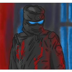
Soap Bubble:

This rainbow of colors cools down shadows while warming highlights, creating a reflective, bubble-like appearance by throwing a warm magenta into the low end of the midtone.
Infatuation:

This warm color scheme lowers the overall contrast of the image. Volume is defined with bright pinks and subtle purples, offset by yellow highlights.
Perfume:

This is infatuation's grown-up relative. Gray softens the deepest shadows and deep purples give way to warm pinks and lavender.
Cosmology:

This is an intense color scheme that uses mainly deep blues offset by a warm magenta and bright yellow.
Going Under:

These muted colors set teal against a subtle red, creating a lot of contrast and emphasizing highlights.
The City:

These colors are a dramatic combination of the primary colors, with some warmth thrown into the yellow to set it off against the bright blues.
Vast Stars:

This blue set trends dark and makes highlights pop into a clear, bright white. Very high contrast.
Lonelier:

This soft color scheme is shades of gray with a deep blue midtone, set off by a subtle gray at the lowest end.
Ravine:

This is another soft set, combining subtle earth tones with a sky blue at the top end.
Ocean Storm:

Another dark set, these colors combine dark greens and deep blues until the highlights take a sudden turn toward gray and off-white.
Moment's Hesitation:

This cool, airy color scheme brightens the midtones and adds a lot of color at the top end.
Thin Air:

Cool teal dominates this color scheme, set off by analogous green and contrasting blue shadows. A touch of yellow warms the highlights to give them more contrast.
Dusk:

This warm color scheme brightens the midtones with a combination of magenta and deep orange gently giving way to a light tan.
Waking:

This temperamental gray color scheme adds a touch of deep red at the deepest shadows and a tight splash of pale blue and yellow at the top end to create an intense division between the shadows and highlights.
The End:

Ironically, not the end! This color scheme is almost entirely gray, with a lot of brightening at the low end contrasted by a very deep, dark brown to give the image a subtle richness.
Mirage:

Another summery color scheme, this set is fairly dark with a lot of emphasis given to the top end where warm reds slide into an intense yellow.
Underground:

This earthy color scheme combines brown and and gray with a vivid orange at the middle, emphasizing midtones.
Years of Study:

Dark green is contrasted by purple shadows and set off by yellow-gold highlights. Pale highlights balance out the richness of the darker colors.
-----------
Phew, that's everything from me! I hope you enjoy these colors as much as I enjoyed putting them together :)


Popular “Gradient set” materials


New materials


Badges
-
 MVP ◆This user has contributed greatly to the management of the community, by posting many great responses to the questions asked. Once every three months, MVPs are determined based on the points earned during that period and will be recognized accordingly.
 -
 New Valuable Player (NVP) ◆These are the next-best contributors to the community after MVPs. This is awarded to users who have not yet won an MVP award, based on the number of points they have earned.
 -
 Official Expert ◆Chosen out of all MVP awardees, who are already proof of excellence, this is a testimony of outstanding correspondence in the community. After careful screening, they are appointed by CELSYS and assume their position.Note: Formally called “Evangelists”
 -
 Official Moderator of CELSYS ◆Moderators are official CELSYS staff members who are fluent in Japanese as well as various other languages. Moderators are not experts on the software or illustration, so they are not able to directly answer your questions. However, moderators provide communication and language support to ensure that everyone can smoothly communicate with each other.
 -
 CELSYS official accountThe Official Administrator Account