
Use in color mode around 20% gradient map (カラーモード20%前後で使うグラデーションマップ) カラーモード20%前後で使うグラデーションマップ
Content ID:1814319
-
170,386

This gradient map is used at around 20% opacity in color mode. It is for processing almost finished.
★ When I was bothered to unify my colors
★ When you want to feel the air and feel
When you want to put together the color taste ★ Vivid
★ But I want to keep the tint of the picture intact
It is recommended at such time.
カラーモードで不透明度20%前後で使う用のグラデーションマップです。ほぼ仕上げの加工用です。
★自分で色を統一させるのが面倒くさい時
★空気感や雰囲気を出したい時
★色味をまとめつつ鮮やかさを出したい時
★だけど絵の濃淡はそのまま維持させたい時
そんな時におすすめです。

※ The color mode is the brightness of the layer below as it is,The mode in which to apply hue and saturation.
★ 2021.06.10 appended.
I corrected the explanation of color mode because I thought that it was misleading.
※ Gradient map Material
Right-click on the Layers Palette > new correction layer > gradient Map > Click the spanner mark >
Select the material from the import material set and you can load it.
★ Color Mode opacity 20% compared with apply


* In other modes, it is not intended to be used in any other color mode.
The original picture collapses depending on the selected gradient map.
There are times when the processing of the feeling is good occasionally if it is a soft light .
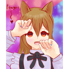
※ Depending on the selected gradient map , like the Akarami of the cheek of the sample illustrations,
The original color may be dull or greatly altered.
In that case, please adjust separately in the layer mask etc. (sample illustration is no adjustment)
※ The opacity of around 20% is the opacity that I recommend to the end.
Adjust the opacity to your liking.
If you're painting with thick paint like me,
It is easy to color-paint in the original color → gradient map
I recommend.
I usually use it in combination with the noise layer and use it for the color rough.

There's also a gradient map of similar shades,
The effect that comes out unexpectedly when I try to use it is different.
Please try to replace the color or adjust the sliders in your favorite.
Because it is a gradient map only to have packed honestly colored, please overlook it though there might be a defect etc....
★ 2020.01.19
I replaced the image because there was a violation of the agreement in the description image here is insufficient confirmation.
The gradient map already downloaded because there is no problem in the material itself is still available.
※カラーモードとは下のレイヤーの明度はそのままで、色相と彩度を適用するモードです。
★2021.06.10追記.
カラーモードの説明が誤解を招きやすかった気がしたため修正しました。
※グラデーションマップ素材は
レイヤーパレット上で右クリック>新規色調補正レイヤー>グラデーションマップ>スパナマークをクリック>
セット素材を読み込みから素材を選択すると読み込むことができます。
★カラーモード不透明度20%適用で比較
※カラーモード以外での利用を想定していないのでそれ以外のモードで使うと
選択したグラデーションマップによっては元絵が大きく崩れます。
ソフトライトなどであればたまに良い感じの加工ができるときもあります。
※選択したグラデーションマップによってはサンプルイラストの頬の赤らみのように、
元の色がくすんだり大きく変化する場合があります。
その際はレイヤーマスクなどで個別に調節してください(サンプルイラストは無調節です)
※不透明度20%前後というのはあくまで推奨している不透明度です。
お好みで不透明度を調節してください。
私のように厚塗りで描いている方は
元の色で簡単に色塗り→グラデーションマップで加工→一枚に統合して気に入らないところだけ手を加える
などもおすすめです。
普段はノイズレイヤーと併用したりカラーラフに使ったりもしています。
似たような色合いのグラデーションマップもありますが
使ってみると意外と出る効果は異なっていたりもします。
その他お好みで色を置き換えたりスライダーを調節してみてください。
正直極彩色を詰めただけのグラデーションマップなので不備などあるかも知れませんが大目に見てください…。
★2020.01.19追記
こちらの確認不足で説明画像に規約違反がありましたので画像を差し替えました。
なお素材自体に問題はありませんので既にダウンロードしたグラデーションマップは引き続きご利用いただけます。


Other materials by potg(ぴおてぐ)

Popular “Gradient set” materials


New materials


Badges
-
 MVP ◆This user has contributed greatly to the management of the community, by posting many great responses to the questions asked. Once every three months, MVPs are determined based on the points earned during that period and will be recognized accordingly.
 -
 New Valuable Player (NVP) ◆These are the next-best contributors to the community after MVPs. This is awarded to users who have not yet won an MVP award, based on the number of points they have earned.
 -
 Official Expert ◆Chosen out of all MVP awardees, who are already proof of excellence, this is a testimony of outstanding correspondence in the community. After careful screening, they are appointed by CELSYS and assume their position.Note: Formally called “Evangelists”
 -
 Official Moderator of CELSYS ◆Moderators are official CELSYS staff members who are fluent in Japanese as well as various other languages. Moderators are not experts on the software or illustration, so they are not able to directly answer your questions. However, moderators provide communication and language support to ensure that everyone can smoothly communicate with each other.
 -
 CELSYS official accountThe Official Administrator Account