
・Material data (original picture)
main color: Black, sub color: White
W x H: 40 x 40 mm 600 dpi
・16 types of brushes (ribbon type)
Draw on a gray or colored layer.
Reproduction in print is unconfirmed. Thank you for your understanding.
・Bonus
Sample layer template 3 points (may be heavy)
19 points total
You can freely draw gradient fills as well as curved tones.
By making it a single-wing brush, it is possible to combine it to dual.
Draw in a vector layer that can be easily corrected and changed after drawing
Recommend.
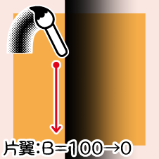
[Single Wing: 100→0] Series
A gradient that fades outward from the drawing line.
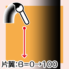
【Single Wing: 0→100】Series
It is a gradient that darkens outward from the drawing line.
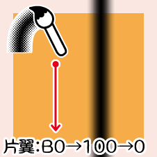
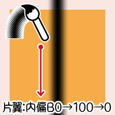
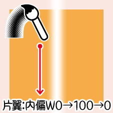
[Single wing: 0→100→0] Series
Draw a gradient bar to the right of the drawing line.
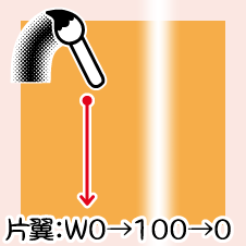
[One Wing: Betta] Series
I made it for combination.
The tool property is the same as the free sample (ID: 0).
Precautions
* If the drawing is interrupted, solve it with "connect line" in the vector
You can't use "connect line" in →raster layer.
* Areas that are too sharp will collapse the drawing
In the "Shape Tool", adjust the numerical value with "Corner roundness: On".
This is the case when you draw a triangle with the "Shape Tool".
Left《Corner roundness: Off》 Middle《Corner roundness: 0.5》 Right《Corner roundness: 2》
Even if you draw "bezier curve" in a straight line, use the "switch corner tool" after drawing
It is recommended because it can be adjusted.
When drawing with "Line", turn off "make corner pointed".
*Difference between drawing color and "brush tip→brush density"
The top is drawn with the brush density lowered, and the bottom is drawn in a similar color (gray).
If the background is white or light, it doesn't seem to change much.
Dark colors or drawings on the background will make a difference.
If you toning it, neither will change.
Please use them according to your needs.
* When toning white, "layer property→ concentration →use color of image"
→, white will not be displayed if "Use density → image brightness" is intact.
* Even if you draw in color, if you toning, it will automatically change to monochrome display.
If you want to color → tones, "layer color" is useful.
In the sample video, after converting the layer settings from color to gray,
I changed the foreground color back to two black and white colors and set the color with "layer color".
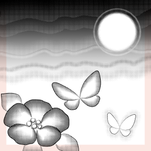
Drawing example
I drew it with this brush.
I also used it for the title.

I toning a part of the above drawing example.
The one in the upper right is a balloon.
Flowers and butterflies combined with pens, drawing tones along with the main line.
All with dual settings, I drew freehand except for the moon.
starting and ending and pen pressure are set.
Three drawing examples are added as an extra.
Please use it to check numerical values and layer settings.
I wanted to add a gradient to one side along with the main line.
I made it as an opportunity.
I think it can be used for hard to soft things, decoration and clothing.
The dual setting of the brush is really useful, isn't it?
I hope you find it useful ☆
・素材データ(原画)
メインカラー:黒、サブカラー:白
幅 x 高さ:40 x 40 mm 600 dpi
・ブラシ(リボンタイプ)16 種類
グレーまたはカラーのレイヤーで描画してください。
印刷での再現は未確認です。ご了承ください。
・おまけ
サンプル用 レイヤーテンプレート 3 点(重いかも)
合計 19 点
グラデーションの塗りはもちろん曲線トーンも自在に描けます。
片翼ブラシにすることでデュアルへの組み合わせを可能にしました。
描画後の修正・変更が簡単にできるベクターレイヤーでの描画を
オススメします。
【片翼:100→0】シリーズ
描画線から外側へ向けて薄くなるグラデーションです。
【片翼:0→100】シリーズ
描画線から外側へ向けて濃くなるグラデーションです。
【片翼:0→100→0】シリーズ
描画線の右側へグラデーションバーを描きます。
【片翼:ベタ】シリーズ
組み合わせ用に作りました。
ツールプロパティは試供品(ID:0)と同じです。
注意点
*描画が途切れたらベクター用の《線つなぎ》で解決
→ラスターレイヤーで《線つなぎ》は使えません。
*鋭角すぎる箇所は描画が崩壊
《図形ツール》では《角の丸さ:オン》で数値を調整してください。
《図形ツール》で三角形を描いた場合です。
左《角の丸さ:オフ》 中《角の丸さ:0.5 》 右《角の丸さ:2 》
《ベジェ曲線》は直線的に描いても描画後に《角の切り替えツール》で
調整ができるのでオススメです。
《折れ線》で描くときは《角をとがらせる》をオフにしてください。
*描画色と《ブラシ先端→ブラシ濃度》の違い
上はブラシ濃度を下げた状態で、下は似た色(グレー)で描画した状態です。
背景が白や淡色ではあまり変化が無いように見えます。
背景に濃い色や描画があると違いが現れます。
トーン化すると、どちらも変わりません。
必要に応じて使い分けてください。
*白をトーン化するときは《レイヤープロパティ→濃度→画像の色を使用》
→《濃度→画像の輝度を使用》のままでは白の表示はされません。
*カラーで描画してもトーン化したら自動的にモノクロ表示に変更
→トーンを彩色したい場合は《レイヤーカラー》が便利です。
サンプル動画では、レイヤー設定をカラーからグレーへと変換したあと
描画色を黒白 2 色へ戻して《レイヤーカラー》で色を設定しました。
作画例
今回のブラシで描いたものです。
タイトルにも使いました。
上の作画例の一部をトーン化してみました。
右上の朧月っぽいのはフキダシです。
花と蝶はペンと組み合わせて、主線と一緒にトーンを引きました。
すべてデュアル設定で、月以外はフリーハンドで描きました。
入り抜きや筆圧の設定をしています。
作画例3点はおまけに付けています。
数値やレイヤー設定などのご確認にご利用ください。
主線と一緒に片側へグラデーションを付けたいと思い立ったことが
きっかけで作りました。
硬質な感じから柔らかいもの、装飾や服飾にも使えると思います。
お役に立てば幸いです☆


 MVP ◆This user has contributed greatly to the management of the community, by posting many great responses to the questions asked. Once every three months, MVPs are determined based on the points earned during that period and will be recognized accordingly.
 New Valuable Player (NVP) ◆These are the next-best contributors to the community after MVPs. This is awarded to users who have not yet won an MVP award, based on the number of points they have earned.
 Official Expert ◆Chosen out of all MVP awardees, who are already proof of excellence, this is a testimony of outstanding correspondence in the community. After careful screening, they are appointed by CELSYS and assume their position.Note: Formally called “Evangelists”
 Official Moderator of CELSYS ◆Moderators are official CELSYS staff members who are fluent in Japanese as well as various other languages. Moderators are not experts on the software or illustration, so they are not able to directly answer your questions. However, moderators provide communication and language support to ensure that everyone can smoothly communicate with each other.
 CELSYS official accountThe Official Administrator Account