
Hollow tone set with a feeling of shaving (1 ~ 3) (削り感が出る空トーンセット(1~3)) 削り感が出る空トーンセット(1~3)
Content ID:1769996
-
780

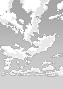
It is an empty tone which becomes the processing that the analog tone was cut out when printing.
This is a paid version of the type of layer that is easy to customize. Set from 01 to 03.
Recommended for black and white manuscripts. Resolution 600DPI recommended.
印刷するとアナログトーンを削ったような処理になる空トーンです。
こちらは、カスタマイズがしやすいレイヤーが分かれたタイプの有償版です。01~03のセット。
モノクロ原稿にオススメ。解像度600dpi推奨。
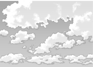
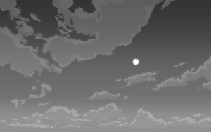
An empty tone with a sharpened tone and a feeling of drawing.
This is a paid version made up of three layers. From 01 to 03 are two types.
The width of the B4 paper is drawn by the size and resolution 600DPI.
This is a paid version made up of three layers. From 01 to 03 are two types.
The width of the B4 paper is drawn by the size and resolution 600DPI.

I put the shaving with the assumption of the net 60 lines.
Because it is a gray layer, scaling is OK,
If you reduce it too much, you may lose the feeling of shaving.

Do not forget to toning . Toning per folder is easy.
(If the basic expression color of the manuscript is in monochrome, it will be automatically toning.)

The layer folder will be added to the Layer palette when you paste the material
Click the > to Open the folder, and then click Custom.
For example, you can do this. ↓

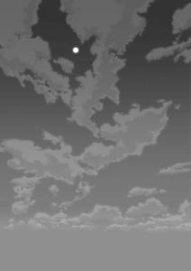
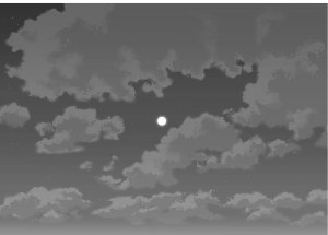
To hide the shadow of the clouds, to brighten the empty concentration and to make the sky simple...

Hide the horoscopes and darken the other concentration to the limit and then to the scary night sky....

Because the gradient uses the Gradetur, more custom is possible.
The cloud layer is also single, so erase the unnecessary clouds with the eraser
You can also sharpen a little yourself.
If you like custom, it is recommended to register on the material palette.
Those who care about the finer things, after shrinking etc.
I recommend that it is printed by a laser printer and it is visually confirmed.
I recommend that it is printed by a laser printer and it is visually confirmed.
The free version of the trial is here ↓
https://assets.clip-studio.com/ja-jp/detail?id=1769884
https://assets.clip-studio.com/ja-jp/detail?id=1769885
https://assets.clip-studio.com/ja-jp/detail?id=1769891
(Sorry, please copy and paste the link to the Address field because it is not pasted.)
Or, another material of "Tachibana" is below... Please)
トーンを削って描いた感じが出る空トーン。
こちらはレイヤー3枚で構成された有償版です。01~03が2種ずつ。
横幅がB4原稿用紙の大きさ、解像度600dpiで描かれています。
こちらはレイヤー3枚で構成された有償版です。01~03が2種ずつ。
横幅がB4原稿用紙の大きさ、解像度600dpiで描かれています。
網60線を想定して削りを入れております。
グレーレイヤーなので拡大縮小はOKですが、
あまり縮小すると削り感がなくなる可能性があります。
トーン化するのを忘れずにお使いください。フォルダごとトーン化がラクです。
(原稿の基本表現色がモノクロになっていれば自動でトーン化されます)
素材を貼るとレイヤーフォルダがレイヤーパレットに追加されるので
>をクリックしてフォルダを開き、カスタムしてください。
例えば、こんなことができます。↓
雲の影を非表示にして、空の濃度を明るくしてシンプルな空にしたり…
月星を非表示にして、他の濃度を限界まで暗くして怖い夜空にしたり…。
グラデーションはグラデツールを使っているので、さらにカスタムが可能です。
雲レイヤーも単独なので、いらない雲を消しゴムで消したり
自分でちょっと削ったりも可能です。
好みにカスタムできたら、素材パレットに登録するのがオススメです。
細かいところが気になる方は、縮小などした後に
レーザープリンタで印刷して目視確認されるのをオススメします。
レーザープリンタで印刷して目視確認されるのをオススメします。
お試しの無償版はこちら↓
https://assets.clip-studio.com/ja-jp/detail?id=1769884
https://assets.clip-studio.com/ja-jp/detail?id=1769885
https://assets.clip-studio.com/ja-jp/detail?id=1769891
(すみません、リンク貼れないのでアドレス欄にコピペしてください。
または、下記にある"たちばな豊可"さんの別の素材…からどうぞ)
Empty tones 空トーン


Other materials by たちばな豊可


Popular “Material catalog” materials


New materials


Badges
-
 MVP ◆This user has contributed greatly to the management of the community, by posting many great responses to the questions asked. Once every three months, MVPs are determined based on the points earned during that period and will be recognized accordingly.
 -
 New Valuable Player (NVP) ◆These are the next-best contributors to the community after MVPs. This is awarded to users who have not yet won an MVP award, based on the number of points they have earned.
 -
 Official Expert ◆Chosen out of all MVP awardees, who are already proof of excellence, this is a testimony of outstanding correspondence in the community. After careful screening, they are appointed by CELSYS and assume their position.Note: Formally called “Evangelists”
 -
 Official Moderator of CELSYS ◆Moderators are official CELSYS staff members who are fluent in Japanese as well as various other languages. Moderators are not experts on the software or illustration, so they are not able to directly answer your questions. However, moderators provide communication and language support to ensure that everyone can smoothly communicate with each other.
 -
 CELSYS official accountThe Official Administrator Account