


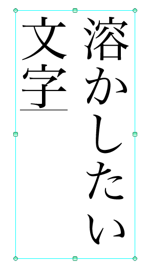
It melts into this.
(Steps below)
(It is recommended to change the color of the character in the clipping etc. after it completes because the color flies when doing excluding the black)
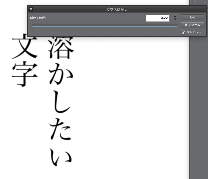

If you run 2 Auto Action, you'll get the number that you want Gaussian blur.
Adjust the amount of the change depending on the font and font size.
The first one was a little blur of about two or three...? Please keep in mind and grasp the sense.
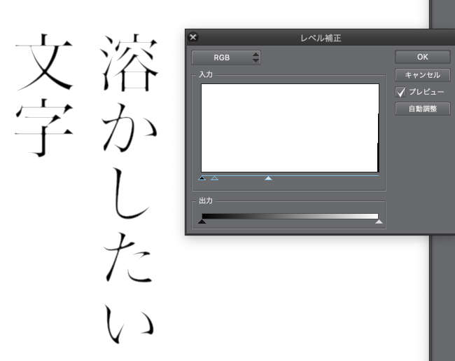
The next "level correction" to thumping the numbers here if you are too much of it, you won't melt at all! Adjust the numbers here to make it bigger.

※ Because I adjust it to a good feeling by light and dark black and white text layer that had been temporarily selected becomes pure white but at the end, please continue without worrying because it becomes a transparent color.
Three -level correction white triangle and gray triangle is adjusted to a good feeling by sliding (black is clearly melted I feel better not move from the initial position)
(Please play the one which is wrapped in the blue frame in the part of white Changshiku that input.)

If you like the colored color, you can use a bucket to complete your favorite clipping.
It melts into a good feeling when I do a sharp line drawing such as a bold font (the morning system) and strong strength.
PostScript 20181119

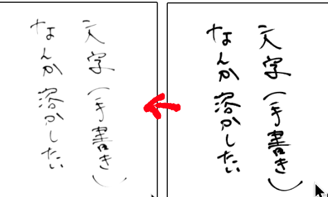
Because I was able to dissolve even a handwritten character, might an unexpected effect be used for such as drawing line...? Such as those of line drawing strong strength, might be recommended.
※ It is not to change the font data, but because there might be the case that the processing prohibits itself by the font, please use it based on the terms of use of the font that each one uses.
I made this reference to https://togetter.com/li/947614.
こんなかんじに溶けます。
(以下手順)
(黒以外でやってしまうと色が飛んでしまったりするので完成してからクリッピングなどで文字色を変えることをおすすめします)
2 オートアクションを実行するとガウスぼかしの数値を求められるのでほどよくボケる数値に、
フォントやフォントサイズによって溶け加減が変わってくるので要調整
はじめは2や3くらいのちょっとぼけたかな…?くらいでとどめておいて感覚をつかんでください。
次の「レベル補正」にてとけすぎたらここの数値をすくなめに、全然とけない!場合はここの数値を大きめにして調整してください。
※白と黒の明暗でいい感じに調整するので一時的に選択していたテキストレイヤーが真っ白になりますが最後には透明色になるので気にせず続けてください。
3 レベル補正で白い三角やら灰色の三角やらをスライドさせていい感じに調整(黒いのは初期位置から移動しない方がくっきり溶ける気がする)
(入力っていう白い長四角の部分にある水色の枠に包まれてる方のをいじってください)
色付きが好みな方はクリッピングなどでお好きな色をバケツでぶっかけて完成です!!
メリハリのあるフォント(明朝系)や強弱の強い線画などでやるといい感じに溶けます
追記20181119
手書きの文字でも溶かすことができたので、線画などにも使って思わぬ効果が出るかも…?強弱の強い線画の方など、おすすめかも。
※フォントデータの改変にはあたりませんがフォントによって加工自体を禁止している場合もあるかもしれないので、各自使用するフォントの利用規約に基づいて利用してください。
https://togetter.com/li/947614 こちらを参考に作りました


Popular “Auto Action” materials


New materials


Badges
-
 MVP ◆This user has contributed greatly to the management of the community, by posting many great responses to the questions asked. Once every three months, MVPs are determined based on the points earned during that period and will be recognized accordingly.
 -
 New Valuable Player (NVP) ◆These are the next-best contributors to the community after MVPs. This is awarded to users who have not yet won an MVP award, based on the number of points they have earned.
 -
 Official Expert ◆Chosen out of all MVP awardees, who are already proof of excellence, this is a testimony of outstanding correspondence in the community. After careful screening, they are appointed by CELSYS and assume their position.Note: Formally called “Evangelists”
 -
 Official Moderator of CELSYS ◆Moderators are official CELSYS staff members who are fluent in Japanese as well as various other languages. Moderators are not experts on the software or illustration, so they are not able to directly answer your questions. However, moderators provide communication and language support to ensure that everyone can smoothly communicate with each other.
 -
 CELSYS official accountThe Official Administrator Account