


| OKLCH 팔레트 | + 빛/크로마 - | (| OKLCH Pallete | + Light/Chroma - |) | OKLCH Pallete | + Light/Chroma - |
콘텐츠 ID:2310298
-
26


밝기가 줄어들 때마다 크로마가 감소하는 OKLCH 색상 공간을 기반으로 색상 설정. Color set based on the OKLCH color space that decreases in Chroma every step it decreases in Lightness.
밝 기 와 채도는 같은 양을 유지해도 색 조만 바꿀 때 왜 명도가 항상 같지 않은지 궁금해해본 적 있나요?
그 이유는 포화도가 지각적으로 균일하지 않기 때문입니다!
채도는 색상의 밝기에 비해 색상의 양을 증가시킵니다. 서로 다른 색조는 자연스럽게 서로 다른 밝기 범위를 차지하기 때문에, 같은 채도와 밝기를 유지한다고 해서 반드시 색상이 똑같이 밝아 보이지는 않습니다.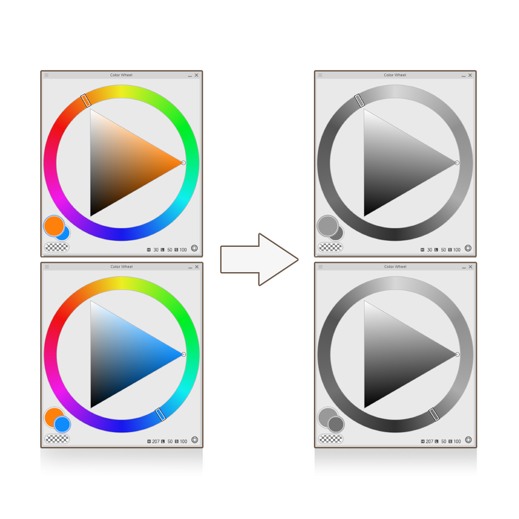
그 이유는 포화도가 지각적으로 균일하지 않기 때문입니다!
채도는 색상의 밝기에 비해 색상의 양을 증가시킵니다. 서로 다른 색조는 자연스럽게 서로 다른 밝기 범위를 차지하기 때문에, 같은 채도와 밝기를 유지한다고 해서 반드시 색상이 똑같이 밝아 보이지는 않습니다.
OKLCH 는 밝음을 지각적으로 더 균일 하게 만들어, 같은 밝기 값을 가진 색들이 색조와 상관없이 인간의 눈에 똑같이 밝게 보이도록 설계된 색 공간입니다.
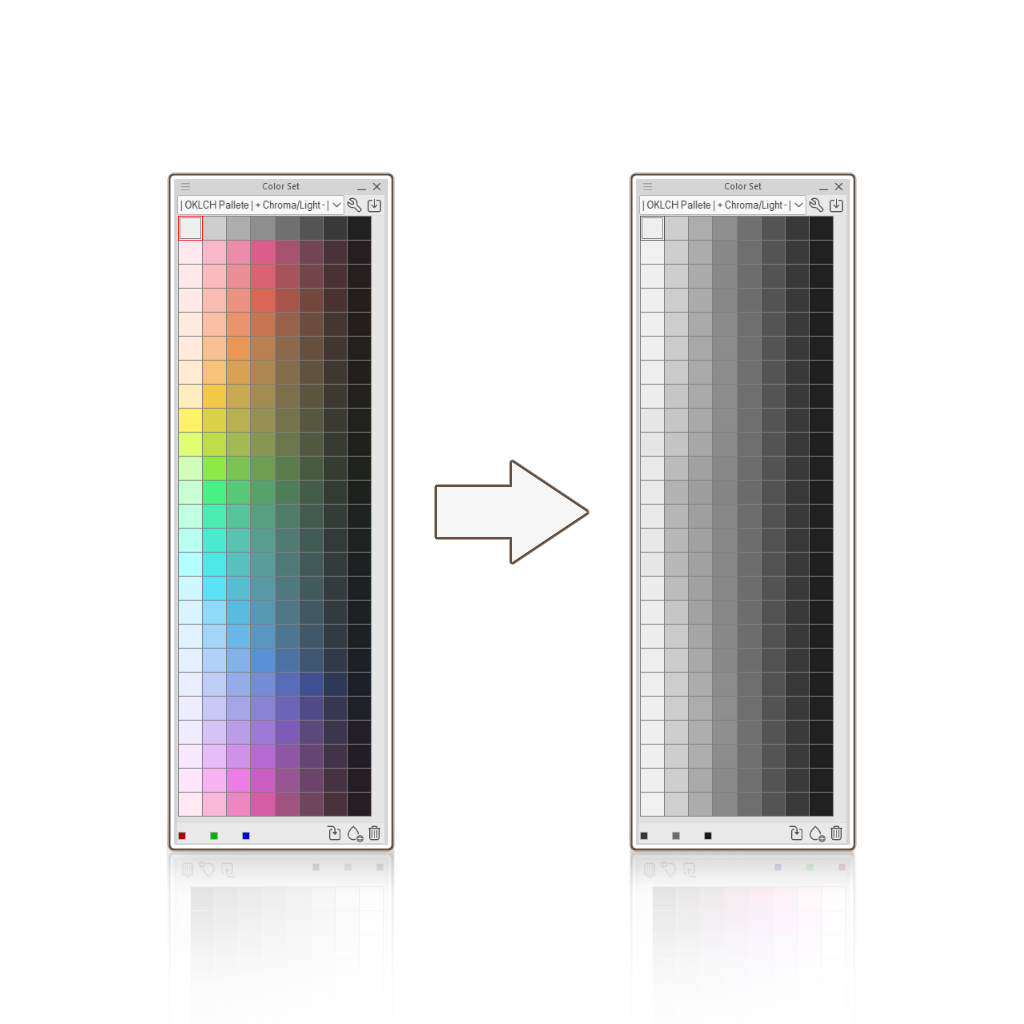
이 아이디어를 바탕으로 이 색상 세트를 만들었어요. 각 색상은 어두워질수록 밝기와 색도 가 줄어들는데, 이는 실제 매트 표면이 작동하는 것과 비슷합니다!
이 색상 세트를 사용하면 그라데이언트 맵을 이용해 그레이스케일부터 컬러로 작업하는 것도 훨씬 쉬워집니다!
- 색상 세트에서 회색 값을 선택하고 피사체에 음영을 더하기 시작하세요. 부드러운 음영은 하지 말고, 단단한 가장자리부터 시작하는 게 더 좋습니다.
- 오른쪽 클릭 레이어에서 새 보정 레이어를 클릭한 후 그라디언트 맵을 선택하세요.
- 설정 내에서 다음 위치 값으로 해당 색상 스와치를 추가하세요: 95 - 85 - 75 - 65 - 55 - 45 - 35 - 25 (첫 번째 스와치는 95, 두 번째 스와치는 85 이후...)
믹싱 모드에서 Perceptual을 선택하고 밝기 보정을 낮음 또는 중간 설정하세요. - 끝나면. 보정 레이어의 블렌딩 모드를 Color로 변경하세요(이렇게 하면 원래 회색 피사체의 밝기 값이 유지됩니다).
그게 전부여야 한다. 다른 레이어에서 그 위에 렌더링하세요.
Ever wondered why your values never stay de same even if you keep the same amount of Lightness and Saturation, when you're just changing Hues?
That's because Saturation isn't perceptually uniform!
Saturation increases the amount of color relative to its own brightness. Because different hues naturally occupy different ranges of brightness, keeping the same Saturation and Lightness doesn't necessarily make colors look equally bright.
That's because Saturation isn't perceptually uniform!
Saturation increases the amount of color relative to its own brightness. Because different hues naturally occupy different ranges of brightness, keeping the same Saturation and Lightness doesn't necessarily make colors look equally bright.
OKLCH is a color space designed to make Lightness more perceptually uniform, so that colors with the same Lightness value look equally bright to the human eye, regardless of their hue.
I made this color set based on this idea. Each color decreases in Lightness and Chroma as it gets darker, similar to how matte surfaces behave in real life!
It even becomes easier to work from grayscale to color using gradient maps with this color set!
- Pick the values in gray across the color set and start shading your subject. I recommend not to do any soft shading, it's better to start with hard edges.
- Right click your layer, click on new correction layer and select Gradient Map.
- Inside the settings, add the corresponding colored swatches in the following position values: 95 - 85- 75- 65 - 55 - 45 - 35 - 25 (The first swatch goes in 95, the second in 85 and so on...)
In Mixing Mode, select Perceptual and set the Brightness Correction to Low or Medium. - Once you're done. Change the blending mode of the correction layer to Color (this will mantain the original Lightness value of the grayscale subject).
And that should be it. Render over it in other layers.


'컬러 세트'의 인기 소재





신규 소재



배지
-
 MVP ◆질문에 적절한 답변을 많이 게시하고 커뮤니티 운영에 크게 공헌한 사용자입니다. MVP는 3개월에 한 번, 그 사이에 획득한 포인트를 바탕으로 결정하고 표창을 실시하고 있습니다.
 -
 NVP(New Valuable Player) ◆MVP 다음으로 커뮤니티 운영에 공헌한 사용자입니다. 이제까지 MVP 수상 경험이 없는 분 중에서 획득한 포인트를 바탕으로 결정하여 표창을 실시하고 있습니다.
 -
 공식 엑스퍼트 ◆뛰어난 응답자의 증표인 MVP수상자 중에서 선택된 커뮤니티에서 가장 뛰어난 응답자의 증표입니다. 심사를 거쳐서 저희 회사에서 의뢰할 경우 취임되십니다.※ 옛 명칭 '에반젤리스트'
 -
 셀시스 공인 모더레이터 ◆모더레이터는 일본어와 기타 언어로 말할 수 있는 셀시스 공인 스태프입니다. 소프트웨어나 창작 전문가가 아니므로 직접 의문을 해결할 수는 없지만 여러분이 순조롭게 소통할 수 있도록 언어나 커뮤니케이션 측면에서 지원합니다.
 -
 셀시스 공식운영에 관련된 공식 계정입니다.