


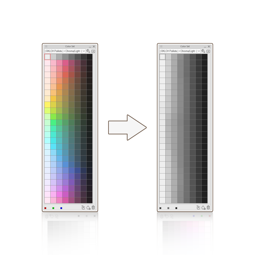
Color set based on the OKLCH color space that decreases in Chroma every step it decreases in Lightness.
Ever wondered why your values never stay de same even if you keep the same amount of Lightness and Saturation, when you're just changing Hues?
That's because Saturation isn't perceptually uniform!
Saturation increases the amount of color relative to its own brightness. Because different hues naturally occupy different ranges of brightness, keeping the same Saturation and Lightness doesn't necessarily make colors look equally bright.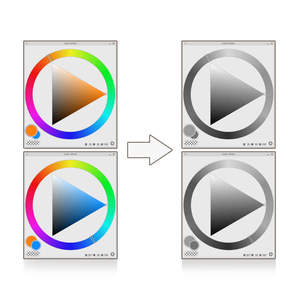
That's because Saturation isn't perceptually uniform!
Saturation increases the amount of color relative to its own brightness. Because different hues naturally occupy different ranges of brightness, keeping the same Saturation and Lightness doesn't necessarily make colors look equally bright.
OKLCH is a color space designed to make Lightness more perceptually uniform, so that colors with the same Lightness value look equally bright to the human eye, regardless of their hue.
I made this color set based on this idea. Each color decreases in Lightness and Chroma as it gets darker, similar to how matte surfaces behave in real life!
It even becomes easier to work from grayscale to color using gradient maps with this color set!
- Pick the values in gray across the color set and start shading your subject. I recommend not to do any soft shading, it's better to start with hard edges.
- Right click your layer, click on new correction layer and select Gradient Map.
- Inside the settings, add the corresponding colored swatches in the following position values: 95 - 85- 75- 65 - 55 - 45 - 35 - 25 (The first swatch goes in 95, the second in 85 and so on...)
In Mixing Mode, select Perceptual and set the Brightness Correction to Low or Medium. - Once you're done. Change the blending mode of the correction layer to Color (this will mantain the original Lightness value of the grayscale subject).
And that should be it. Render over it in other layers.


Popular “Color set” materials




New materials


Badges
-
 MVP ◆This user has contributed greatly to the management of the community, by posting many great responses to the questions asked. Once every three months, MVPs are determined based on the points earned during that period and will be recognized accordingly.
 -
 New Valuable Player (NVP) ◆These are the next-best contributors to the community after MVPs. This is awarded to users who have not yet won an MVP award, based on the number of points they have earned.
 -
 Official Expert ◆Chosen out of all MVP awardees, who are already proof of excellence, this is a testimony of outstanding correspondence in the community. After careful screening, they are appointed by CELSYS and assume their position.Note: Formally called “Evangelists”
 -
 Official Moderator of CELSYS ◆Moderators are official CELSYS staff members who are fluent in Japanese as well as various other languages. Moderators are not experts on the software or illustration, so they are not able to directly answer your questions. However, moderators provide communication and language support to ensure that everyone can smoothly communicate with each other.
 -
 CELSYS official accountThe Official Administrator Account
