

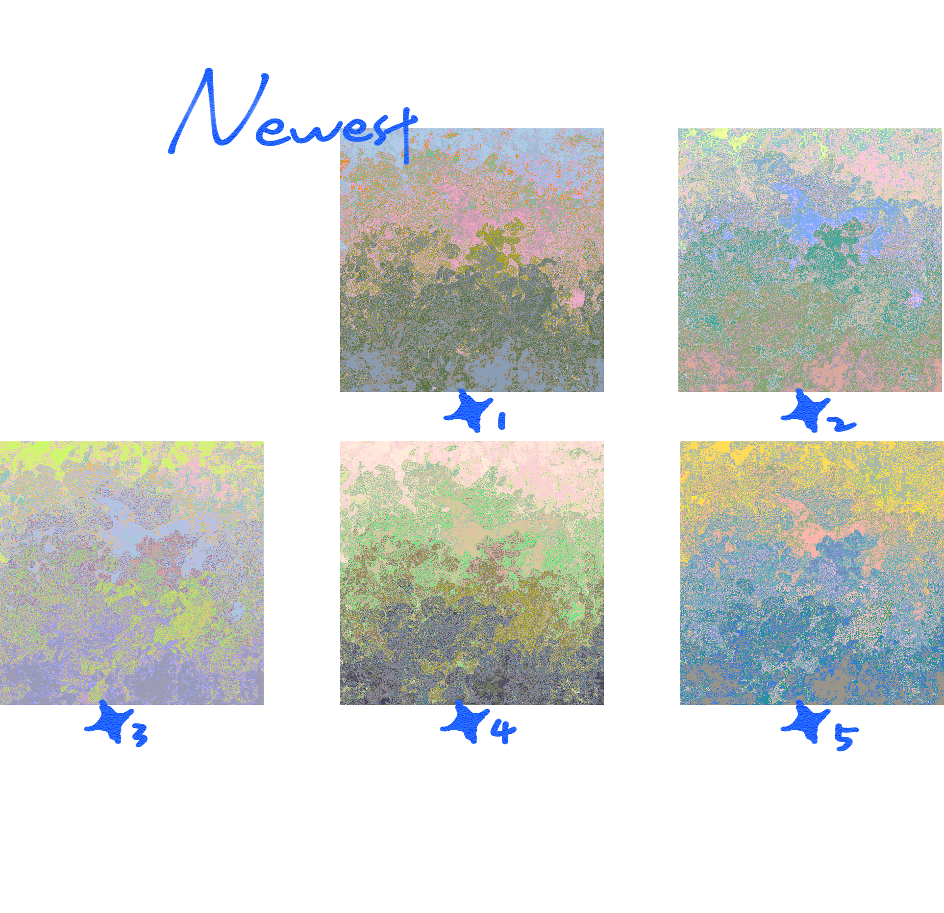
Five new gradients have been updated~
The new gradient is a lighter color.
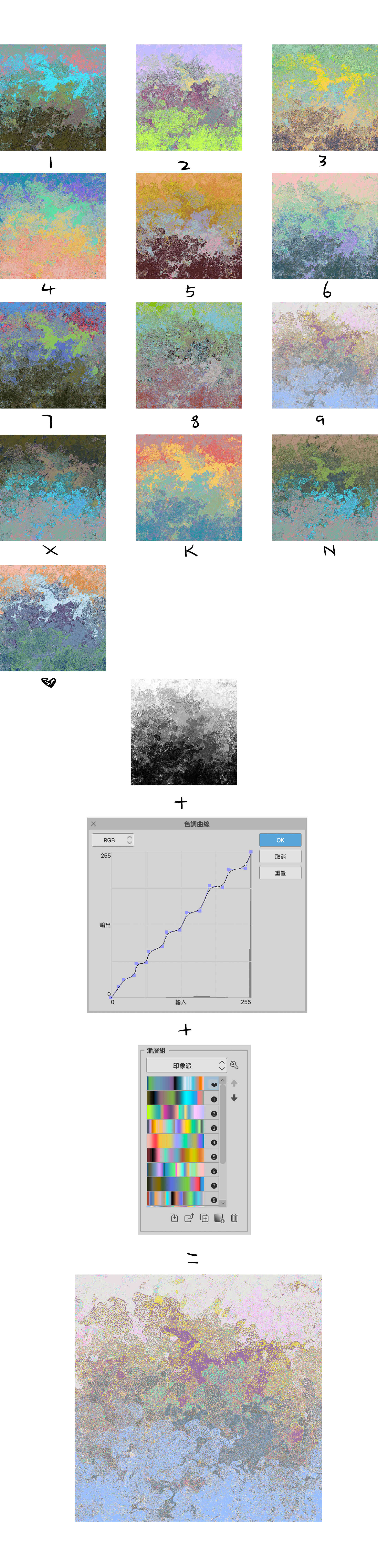
 A gradient set created based on Impressionist-style paintings, this is a set of colors that can make the painting even more dreamy!
 A gradient set created based on Impressionist-style paintings, this is a set of colors that can make the painting even more dreamy!
I think opening the "Tone Curve" adjustment before using gradients will give the image more color variety, making it easier for gradient colors to stick together!
I think gradient colors at 20% to 30% are more suitable for "soft light" or "coverage" effects!
更新了5个新的渐变~
新增渐变是比较轻盈的颜色。
基於印象派風格畫作製作出來的漸變組,這是一組可以讓畫面更加夢幻的顏色!
基於印象派風格畫作製作出來的漸變組,這是一組可以讓畫面更加夢幻的顏色!我認為,在使用漸變之前,先打開“色調曲線”調整會讓畫面色調有更多變化,從而讓漸變色彩更好附著!
漸變顏色我認為在20%至30%,效果為“柔光”或者“覆蓋”更加合適!
Old version


Other materials by 实用主义


Popular “Gradient set” materials


New materials


Badges
-
 MVP ◆This user has contributed greatly to the management of the community, by posting many great responses to the questions asked. Once every three months, MVPs are determined based on the points earned during that period and will be recognized accordingly.
 -
 New Valuable Player (NVP) ◆These are the next-best contributors to the community after MVPs. This is awarded to users who have not yet won an MVP award, based on the number of points they have earned.
 -
 Official Expert ◆Chosen out of all MVP awardees, who are already proof of excellence, this is a testimony of outstanding correspondence in the community. After careful screening, they are appointed by CELSYS and assume their position.Note: Formally called “Evangelists”
 -
 Official Moderator of CELSYS ◆Moderators are official CELSYS staff members who are fluent in Japanese as well as various other languages. Moderators are not experts on the software or illustration, so they are not able to directly answer your questions. However, moderators provide communication and language support to ensure that everyone can smoothly communicate with each other.
 -
 CELSYS official accountThe Official Administrator Account