

It becomes gradient set that the color scheme of the illustration and the costume can be made easily. All 100 species イラストや衣装の配色が簡単にできるグラデーションセットになります。全100種
I think that it is a color scheme that is easier to use than last time.
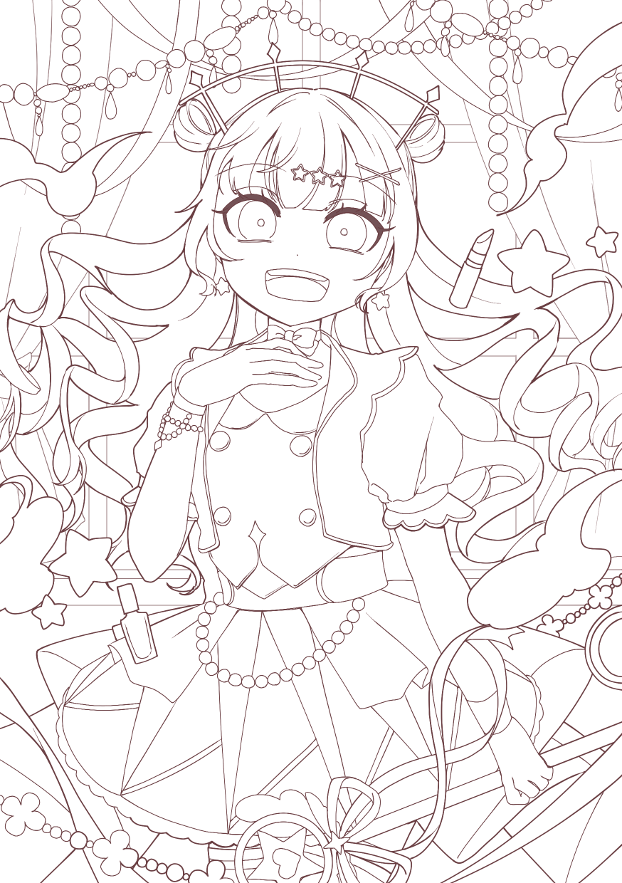
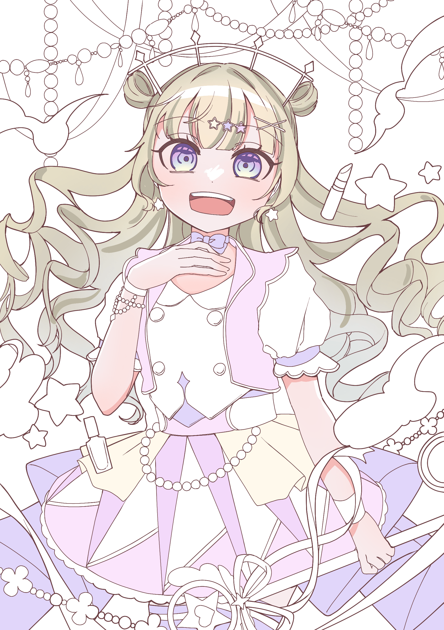
The image is like this.

Changing the colors and the order is fine.
▶ Main use ◀ This method can be used in other gradient map

There is a picture which worries about the color scheme here. (I put the line drawing up to be easy to understand)

2. Painted in black and white gray

I think that the color scheme becomes beautiful when the difference of the lightness of the color that is adjacent is clear when I arrange colors.
3. Choose layers → new correction layer → gradient map and select a gradient from the top of the layer painted in black and white. (Here we have selected number 66)

Basically combine mode is usually recommended, but I think it's fun to multiply and overlay and hard light.
4. I think that it is good to draw up the layer on the place where it is insufficient and to make it as appropriate.
前回より使いやすい配色になってると思います。
使用イメージはこんな感じです。
色や順番の変更は全然大丈夫です。
▶主な使い方◀ この方法は他のグラデーションマップでも使えます
1.ここに配色に悩んでいる絵があります。(分かりやすいように線画を載せています)
2.白黒グレーで塗り分けます
色を並べる際、隣り合う色の明度の差がはっきりしている方が配色がきれいになると思います。
3.白黒で塗り分けたレイヤーの上から「レイヤー」→「新規色調補正レイヤー」→「グラデーションマップ」と選択し、お好きなグラデーションを選択します。(ここでは66番を選択しました)
基本的に合成モードは「通常」がおすすめですが、「乗算」や「オーバーレイ」「ハードライト」でも楽しいと思います。
4.足りないと思ったところは上にレイヤーを作って適宜描き足してもいいと思います。


Other materials by 咲ヶ本


Popular “Gradient set” materials


New materials


Badges
-
 MVP ◆This user has contributed greatly to the management of the community, by posting many great responses to the questions asked. Once every three months, MVPs are determined based on the points earned during that period and will be recognized accordingly.
 -
 New Valuable Player (NVP) ◆These are the next-best contributors to the community after MVPs. This is awarded to users who have not yet won an MVP award, based on the number of points they have earned.
 -
 Official Expert ◆Chosen out of all MVP awardees, who are already proof of excellence, this is a testimony of outstanding correspondence in the community. After careful screening, they are appointed by CELSYS and assume their position.Note: Formally called “Evangelists”
 -
 Official Moderator of CELSYS ◆Moderators are official CELSYS staff members who are fluent in Japanese as well as various other languages. Moderators are not experts on the software or illustration, so they are not able to directly answer your questions. However, moderators provide communication and language support to ensure that everyone can smoothly communicate with each other.
 -
 CELSYS official accountThe Official Administrator Account