

It is a set of sub tool made aiming to become rough drawing taste like pencil in monochrome two-valued layer. モノクロ二値レイヤーで鉛筆っぽいざらざらした描き味になることを目指して作ったサブツールセットです。
You can draw with the same taste in gray and colored layers.
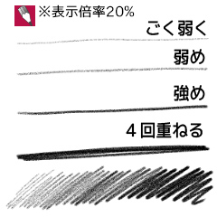
[10] for when you draw under the display of characters, such as 25 to 50%
"5" for the Atari of the image and graffiti of the web resolution or when you draw a detailed under pixel size display
It is adjusted to the roughness assumed to be used as.


グレーやカラーのレイヤーでも同じ書き味で描けます。
「10」は25~50%くらいの表示でキャラクターなどの下描きをする時用
「5」はピクセル等倍表示で細かい下描きをする場合や、web解像度の画像・落書きのアタリ用
として使用することを想定した粗さに調整しています。
Black and white pencil drawn under three モノクロ下描き鉛筆3種


Prototype 試作


Update history
20131021 up 20131021 up


Other materials by 玉英


Popular “Material catalog” materials


New materials


-
 MVP ◆This user has contributed greatly to the management of the community, by posting many great responses to the questions asked. Once every three months, MVPs are determined based on the points earned during that period and will be recognized accordingly.
 -
 New Valuable Player (NVP) ◆These are the next-best contributors to the community after MVPs. This is awarded to users who have not yet won an MVP award, based on the number of points they have earned.
 -
 Official Expert ◆Chosen out of all MVP awardees, who are already proof of excellence, this is a testimony of outstanding correspondence in the community. After careful screening, they are appointed by CELSYS and assume their position.Note: Formally called “Evangelists”
 -
 Official Moderator of CELSYS ◆Moderators are official CELSYS staff members who are fluent in Japanese as well as various other languages. Moderators are not experts on the software or illustration, so they are not able to directly answer your questions. However, moderators provide communication and language support to ensure that everyone can smoothly communicate with each other.
 -
 CELSYS official accountThe Official Administrator Account