



여러 그라데이션 맵을 제공해, 단일 참고 이미지와 특정 설정에서 선택해야 하는 수많은 색상에 신경 쓰지 않고 재료를 렌더링하는 과정을 빠르게 할 수 있습니다. A series of gradient maps to help quicken the process of rendering materials without losing your marbles on the myriad of colors you have to pick from a single reference image and specific settings.
수년간 메탈릭 색칠에 도움이 된 '작은' 그라데이션 세트! 원하는 그림을 기본 흑백 값으로 음영 처리한 다음, Edit>Tonal Correction>Gradient Mapss에서 원하는 그라데이션을 선택하세요.
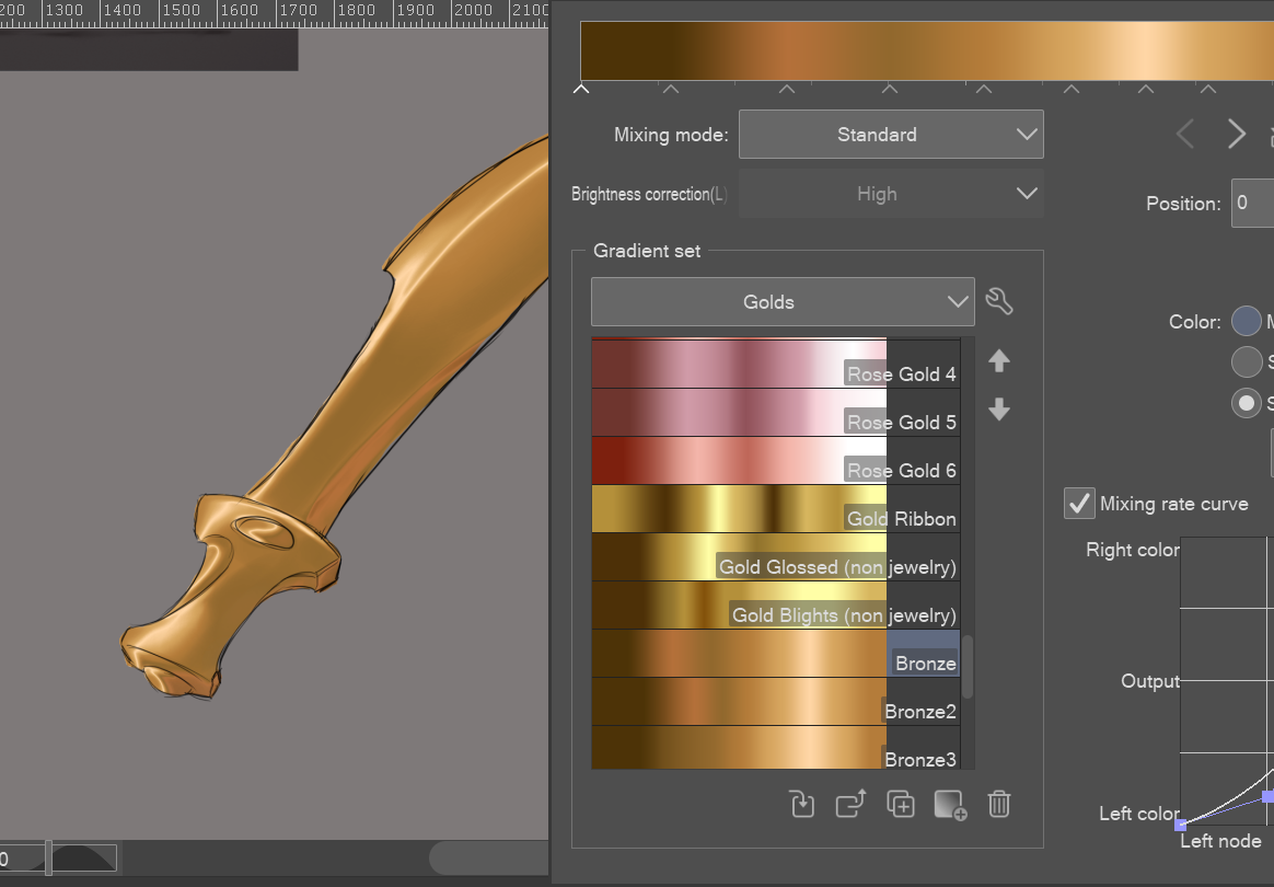
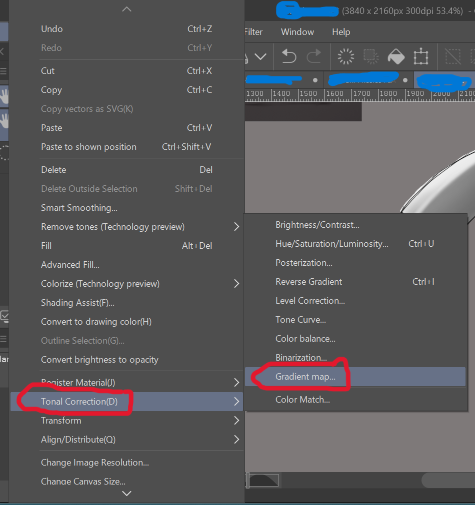
* 참고: 그라데이언트 맵은 슬라이더에 할당된 색상으로 값을 가장 어둡게(왼쪽)에서 가장 밝은 쪽(오른쪽)으로 대체하므로, 음영 순간에 값이 얼마나 균형 잡혀 있는지 주의하세요. 그렇지 않으면 선택한 그라데이션에서 전체 색상 스펙트럼을 얻기 어렵습니다. 어두운 회색, 회색, 흰색을 사용해 음영을 하는 것이 도움이 됩니다.
A "small" set of gradients that have helped me color metallics over the years! Just shade your desired drawing in basic black and white values, then go to Edit>Tonal Correction>Gradient Maps and select the gradient you desire.
* NOTE: Gradient Maps replace values with the colors assigned in the slider from darkest (left side) to lightest (right side), so be mindful of how balanced your values are in the moment of shading, else you won't be able to get the full spectrum of color on the chosen gradient. It helps to simply use a dark gray, gray, and white color to shade with.








'그라데이션 세트'의 인기 소재


신규 소재






배지
-
 MVP ◆질문에 적절한 답변을 많이 게시하고 커뮤니티 운영에 크게 공헌한 사용자입니다. MVP는 3개월에 한 번, 그 사이에 획득한 포인트를 바탕으로 결정하고 표창을 실시하고 있습니다.
 -
 NVP(New Valuable Player) ◆MVP 다음으로 커뮤니티 운영에 공헌한 사용자입니다. 이제까지 MVP 수상 경험이 없는 분 중에서 획득한 포인트를 바탕으로 결정하여 표창을 실시하고 있습니다.
 -
 공식 엑스퍼트 ◆뛰어난 응답자의 증표인 MVP수상자 중에서 선택된 커뮤니티에서 가장 뛰어난 응답자의 증표입니다. 심사를 거쳐서 저희 회사에서 의뢰할 경우 취임되십니다.※ 옛 명칭 '에반젤리스트'
 -
 셀시스 공인 모더레이터 ◆모더레이터는 일본어와 기타 언어로 말할 수 있는 셀시스 공인 스태프입니다. 소프트웨어나 창작 전문가가 아니므로 직접 의문을 해결할 수는 없지만 여러분이 순조롭게 소통할 수 있도록 언어나 커뮤니케이션 측면에서 지원합니다.
 -
 셀시스 공식운영에 관련된 공식 계정입니다.