



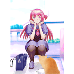
It gradient map may be like a liminal space.
⭕️ Recommended: Low contrast and ➕ low saturation
❌ Deprecated: Low contrast and ➕ high saturation
How it is applied seems to vary considerably from person to person.
If it's subtle, adjust 🎶 it to your liking.
リミナルスペースっぽいかもしれないグラデーションマップです。
⭕️推奨:コントラスト低め➕彩度低め
❌非推奨:コントラスト低め➕彩度高め
どう適用されるかはかなり個人差があると思われます。
もし微妙だった場合はお好きに調整してください🎶




Other materials by ごごごんごごんごご


Popular “Gradient set” materials


New materials









Badges
-
 MVP ◆This user has contributed greatly to the management of the community, by posting many great responses to the questions asked. Once every three months, MVPs are determined based on the points earned during that period and will be recognized accordingly.
 -
 New Valuable Player (NVP) ◆These are the next-best contributors to the community after MVPs. This is awarded to users who have not yet won an MVP award, based on the number of points they have earned.
 -
 Official Expert ◆Chosen out of all MVP awardees, who are already proof of excellence, this is a testimony of outstanding correspondence in the community. After careful screening, they are appointed by CELSYS and assume their position.Note: Formally called “Evangelists”
 -
 Official Moderator of CELSYS ◆Moderators are official CELSYS staff members who are fluent in Japanese as well as various other languages. Moderators are not experts on the software or illustration, so they are not able to directly answer your questions. However, moderators provide communication and language support to ensure that everyone can smoothly communicate with each other.
 -
 CELSYS official accountThe Official Administrator Account