


|OKLCH 托盤 |+ 光/色度 - | (| OKLCH Pallete | + Light/Chroma - |) | OKLCH Pallete | + Light/Chroma - |
素材ID:2310298
-
26


顏色設定基於OKLCH色彩空間,色度每降低一點亮度就減少。 Color set based on the OKLCH color space that decreases in Chroma every step it decreases in Lightness.
你有沒有想過為什麼即使你保持相同的 明暗 和 飽和度,明暗卻永遠不會保持不變,當你只是改變 色調時?
那是因為 飽和度在感知上並不均勻!
飽和度會增加顏色相對於自身亮度的量。因為不同色調自然佔據不同的亮度範圍,保持相同的飽和度和亮度不一定讓顏色看起來同樣明亮。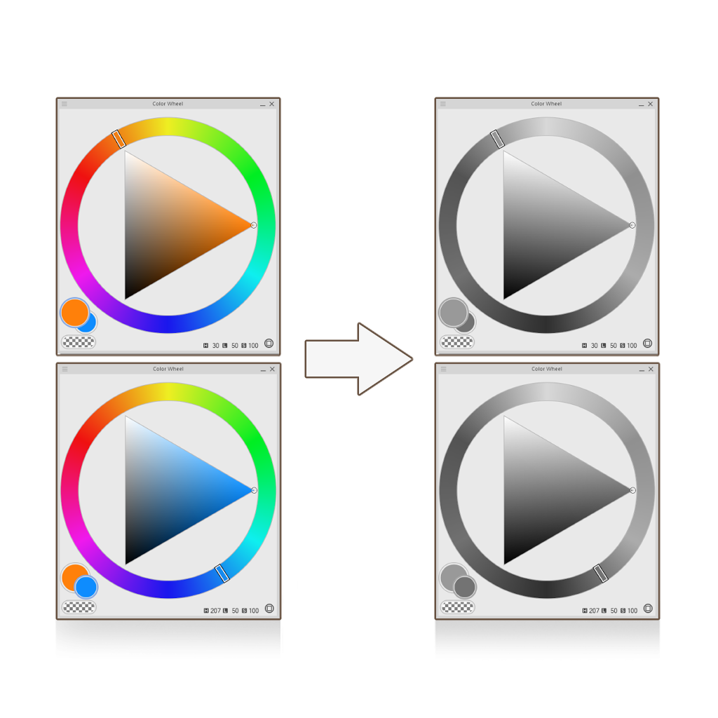
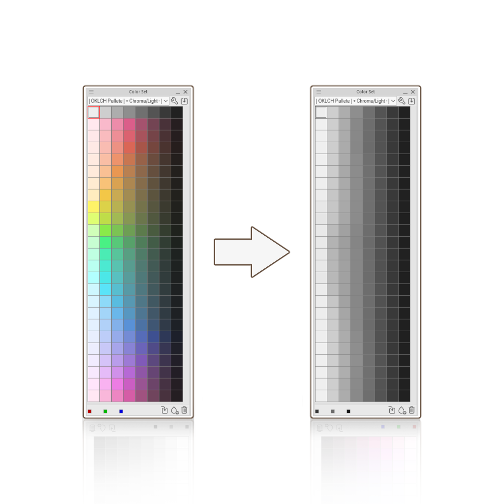
那是因為 飽和度在感知上並不均勻!
飽和度會增加顏色相對於自身亮度的量。因為不同色調自然佔據不同的亮度範圍,保持相同的飽和度和亮度不一定讓顏色看起來同樣明亮。
OKLCH 是一種色彩空間,旨在使明度在感知上更均勻, 使得具有相同明度值的顏色對人眼來說看起來同樣明亮,無論其色調為何。
我就是根據這個想法做了這套色彩組合。每種顏色隨著顏色變暗而逐漸降低亮度 和色度 ,這就像現實中霧面表面的表現一樣!
用這組色彩集,從 灰階到色彩 的漸 層貼圖 甚至變得更容易!
- 在 整個色彩集中 選取灰色值,開始為主體上色。我建議不要做任何柔和的陰影,最好先從硬邊開始。
- 右鍵點擊你的圖層,點選新的修正圖層,然後選擇漸層貼圖。
- 在設定中,加入對應的彩色色片,分別設定以下位置值:95 - 85 - 75 - 65 - 55 - 45 - 35 - 25(第一張色片放95,第二張放85,依此類推......)
在混音模式中,選擇感知,並將亮度校正設定為低或中。 - 等你完成後。將校正圖層的混合模式改為色彩(這會維持灰階主體的原始明暗值)。
事情就該這樣了。在其他圖層上渲染。
Ever wondered why your values never stay de same even if you keep the same amount of Lightness and Saturation, when you're just changing Hues?
That's because Saturation isn't perceptually uniform!
Saturation increases the amount of color relative to its own brightness. Because different hues naturally occupy different ranges of brightness, keeping the same Saturation and Lightness doesn't necessarily make colors look equally bright.
That's because Saturation isn't perceptually uniform!
Saturation increases the amount of color relative to its own brightness. Because different hues naturally occupy different ranges of brightness, keeping the same Saturation and Lightness doesn't necessarily make colors look equally bright.
OKLCH is a color space designed to make Lightness more perceptually uniform, so that colors with the same Lightness value look equally bright to the human eye, regardless of their hue.
I made this color set based on this idea. Each color decreases in Lightness and Chroma as it gets darker, similar to how matte surfaces behave in real life!
It even becomes easier to work from grayscale to color using gradient maps with this color set!
- Pick the values in gray across the color set and start shading your subject. I recommend not to do any soft shading, it's better to start with hard edges.
- Right click your layer, click on new correction layer and select Gradient Map.
- Inside the settings, add the corresponding colored swatches in the following position values: 95 - 85- 75- 65 - 55 - 45 - 35 - 25 (The first swatch goes in 95, the second in 85 and so on...)
In Mixing Mode, select Perceptual and set the Brightness Correction to Low or Medium. - Once you're done. Change the blending mode of the correction layer to Color (this will mantain the original Lightness value of the grayscale subject).
And that should be it. Render over it in other layers.


「色板」的人氣素材





最新素材



徽章
-
 MVP ◆針對問題投稿了眾多適切的回答,對社群有顯著貢獻的用戶。每3個月一次,會依據期間內獲得的點數選出MVP用戶,並進行表揚。
 -
 NVP(New Valuable Player) ◆繼MVP後,對社群營運做出良好貢獻的用戶。將從不曾獲選為MVP的用戶中,依據獲得的點數進行評選、表揚。
 -
 官方推廣大使 ◆從被證明為優良回答用戶的MVP獲獎者中選出社群中最優異的回答者。並經審查後由本社委託就任。※舊名稱為「Evangelist」
 -
 CELSYS公認Moderator ◆Moderator為會使用日文及其他語言的CELSYS公認工作人員。由於並非軟體或創作的專業人士,Moderator無法直接為用戶解決疑問,但能在語言、交流方面提供支援,幫助用戶們順利地進行溝通。
 -
 CELSYS官方為與營運相關的官方帳號。