

手工製作彩色玻璃的DIY工具包。現在是壯舉。 梯度圖。 A DIY toolkit for making stained glass by hand. Now feat. gradient maps.

製作手工彩繪玻璃藝術的一套材料!
該套件包括:
- 五把刷子/工具,用於繪製鉛盒(框架中用於固定玻璃片的材料)
- 用於高光和陰影玻璃的刷子。
- 粗鉛筆,用於柔和的素描細節
- 用於遮擋玻璃的灰度調色板
- 五個預製窗框
- 預製光束圖像材料
- 一套 21 個用於著色玻璃的預設漸變圖
如何使用:
製作彩色玻璃窗看起來很複雜,但一旦你瞭解了自己在做什麼,實際上就不那麼困難了。其中大部分實際上只是幾何圖形和使用尺子、線條和網格。
“哦,不,數學,”我 聽到了,但你實際上並不需要數位。 我做了一個小教程來展示它是多麼簡單(或至少是可行的) !

首先,決定你想用什麼圖案或圖案作為櫥窗的中心裝飾品。盡量不要選擇太複雜的東西,形狀越簡單,設計窗戶就越容易。
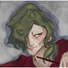
對於這個例子,我決定使用我的老朋友 Khadija 惡魔 snek。
步驟 1。設計圖案后,在向量圖層上使用 Lead Came Liner 畫筆來放下線條。在這個階段,只畫輪廓。 以大解析度繪製,並在輪廓內留出足夠的空間。
第2步。在線藝術畫下創建一個新的柵格圖層,然後使用細節鉛筆勾勒出圖案中最重要的細節。這不一定是超級乾淨或完美的,你不應該包含太多的細節。將您的設計簡化為僅最基本的形狀,以獲得最佳效果。

第 3 步。選擇一種鮮豔的顏色,然後在下面再做一層。用鉛筆勾勒出凸輪的基本線條。這個想法是製作稜角分明的形狀,主要是三角形和矩形,將您的設計分割成更小的部分。它們不應該是完全筆直的,只是徒手素描作品。想像一下,像馬賽克一樣拼湊在一起的小碎玻璃。
第 4 步。對線條的位置感到滿意后,返回向量圖層並將它們添加到線條中。在這個階段,我經常發現圖案開始變得難以區分,到處都是很多線條,所以我輕輕地用鉛筆在下面低不透明度圖層上為細節參考的區域著色。

第 5 步。選擇一個預製框架或設計您自己的視窗並調整框架和向量的大小,直到它放置在您想要的位置。同樣,以高解析度工作將使您的生活更輕鬆。我在 2000px 600 dpi 的畫布上工作,並在最後減小了尺寸,但它不必那麼大。剛好足夠你以後可以在凸輪的內部工作。
第 6 步。我建議對此部分使用 CSP 預設對稱尺規。將其放在視窗的中心,然後使用「引線工具」添加您喜歡的框架。許多彩色玻璃窗有不同的部分,非常複雜的玻璃窗通常每個部分都有不同的設計。在這個例子中,我只是選擇了一些簡單、優雅的形狀,並將它們添加到框架中。不同的統治者的特徵略有不同。90 度尺規強制線條工具的邊緣與線條的方向對齊,而常規尺規始終拉直直角。其中一個彎曲的以不同的角度自動變薄;嘗試一下,看看什麼效果最好。

第 7 步。到目前為止,最煩人的步驟是添加其餘的窗格。這可能需要一點時間,但過程與以前完全相同。瞄準有曲線的角度形狀,或多或少地將窗戶向上分割,但不要追求完美或對稱。魅力的一部分在於不完美。放置完所有線條后,我建議返回所有交匯點並對每個角的內側進行圓角處理。這裡的想法是,金屬凸輪已經焊接在一起,因此它們通常是塊狀的,或者有粘性材料將玻璃固定到位。

第8步。您可以先執行其中任一步驟。將向量圖層設置為參考圖層,並使用帶有剪貼蒙版的光柵圖層或下方的選區來開始填充背景和設計的顏色。
8一個。您的設計可能會有獨特的顏色,因此您需要製作自己的調色板。這是我如何設置我的。

Khadija 主要是一條綠色的蛇,有棕色斑點和米色的腹部,所以我的主要調色板只有三種顏色。因為綠色是設計中最大的部分,所以我選擇了另外三種綠色,然後選擇了兩種棕色和兩種奶油色。一旦你滿意了,你就有足夠的東西,開始用填充工具或阻擋筆填充。避免對相鄰的凸輪使用相同的顏色。
8乙.由於主要設計使用的顏色不同,因此更容易使用灰度作為背景。在另一個圖層上,我包含了一個灰度調色板,其中包含多個值可供選擇。同樣,盡量不要在相鄰窗格中使用相同的顏色,但如果需要,可以這樣做。

第 9 步。使用漸變貼圖或調色板,將灰度替換為您選擇的顏色。我發現使用具有多種色調的漸變貼圖可以產生最佳對比度。您還可以使用特定的調色板或漸變來確保顏色不會太相似。您可以使用隨附的地圖或您自己的漸變。
第 10 步。處理完背景后,您可以使用校正層調整主題顏色,以便它們更好地與您選擇的背景融合。在這裡,我使用了 Addition 漸變貼圖 圖層來柔化和預熱 Khadija 的調色板。

第 11 步。喘息,快完成了!唉,這是另一個乏味的部分。使用隨附的陰影/高光劃筆,在乘法圖層上勾勒出每個玻璃板的邊緣。我建議使用較深的主色和較淺的副色作為陰影,然後將圖層設置為您選擇的不透明度。不要追求完美,並盡量牢記您的光源。無論金屬在哪裡阻擋光線,陰影都應該比光線直接照射到玻璃的一部分更暗/更大。
第 12 步。將主色切換為比副色淺的顏色,並創建一個新的添加(發光)圖層。對於這部分,您希望將高光刷輕拍到每個玻璃面板的中心,並且您不希望它完全光滑或整潔。彩色玻璃通常是翹曲或紋理的,所以你要對它有繪畫性。您也不必突出顯示每個窗格,只需突出顯示您認為會受到光源最強烈影響的窗格。

13. 根據您的光源和周圍空間的條件,您可能需要在主框架部分下方添加光束或發光以及陰影。在需要時使用陰影畫筆,然後您可以手動添加光束或使用隨附的光源材質和網格變換,以滿足您在添加/發光圖層上的指定需求。隨意調整顏色和亮度,或嘗試不同的照明技術。

終於可以了!你有一個漂亮的彩色玻璃窗,現在你可以體驗這個過程,製作獨特的構圖和技術!
“玩得開心,嘶嘶~”
A set of materials for making handmade stained glass art!
This kit includes:
- Five brushes/tools for drawing lead cames (the material in the frames that hold the glass pieces in place)
- A brush for highlighting and shadowing glass.
- A thick pencil for soft sketching details
- A grayscale palette for blocking glass
- Five pre-made window frames
- A pre-made light beam image material
- A set of 21 preset gradient maps for coloring glass
How to use:
Making stained glass windows looks complicated, but it's actually not that difficult once you understand what you're doing. Most of it is actually just geometry and using rulers, lines, and grids.
"Oh no, math," I hear you, but you don't actually need numbers. I made a small tutorial to show how simple (or at least, doable) it can be!
First things first, decide what motif or pattern you want to feature as the centerpiece in your window. Try not to pick something too complex, the simpler the shape, the easier it is to design the window.
For this example, I decided to use my old friend Khadija the demon snek.
Step 1. Once you've designed your pattern, use the Lead Came Liner brush on a vector layer to put down the lineart. At this stage, only draw the outline. Draw at a large resolution and leave plenty of space to work inside your outline.
Step 2. Make a new raster layer under the lineart and use the Detail Pencil to sketch in the most important details of your pattern. This doesn't have to be super clean or perfect, and you shouldn't include too many details. Reduce your design to only its most basic shapes for best results.
Step 3. Choose a bright color and make another layer underneath. Use the pencil to sketch in the basic lines for the cames. The idea is to make angular shapes, mostly triangles and rectangles, to segment your design into smaller pieces. They shouldn't be perfectly straight, just free-hand sketching works. Imagine little broken pieces of glass being put together like a mosaic.
Step 4. Once you're satisfied with the placement of the lines, go back to the vector layer and add them to the lineart. I often find at this stage that the pattern starts to get hard to distinguish, with so many lines everywhere, so I lightly used the pencil to color in the areas where the details are for reference on a low opacity layer underneath.
Step 5. Choose one of the pre-made frames or design your own window and resize the frame and your vector until it's placed where you want. Again, working at high resolutions will make your life easier. I worked on a 2000px 600 dpi canvas and lowered the size at the end, but it doesn't have to be THAT big. Just enough that you can work on the inside of the cames later.
Step 6. I recommend using the CSP default symmetrical ruler for this part. Place it down the center of the window and use the Lead Came Line Tools/Rulers to add frames however you like. Many stained glass windows come in various sections, and very complicated ones often have different designs in each. For this example I just chose some simple, elegant shapes and added them to the frame. The different rulers have slightly different traits. The 90 degree ruler forces the edges of the line tool to snap with the direction of the line, while the regular one always straightens right angles. One of the curved ones thins automatically at different angles; try them out and see what works best.
Step 7. The most annoying step by far is adding the rest of the window panes. This might take a little while, but the process is exactly the same as before. Aim for angled shapes with curves, segment the window up more or less equally but don't aim for perfection or symmetry. Part of the charm is in the imperfection. When you're done placing all the lines, I recommend going back to all the junctions and rounding the insides of each corner. The idea here is that the metal cames have been welded together, so they're often lumpy or have adhesive materials to keep the glass in place.
Step 8. You can do either of these steps first. Set the vector layer as the reference layer and use a raster layer with a clipping mask or a selection underneath to start filling in the colors of the background and your design.
8A. Your design will probably have unique colors so you'll need to make your own palettes. Here's how I set mine up.
Khadija is mostly a green snake, with brown spots and a beige underbelly, so my main palette consists of only three colors. Because green is the biggest section of the design, I picked three other shades of green, then picked two brown and two cream. Once you're satisfied you have enough, start filling in cames with the fill tool or a blocking pen. Avoid using the same color for adjacent cames.
8B. Because of the different colors you use for your main design, it's easier to work with grayscale for the background. On a different layer, I've included a grayscale palette with several values to pick from. Again, try not to use the same color in adjacent panes, though you can if you want to.
Step 9. Using a gradient map or a palette, replace the grayscale with colors of your choice. I find that using a gradient map with a large variety of hues in it makes the best contrast. You can also use specific-color palettes or gradients to make sure the colors aren't too similar. You can use the included maps or your own gradients.
Step 10. Once the background is taken care of, you can adjust the motif colors with a correction layer so they blend in better with the background you chose. Here I used an Addition gradient map layer to soften and warm Khadija's palette.
Step 11. Wheeze, almost done!This is another tedious part, alas. Using the shadow/highlight brush included, outline the edges of each glass pane on a multiply layer. I recommend using a darker main color and lighter sub color for shadows, then setting the layer to your chosen opacity. Don't go for perfection, and try to keep your light source in mind. Wherever the metal would block light, the shadow should be a bit darker/bigger than a part of the glass where the light would hit it directly.
Step 12. Switch your main color to something lighter than the sub color and create a new addition (glow) layer. For this part, you want to sort of dab the highlight brush into the center of each glass panel, and you don't want it to be perfectly smooth or neat. Stained glass is often warped or textured, so you want to be painterly about it. You don't have to highlight EVERY pane either, just the ones you think would be hit most strongly by your light source.
13. Depending on your light source and the conditions of the surrounding space, you may want to add light beams or glow, as well as shadows under the main frame sections. Use the shadow brush where needed, and then you can manually add light beams or use the included light material and mesh transform to your specified needs on an addition/glow layer. Feel free to adjust the colors and brightness, or try different lighting techniques.
That's it, finally! You have a nice stained glass window, and now you can experiement with the process to make unique compositions and techniques!
"Have fun, hiss~"
彩色玻璃套件 Stained Glass Kit
-
細節素描鉛筆 Detail Sketch Pencil
-
鉛來襯墊 Lead Came Liner
-
雙面陰影/高光 Double Sided Shadow/Highlight
-
彩色玻璃框架 Stained Glass Frames
-
90度領先尺規 90 Degree Lead Came Ruler
-
自由形式鉛來了尺規 Freeform Lead Came Ruler
-
自由曲面彎曲引線尺規 Freeform Curved Lead Came Ruler
-
變薄的彎曲鉛來了尺子 Thinning Curved Lead Came Ruler
-
彩色玻璃灰度 Stained Glass Grayscale
-
彩色玻璃地圖 Stained Glass Maps
-
光束 Light Beam


更新歷史記錄
12/3/23 修復了標記問題;新增漸變貼圖集
12/4/23 免費分發已結束。
12/3/23 Fixed a tagging issue; Added gradient map set
12/4/23 Free distribution has ended.


「Hadi42」的其他素材


「素材集」的人氣素材


最新素材


徽章
-
 MVP ◆針對問題投稿了眾多適切的回答,對社群有顯著貢獻的用戶。每3個月一次,會依據期間內獲得的點數選出MVP用戶,並進行表揚。
 -
 NVP(New Valuable Player) ◆繼MVP後,對社群營運做出良好貢獻的用戶。將從不曾獲選為MVP的用戶中,依據獲得的點數進行評選、表揚。
 -
 官方推廣大使 ◆從被證明為優良回答用戶的MVP獲獎者中選出社群中最優異的回答者。並經審查後由本社委託就任。※舊名稱為「Evangelist」
 -
 CELSYS公認Moderator ◆Moderator為會使用日文及其他語言的CELSYS公認工作人員。由於並非軟體或創作的專業人士,Moderator無法直接為用戶解決疑問,但能在語言、交流方面提供支援,幫助用戶們順利地進行溝通。
 -
 CELSYS官方為與營運相關的官方帳號。