

我可能要出來畫一個戰鬥場景。
我試圖為效果創建畫筆集。
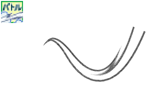
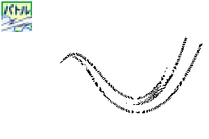
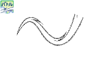
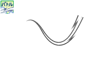
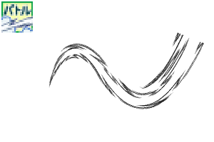
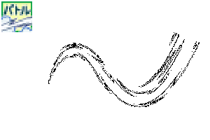
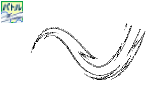
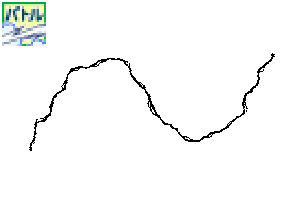
"劍線",這是有用的表達軌跡,如劍,武器和拳頭,
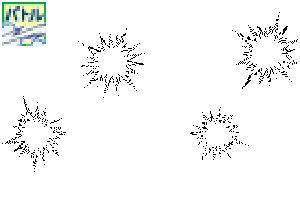
"衝擊波"和"閃光",如爆炸,
魔法的表達效果包括閃電和電流。
如"土煙"站在戰鬥背景...
バトルシーンをお絵描きするのに出てきそうな
エフェクトのブラシセットを作ってみました。
刀や武器・パンチなどの軌跡の表現に便利な「太刀筋」、
爆発などの「衝撃波」や「閃光」、
魔法の表現効果などには「稲妻」「電流」を、
戦闘背景に立ちのぼる「土煙」などなど…。
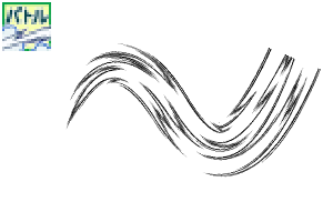
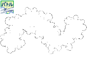
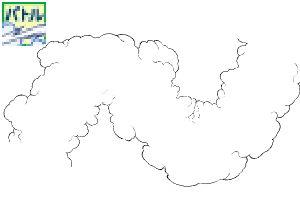
合計34本のブラシ(18デザイン)が梱包されています。
メイン・サブカラー変更可能です。
そうならない単體使いのもの(無印)と2種類のブラシがあります。
(種類によっては1種類しか無いものもあります)
各種レイヤーの色モードによって使いわけてくださいね。
"劍場",方便表達劍、武器、拳頭等的軌跡。
"衝擊波"和"閃光",如爆炸,
"閃電"和"電流"用於神奇的表達效果等。
"從地面冒煙",在戰鬥的背景上升。
可能出現在戰鬥場景中的效果
我做了一個畫筆集。
共有34把刷子(18個設計)。
可以更改主色和子色。
(有些類型只有一種類型)
請根據每層的顏色模式正確使用它。


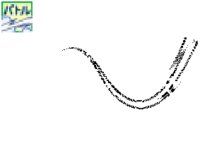
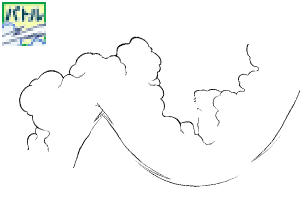
有關詳細資訊確認:將放大使用示例的示例部分示例。


繪製向量層,擦除或移動控制點,形成美麗的形狀。
通過操作曲線尺的控制點設置要創建的軌跡。
沿著尺子用刷子畫畫。
完成!

如果自行繪製或繪製筆劃,重疊部分將不會是白色的。
無論您是通過單筆劃或單獨繪圖繪製,重疊部分都將是白色的。
常見的單色 / 減少單色 / 灰色 / 顏色層。

如果你從下到上運行筆,圖像就會出來。
背景中的塵雲是階層式,以提供深度。
要更改方向,請按一下物件工具並操作周圍的指點進行旋轉。
如果不能旋轉,請嘗試以下幾點:
選擇使用物件工具繪製的內容,並指定"子工具詳細資訊"→"刷提示"→"行向"。
選擇使用物件工具繪製的內容,並指定"子工具詳細資訊"→"刷尖"→"厚度"→"應用方向"→選擇"水準/垂直"→更改"厚度"的數量。
適度繪製浮誇,然後用物件工具拖動和下降,將其移動到任何位置。
旋轉方向或微調移動,
在讓它看起來不錯之後,擦去你最後不需要的部分。

如果你想改變黑暗,如灰色,改變層的不透明值。
如有必要,更改為點。
如果要更改為較淺的顏色,請降低該層上的不透明度數位。
如果你想把它改成較深的顏色,請指定灰色部分的顏色範圍,進行選擇,並將其填充所需的深灰色。
如有必要,更改為點。

你可以倒白和黑色。
對於從一開始就只有白色的畫筆,主色和亞色是反向的。(O / P / Q 刷)
如果主色和子色相同,則看起來會像圖形。
它可以改為灰色或顏色。

繪製在拉斯特層上,並轉換為向量以校正線寬度。
線條密度高的區域通過校正線寬度使其更薄,看起來是自然的。
通過創建線路選擇區域和"擴展/收縮"以繪製或擦除來調整線寬度。
繪製在拉斯特層上,從上面的功能表列中,"將亮度轉換為透明度"來擦除白色部分。
之後,在外線製作一條黑線,其"邊界效應"為層屬性的"效果"。
在背景顏色中添加白色。
使用灰色層上的主黑色和亞白色繪製,並從上面的功能表列上塗上"模糊"的"模糊"的"模糊"。
之後,更改為單色層,並從層屬性調整"顏色/阿爾法閾值"的值。

説明用の畫像はサンプルなので線を入れています。実際の素材には入っていません。
由於用於解釋的圖像是示例,將插入一行。它不包括在實際材料中。
合計34本のブラシ(18デザイン)が梱包されています。
メイン・サブカラー変更可能です。
そうならない単体使いのもの(無印)と2種類のブラシがあります。
(種類によっては1種類しか無いものもあります)
各種レイヤーの色モードによって使いわけてくださいね。
"Sword locus", which is convenient for expressing the locus of swords, weapons, punches, etc.
"Shock waves" and "flashes" such as explosions,
"Lightning bolt" and "electric current" used for magical expression effects, etc.
"Smoke from the ground" that rises in the background of the battle.
Effects that are likely to appear in the battle scene
I made a brush set for drawing.
There are a total of 34 brushes (18 designs).
The main and sub colors can be changed.
(Some types have only one type)
Please use it properly according to the color mode of each layer.
For details confirmation: A part of the sample image of the usage example is enlarged.
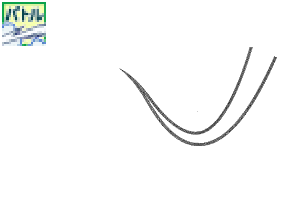
Draw on a vector layer and erase or move the control points to form a beautiful shape.
Set the trajectory you want to create by operating the control points of the curve ruler.
Draw with a brush along the ruler.
Complete!
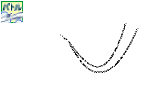
In the case of drawing by itself or strokes drawn apart, the overlapping part will not be white.
Whether you draw by connecting with one stroke or drawing separately, the overlapping part will be white.
Common to monochrome / reduced monochrome / gray / color layers.
If you run the pen from bottom to top, the image will come out.
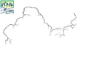
The dust-Cloud in the background is layered to give depth.
If you want to change the orientation, click with the object tool and operate the pointer around it to rotate.
If you can't rotate it, try the following:
Select what you drew with the object tool and specify "Sub tool details" → "Brush tip" → "Line direction".
Select what you drew with the object tool and specify "Sub tool details" → "Brush tip" → "Thickness" → "Apply direction" → Select either "Horizontal / Vertical" → Change the number of "Thickness" .
Draw a pompon moderately and drag and drop with the object tool to move it to any position.
Rotate the direction or move with fine adjustment,
After making it look good, erase the parts you don't need at the end.
If you want to change the darkness such as gray, change the opacity value of the layer.
Change to dots if necessary.
If you want to change to a lighter color, lower the opacity number on the layer.
If you want to change it to a darker color, specify the color gamut of the gray part, make a selection, and fill it with the desired dark gray.
Change to dots if necessary.
You can reverse white and black.
For brushes that are only white from the beginning, the main and sub colors are reversed. (O / P / Q brush)
If the main and sub colors are the same, it will look like the figure.
It can be changed to gray or color.
Draw on a raster layer and convert to vector to correct the line width.
Areas with a high density of lines look natural by correcting the line width to make them thinner.
Adjust the line width by creating a selection area of the line and "expanding/contracting" to paint or erase.
Draw on a raster layer, and from the menu bar above, "Convert brightness to transparency" to erase the white part.
After that, make a black line on the outside with "Boundary effect" of "Effect" of the layer property.
Add a white color to the background color.
Draw using the main black and sub white on the gray layer, and apply the "Gaussian blur" of "Blur" of "Filter" from the menu bar above.
After that, change to a monochrome layer and adjust the value of "Color/alpha threshold" from the layer properties.
説明用の画像はサンプルなので線を入れています。実際の素材には入っていません。
Since the image for explanation is a sample, a line is inserted. It is not included in the actual material.
太刀筋 太刀筋
-
A1館-太刀筋/等間線正常 Sword-Trajectory Equal-width-line Normal A1館-太刀筋/等間線ノーマル Sword-Trajectory Equal-width-line Normal
-
A2館■-太刀筋/等間線白努基 Sword-Trajectory Equal-width-line White-inside A2館■-太刀筋/等間線白ヌキ Sword-Trajectory Equal-width-line White-inside
-
A3館-太刀筋/玫瑰線正常 Sword-Trajectory Random-line Normal A3館-太刀筋/バラ線ノーマル Sword-Trajectory Random-line Normal
-
A4館■-太刀筋/巴拉線白努基 Sword-Trajectory Random-line White-inside A4館■-太刀筋/バラ線白ヌキ Sword-Trajectory Random-line White-inside
-
B1館-太刀筋/等間線正常 Sword-Trajectory Equal-width-line Normal B1館-太刀筋/等間線ノーマル Sword-Trajectory Equal-width-line Normal
-
B2館■-太刀筋/等間線白努基 Sword-Trajectory Equal-width-line White-inside B2館■-太刀筋/等間線白ヌキ Sword-Trajectory Equal-width-line White-inside
-
C1館-太刀筋/等間線正常 Sword-Trajectory Equal-width-line Normal C1館-太刀筋/等間線ノーマル Sword-Trajectory Equal-width-line Normal
-
C2館■-太刀筋/等間線白努基 Sword-Trajectory Equal-width-line White-inside C2館■-太刀筋/等間線白ヌキ Sword-Trajectory Equal-width-line White-inside
-
D1館-太刀筋/巴拉線正常 Sword-Trajectory Random-line Normal D1館-太刀筋/バラ線ノーマル Sword-Trajectory Random-line Normal
-
D2館■-太刀筋/巴拉線白努基 Sword-Trajectory Random-line White-inside D2館■-太刀筋/バラ線白ヌキ Sword-Trajectory Random-line White-inside
-
E1館-太刀筋/玫瑰線正常 Sword-Trajectory Random-line Normal E1館-太刀筋/バラ線ノーマル Sword-Trajectory Random-line Normal
-
E2館■-太刀筋/玫瑰線白努基 Sword-Trajectory Random-line White inside E2館■-太刀筋/バラ線白ヌキ Sword-Trajectory Random-line White inside
-
F1館-太刀筋/玫瑰線正常 Sword-Trajectory Random-line Normal F1館-太刀筋/バラ線ノーマル Sword-Trajectory Random-line Normal
-
F2館■-太刀筋/玫瑰線白努基 Sword-Trajectory Random-line White-inside F2館■-太刀筋/バラ線白ヌキ Sword-Trajectory Random-line White-inside
-
G1館-DEF混合普通DEF-混合諾瑪 G1館-DEF混合ノーマル DEF-Mixed Norma
-
G2館■-DEF混合白努基 DEF-Mixed White-inside G2館■-DEF混合白ヌキ DEF-Mixed White-inside


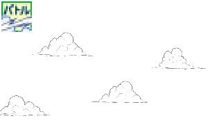
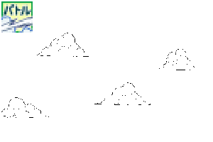
土煙 土煙
-
H1館-土煙/全方位單體正常 Dust-Cloud Every-direction-Unit Normal H1館-土煙/全方位単体ノーマル Dust-Cloud Every-direction-Unit Normal
-
H2館■-土煙/全方位單體白努基 Dust-Cloud Every-direction Unit White-inside H2館■-土煙/全方位単体白ヌキ Dust-Cloud Every-direction Unit White-inside
-
I館-土煙/上下有連續 Dust-Cloud Up-and-down Continuous I館-土煙/上下有連続 Dust-Cloud Up-and-down Continuous
-
J館-土煙/下吉薩連續 Dust-Cloud Lower-jagged Continuous J館-土煙/下ギザ連続 Dust-Cloud Lower-jagged Continuous
-
K1館-土煙/下吉薩單體普通 Dust-Cloud Lower-jagged Unit Normal K1館-土煙/下ギザ単体ノーマル Dust-Cloud Lower-jagged Unit Normal
-
K2館■-土煙/下吉紮單體白努基 Dust-Cloud Lower-jagged Unit White-inside K2館■-土煙/下ギザ単体白ヌキ Dust-Cloud Lower-jagged Unit White-inside
-
L1館-土煙/下博凱西短連續 Dust-Cloud Bottom-blur short Continuous L1館-土煙/下ボカシ短連続 Dust-Cloud Bottom-blur short Continuous
-
L2館-土煙/下博凱西長連續 Dust-Cloud Bottom-blur long Continuous L2館-土煙/下ボカシ長連続 Dust-Cloud Bottom-blur long Continuous


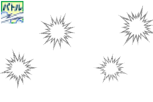
衝擊波、閃電、閃光、電流 衝撃波・稲妻・閃光・電流
-
M1館-衝擊波/半圓普通Shock-wave semicircle Normal M1館-衝撃波/半円ノーマル Shock-wave semicircle Normal
-
M2館■-衝擊波/半圓白努基 Shock-wave semicircle White-inside M2館■-衝撃波/半円白ヌキ Shock-wave semicircle White-inside
-
N1館-衝擊波/全圓正常Shock-wave circle Normal N1館-衝撃波/全円ノーマル Shock-wave circle Normal
-
N2館■-衝擊波/全圓白努基 Shock-wave circle White-inside N2館■-衝撃波/全円白ヌキ Shock-wave circle White-inside
-
O1館-閃電/曲線大 Thunder Curve-L O1館-稲妻/カーブ大 Thunder Curve-L
-
O2館-閃電/曲線小 Thunder Curve-S O2館-稲妻/カーブ小 Thunder Curve-S
-
P館-閃電/直 Thunder Straight P館-稲妻/ストレート Thunder Straight
-
Q館-閃光 Flash Q館-閃光 Flash
-
R1館-電流 Electric R1館-電流 Electric
-
R2館■-電流/帶邊緣灰色 Electric Edge-gray R2館■-電流/フチグレー付 Electric Edge-gray


「背景職人の館」的其他素材


「素材集」的人氣素材


最新素材


-
 MVP ◆針對問題投稿了眾多適切的回答,對社群有顯著貢獻的用戶。每3個月一次,會依據期間內獲得的點數選出MVP用戶,並進行表揚。
 -
 NVP(New Valuable Player) ◆繼MVP後,對社群營運做出良好貢獻的用戶。將從不曾獲選為MVP的用戶中,依據獲得的點數進行評選、表揚。
 -
 官方推廣大使 ◆從被證明為優良回答用戶的MVP獲獎者中選出社群中最優異的回答者。並經審查後由本社委託就任。※舊名稱為「Evangelist」
 -
 CELSYS公認Moderator ◆Moderator為會使用日文及其他語言的CELSYS公認工作人員。由於並非軟體或創作的專業人士,Moderator無法直接為用戶解決疑問,但能在語言、交流方面提供支援,幫助用戶們順利地進行溝通。
 -
 CELSYS官方為與營運相關的官方帳號。