


|OKLCH パレット |+ 光/クロマ - | (| OKLCH Pallete | + Light/Chroma - |) | OKLCH Pallete | + Light/Chroma - |
コンテンツID:2310298
-
26


OKLCHカラースペースに基づいて色を設定し、明るさが減るごとにクロマが減少します。 Color set based on the OKLCH color space that decreases in Chroma every step it decreases in Lightness.
色合いを変えるだけなのに、明るさや彩度を同じく保っていても、なぜ自分の明暗が変わらないのか不思議に思ったことはありませんか?
それは彩 度が知覚的に均一ではないからです!
彩度は色の量を自身の明るさに対して増加させます。異なる色合いは自然に異なる明るさの範囲を占めるため、同じ彩度と明るさを保っても色が同じように明るく見えるとは限りません。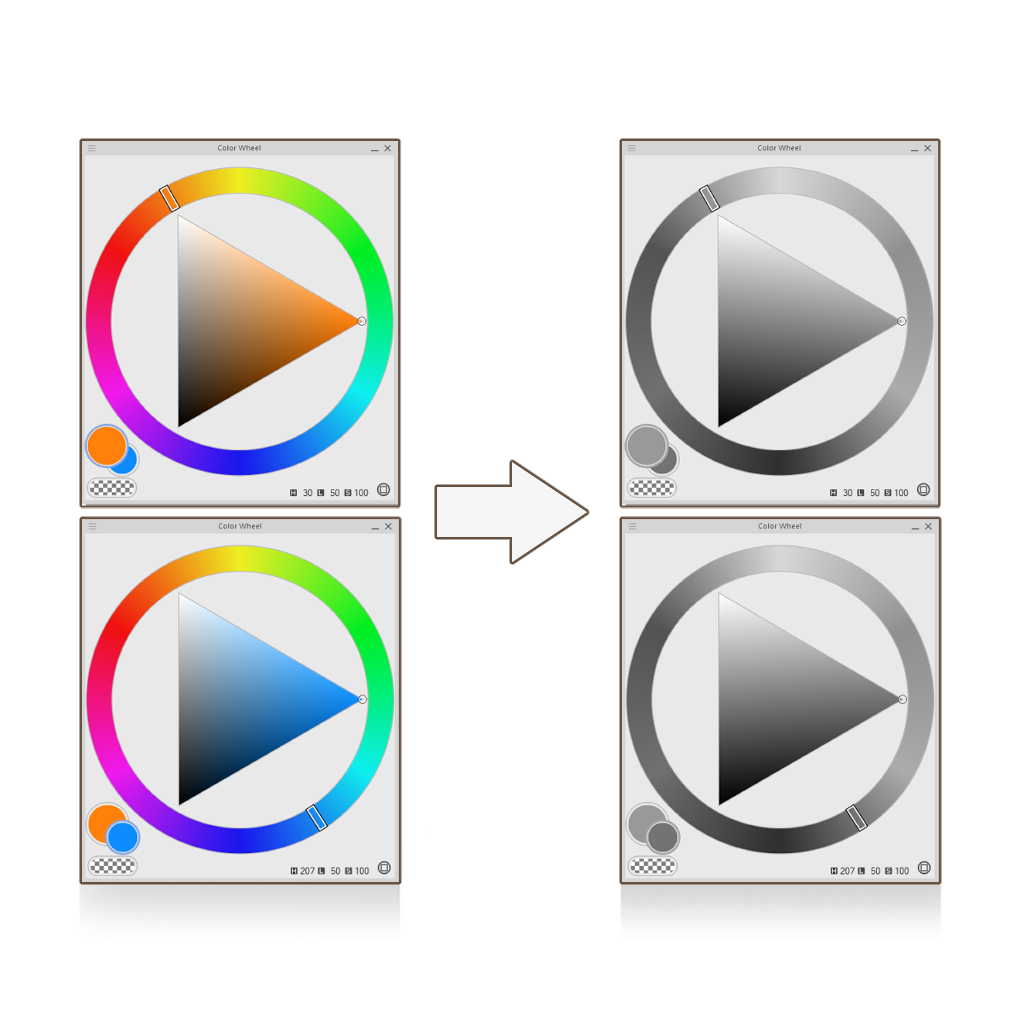
それは彩 度が知覚的に均一ではないからです!
彩度は色の量を自身の明るさに対して増加させます。異なる色合いは自然に異なる明るさの範囲を占めるため、同じ彩度と明るさを保っても色が同じように明るく見えるとは限りません。
OKLCH は、明度をより均一にするために設計された色空間で、 同じ明度値の色が色相に関係なく人間の目に同じように見えるようにします。
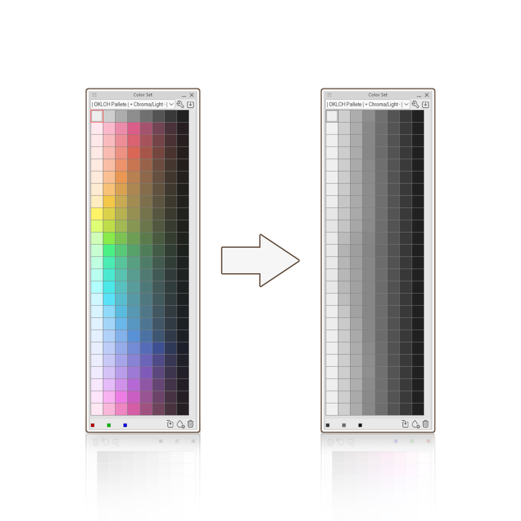
このアイデアをもとにこのカラーセットを作りました。色が暗くなるにつれて 明るさとクロマ が減少し、これは実際のマット面の挙動に似ています!
このカラーセットではグラデーションマップを使ってグレースケールからカラーへの作業も簡単になります!
- 色 セット全体の グレーの値を選び、被写体の陰影をつけ始めます。ソフトシェーディングはやめて、まずは硬いエッジから始めるのが良いです。
- レイヤーを右クリックし、新しい補正レイヤーをクリックしてグラデーションマップを選択します。
- 設定内で、対応する色付きスウォッチを次の位置値で追加します:95 - 85 - 75 - 65 - 55 - 45 - 35 - 25(最初のスウォッチは95、2つ目は85、以下は...)
ミキシングモードでは知覚を選択し、明るさ補正を低または中に設定します。 - 終わったら。補正レイヤーのブレンドモードを「カラー」に変更してください(これによりグレースケールの元の明るさの値が維持されます)。
それで終わりだ。他のレイヤーでその上からレンダリングします。
Ever wondered why your values never stay de same even if you keep the same amount of Lightness and Saturation, when you're just changing Hues?
That's because Saturation isn't perceptually uniform!
Saturation increases the amount of color relative to its own brightness. Because different hues naturally occupy different ranges of brightness, keeping the same Saturation and Lightness doesn't necessarily make colors look equally bright.
That's because Saturation isn't perceptually uniform!
Saturation increases the amount of color relative to its own brightness. Because different hues naturally occupy different ranges of brightness, keeping the same Saturation and Lightness doesn't necessarily make colors look equally bright.
OKLCH is a color space designed to make Lightness more perceptually uniform, so that colors with the same Lightness value look equally bright to the human eye, regardless of their hue.
I made this color set based on this idea. Each color decreases in Lightness and Chroma as it gets darker, similar to how matte surfaces behave in real life!
It even becomes easier to work from grayscale to color using gradient maps with this color set!
- Pick the values in gray across the color set and start shading your subject. I recommend not to do any soft shading, it's better to start with hard edges.
- Right click your layer, click on new correction layer and select Gradient Map.
- Inside the settings, add the corresponding colored swatches in the following position values: 95 - 85- 75- 65 - 55 - 45 - 35 - 25 (The first swatch goes in 95, the second in 85 and so on...)
In Mixing Mode, select Perceptual and set the Brightness Correction to Low or Medium. - Once you're done. Change the blending mode of the correction layer to Color (this will mantain the original Lightness value of the grayscale subject).
And that should be it. Render over it in other layers.


"カラーセット"の人気素材


新着素材


バッジ
-
 MVP ◆質問に対して適切な回答を数多く投稿し、コミュニティの運営に大きく貢献したユーザーです。MVPは3ヶ月に一度、その間に獲得したポイントを元に決定し、表彰を行っています。
 -
 NVP (New Valuable Player) ◆MVPに次いでコミュニティの運営に貢献したユーザーです。これまでMVPの受賞経験のない方から、獲得したポイントを元に決定し、表彰を行なっています。
 -
 公式エキスパート ◆優れた回答者の証であるMVP受賞者の中からさらに選ばれた、コミュニティで最も優良な回答者の証です。審査を経て当社から依頼し就任いただいています。※旧名称「エバンジェリスト」
 -
 セルシス公認モデレーター ◆モデレーターは、日本語とその他の言語が話せるセルシス公認のスタッフです。ソフトウェアや創作のエキスパートではないので、直接疑問を解決することはできませんが、みなさんがスムーズにコミュニケーションできるように、言葉やコミュニケーションの側面からサポートします。
 -
 セルシス公式運営に関連した公式アカウントです。