

「子供の頃に好きだったマンガ雑誌のようにスケッチをしたい...」まあ、彼らはできます! “I want my sketches to look just like my favourite manga magazine growing up…” well, they can!
スケッチページにグラデーションマップが必要な場合の私のお気に入りの選択肢です。友達が言っていたのは、若い頃に読んでいた少女漫画雑誌の印刷に使われていたインクを思い出すと言っていて、すごく嬉しかったです。ピンクは、すべてが少しロマンチックで夢のような感じになると思いますよね?バレンタインアイテムだけに使いたいときでも、本当に可愛いです。可愛いですね。
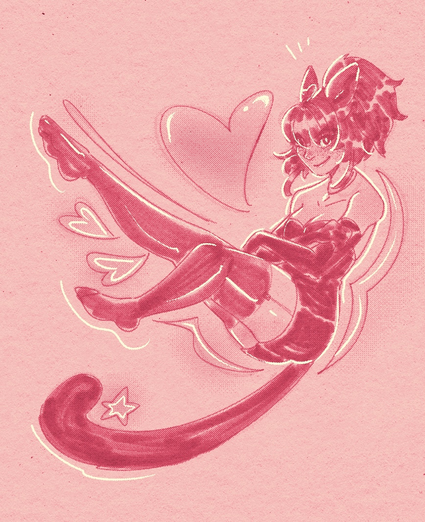
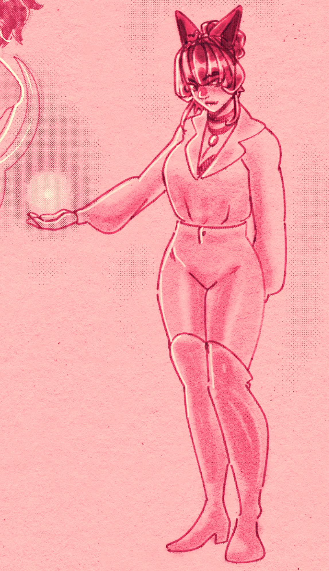
あなたがここにいる間、私の猫の女の子をフィーチャーしたいくつかの例を楽しんでください。ベースレイヤーとして紙のテクスチャを使用し、上のレイヤーにアルコールマーカーブラシまたは水彩ペイントブラシで描画すると、非常に優れた伝統的なアートのような効果が得られます。スクリーントーンやハイライトの見え方も気に入っています。私にとっては、広い値幅を実現できることが重要でした。


My favourite choice when I need a gradient map for my sketch pages. My friend said it reminds them of the ink used to print the shoujo manga magazine we read when young, and it made me really happy. I think pink makes everything feel a little bit more romantic and dreamy, right? it’s really cute even if you only want to use it for a valentine’s piece. that sounds cute, right?
While you’re here, enjoy some examples, featuring my catgirl. If you use a paper texture as your base layer and draw with an alcohol marker brush or watercolour paint brush on the layers above, you get some really nice traditional art looking effects. i like how screentones and highlights look with it, too. it was important to me to be able to achieve a wide value range.


"honeyviolets"さんの別の素材


"グラデーション"の人気素材


新着素材


バッジ
-
 MVP ◆質問に対して適切な回答を数多く投稿し、コミュニティの運営に大きく貢献したユーザーです。MVPは3ヶ月に一度、その間に獲得したポイントを元に決定し、表彰を行っています。
 -
 NVP (New Valuable Player) ◆MVPに次いでコミュニティの運営に貢献したユーザーです。これまでMVPの受賞経験のない方から、獲得したポイントを元に決定し、表彰を行なっています。
 -
 公式エキスパート ◆優れた回答者の証であるMVP受賞者の中からさらに選ばれた、コミュニティで最も優良な回答者の証です。審査を経て当社から依頼し就任いただいています。※旧名称「エバンジェリスト」
 -
 セルシス公認モデレーター ◆モデレーターは、日本語とその他の言語が話せるセルシス公認のスタッフです。ソフトウェアや創作のエキスパートではないので、直接疑問を解決することはできませんが、みなさんがスムーズにコミュニケーションできるように、言葉やコミュニケーションの側面からサポートします。
 -
 セルシス公式運営に関連した公式アカウントです。