



一系列漸層貼圖幫助加快材質渲染過程,同時避免在必須從單一參考圖片和特定設定中挑選的眾多顏色中失去耐心。 A series of gradient maps to help quicken the process of rendering materials without losing your marbles on the myriad of colors you have to pick from a single reference image and specific settings.
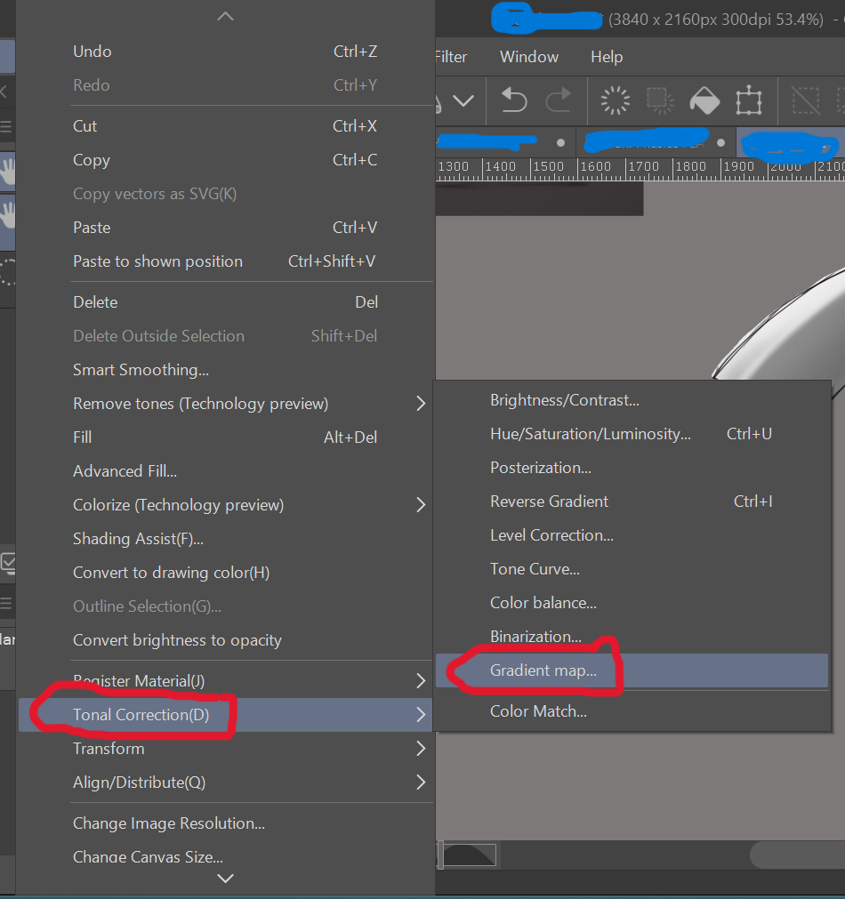
這是一組「小」漸層,這些年來幫助我為金屬色上色!只要用基本的黑白值著色你想要的圖,然後到編輯>色調修正>漸層貼圖,選擇你想要的漸層。
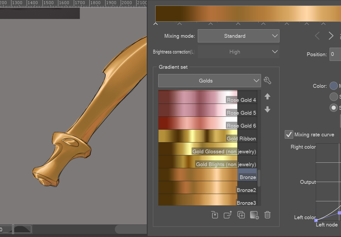
* 注意:漸層貼圖會用滑桿中分配的顏色替換值,從最深(左側)到最亮(右側),因此在陰影瞬間要注意數值的平衡性,否則你無法在所選漸層上獲得完整的色彩光譜。直接用深灰、灰色和白色來上色會比較有幫助。
A "small" set of gradients that have helped me color metallics over the years! Just shade your desired drawing in basic black and white values, then go to Edit>Tonal Correction>Gradient Maps and select the gradient you desire.
* NOTE: Gradient Maps replace values with the colors assigned in the slider from darkest (left side) to lightest (right side), so be mindful of how balanced your values are in the moment of shading, else you won't be able to get the full spectrum of color on the chosen gradient. It helps to simply use a dark gray, gray, and white color to shade with.








「漸層組」的人氣素材





最新素材



徽章
-
 MVP ◆針對問題投稿了眾多適切的回答,對社群有顯著貢獻的用戶。每3個月一次,會依據期間內獲得的點數選出MVP用戶,並進行表揚。
 -
 NVP(New Valuable Player) ◆繼MVP後,對社群營運做出良好貢獻的用戶。將從不曾獲選為MVP的用戶中,依據獲得的點數進行評選、表揚。
 -
 官方推廣大使 ◆從被證明為優良回答用戶的MVP獲獎者中選出社群中最優異的回答者。並經審查後由本社委託就任。※舊名稱為「Evangelist」
 -
 CELSYS公認Moderator ◆Moderator為會使用日文及其他語言的CELSYS公認工作人員。由於並非軟體或創作的專業人士,Moderator無法直接為用戶解決疑問,但能在語言、交流方面提供支援,幫助用戶們順利地進行溝通。
 -
 CELSYS官方為與營運相關的官方帳號。