

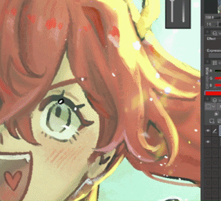
最近我對把作品上傳到 Instagram 或 TikTok 感到比較焦慮,但我總是懶得去找圖片疊加、下載茄科植物或自己做實體圖片,所以我改做漸層。
我看到 ibis paint 和線上藝術家的做法,所以我從中獲得了一些靈感。
I've been feeling more anxious about posting my art online to instagram or tiktok nowadays, but I was always too lazy to try to find a image overlay, download nightshade, or make a material image myself, so I made a gradient instead.
I saw how ibis paint and artists online did it so I took some inspiration from them.
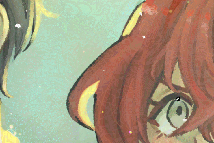
縮圖看起來沒什麼差別,但放大這張圖會發現有一點點色彩化(約5~10%的不透明度)

 我個人覺得5%比10%好看,因為我希望它盡可能隱形,但我標示10%只是想展示它更明顯時的實際效果。


無干擾 5% 不透明度擾動 你可以看到有些變化,但變化不大:)
 你可以看到有些變化,但變化不大:)
 這是大約10%不透明度時的擾動(我用在縮圖上的那個)
無干擾 10% 不透明度擾動

我也做過其他漸層圖來好玩(這樣下載時就不會只是單一漸層)
分別是「Disturbance」、「Warm Disturbance」、「Cool Disturbance」和「TV Stereo」。剛開始用的時候看起來有點嚇人......
 我個人覺得5%比10%好看,因為我希望它盡可能隱形,但我標示10%只是想展示它更明顯時的實際效果。
只有當你非常近距離拉近時,才會真正看到差異(可以隨時放大)。 

現在真正的問題 是,這是否如我所建議的有效,因為我把它做成了漸層而非實體影像......我無法確定它是否真的有效(因為我不會訓練 AI),但我可以給你一些強化它的方法^^
1) 使用 liquidfy ->

因為我看到的 AI 擾動濾鏡都是圖片,我不知道一個完美對齊的漸層效果如何,所以......如果你願意,可以用 LiquidFy 做出一團完全獨特的色彩混合。我也覺得這比匯入圖片還簡單...... --;;
2) 在上方畫點東西,再加上漸層,然後將所有可見物合併到新圖層 ->

(當你看到一個看起來幾乎不受漸變影響的區域時,效果特別好。)
你可以用任何東西來做這個,你可以自己畫,隨意亂塗,或者像我幾天前做的那個設計......

(10%)
內容編號:2246101

你也可以用文字,這會帶來很酷的效果^^對任何看的人來說也能像彩蛋一樣 ->

(順帶一提,我這裡用的是 5% 的不透明度)
...
最後,如果不行,你可以把它當成色彩增強劑,放在柔和的光線上,讓畫面更繽紛或更有趣^o^我覺得應該可行
希望我有幫助......
On the thumbnail, it looks like there's no difference, but if you zoom in to this image, you can see there's a small amount of colorization (at about 5~10% opacity)
I personally think 5% looks better than 10% since I want it to be as invisible as possible, but I showed 10% just to show how it actually looks when it's more visible.
No Disturbance 5% Opacity DisturbanceYou can see there's some changes, but the changes aren't very big :)
You can see there's some changes, but the changes aren't very big :) Here is the disturbance at about 10% opacity (what I used on the thumbnail)
No Disturbance 10% Opacity Disturbance
I've also made other gradients for fun (so that when you download this it isn't just a singular gradient)
It's "Disturbance", "Warm Disturbance", "Cool Disturbance", and "TV Stereo" respectively. It kind of look scary when you first use it...
I personally think 5% looks better than 10% since I want it to be as invisible as possible, but I showed 10% just to show how it actually looks when it's more visible.You only really see the difference when you zoom in really close (feel free to zoom in)
Now the real question is whether this works as I advised, since I made this a gradient instead of a material image... I can't speak on whether it actually works or not (because I don't know how to train AI), but I can give you ways to enhance it ^^
1) Using liquidfy ->
Because all the AI Disturbance filters I saw were images, I didn't know how well a gradient that's perfectly aligned to the drawing would work, so... if you felt up for it, you could use liquidfy to make a completely unique mess of colors. I also feel like it's easier to do than importing an image... --;;
2) Drawing something on top before adding the gradient, then merging all visible to new layer ->
(It works especially well when you have an area that looks really unaffected by the gradient.)
You can do this with anything, you could draw it yourself, make random scribbles, or it could be a design, like what I made a few days ago...
(10%)
Content ID: 2246101
You can also use text, it gives a pretty cool effect ^^ it could act like an easter egg for anyone who's looking at it as well ->
(I used 5% opacity here btw)
...
In the end, if it doesn't work, you could just treat this as like a color enhancer that you put on soft light so that it's a bit more colorful or more interesting to look at ^o^ I think it should work though
I hope I helped...
梯度 Gradient


「Danabochi」的其他素材


「素材集」的人氣素材


最新素材


徽章
-
 MVP ◆針對問題投稿了眾多適切的回答,對社群有顯著貢獻的用戶。每3個月一次,會依據期間內獲得的點數選出MVP用戶,並進行表揚。
 -
 NVP(New Valuable Player) ◆繼MVP後,對社群營運做出良好貢獻的用戶。將從不曾獲選為MVP的用戶中,依據獲得的點數進行評選、表揚。
 -
 官方推廣大使 ◆從被證明為優良回答用戶的MVP獲獎者中選出社群中最優異的回答者。並經審查後由本社委託就任。※舊名稱為「Evangelist」
 -
 CELSYS公認Moderator ◆Moderator為會使用日文及其他語言的CELSYS公認工作人員。由於並非軟體或創作的專業人士,Moderator無法直接為用戶解決疑問,但能在語言、交流方面提供支援,幫助用戶們順利地進行溝通。
 -
 CELSYS官方為與營運相關的官方帳號。