

色を編集したり、Mmmphhを追加したりするため for editing my colors or adding more Mmmphh
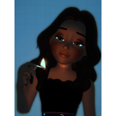
自分の作品に使っているグラデーションマップのサンプルです。
-色の雰囲気を加えるお気に入りのマップを選択し、不透明度を下げるか(通常は20%)、または低くして、ハード/ソフトライト、色/色相/衛星、または最も見た目や感触が最も良いものとして追加します。
私が作成したセットもあれば、Pinterest/TikTokのリファレンスなどから取ったセットもあります。
楽しむ!!


Samples of gradient maps that I use for my own work.
-I pick a map I like that adds to the color vibe and either lower the opacity (usually to 20%) or lower and add it as hard/soft light, color/hue/sat, or whatever looks or feels best.
some sets were created by me and others were taken from pinterest/tiktok references and such.
enjoy!!
カテゴリー1 Category 1


バッジ
-
 MVP ◆質問に対して適切な回答を数多く投稿し、コミュニティの運営に大きく貢献したユーザーです。MVPは3ヶ月に一度、その間に獲得したポイントを元に決定し、表彰を行っています。
 -
 NVP (New Valuable Player) ◆MVPに次いでコミュニティの運営に貢献したユーザーです。これまでMVPの受賞経験のない方から、獲得したポイントを元に決定し、表彰を行なっています。
 -
 公式エキスパート ◆優れた回答者の証であるMVP受賞者の中からさらに選ばれた、コミュニティで最も優良な回答者の証です。審査を経て当社から依頼し就任いただいています。※旧名称「エバンジェリスト」
 -
 セルシス公認モデレーター ◆モデレーターは、日本語とその他の言語が話せるセルシス公認のスタッフです。ソフトウェアや創作のエキスパートではないので、直接疑問を解決することはできませんが、みなさんがスムーズにコミュニケーションできるように、言葉やコミュニケーションの側面からサポートします。
 -
 セルシス公式運営に関連した公式アカウントです。