

ワークフローを簡素化するために作成した銅パイプまたはワイヤーのカラーセット。真新しい明るいオレンジ色のパイプは私が望んでいた雰囲気に合わなかったため、かなり新しいが軽度に酸化した銅パイプのように見えるように色を調整しました。タイトルの緑青は、酸化したという派手な言い方に過ぎません笑。
お好みでお使いください!
Copper pipe or wire colour set I made to simplify workflow. I adjusted the colours to give the look of a fairly new, but mildly oxidised copper pipe, as a brand new bright orange pipe didn't fit the vibe I wanted. Patina in the title is just a fancy way of saying oxidised lol.
Please use as you see fit!
このカラーセットを使用する最も簡単な方法は、私が使用したのと同じ方法です:影を落とす側に応じて、左から右または右から左の順に色を使用します。光源に応じて、ハイライトというラベルの付いた最も明るい色を他の色よりも多かれ少なかれ使用することも、まったく使用しないこともできます。例については図面を参照してください。
説明書はパイプなどの円筒形の物体に最適ですので、あなたの裁量で使用してください。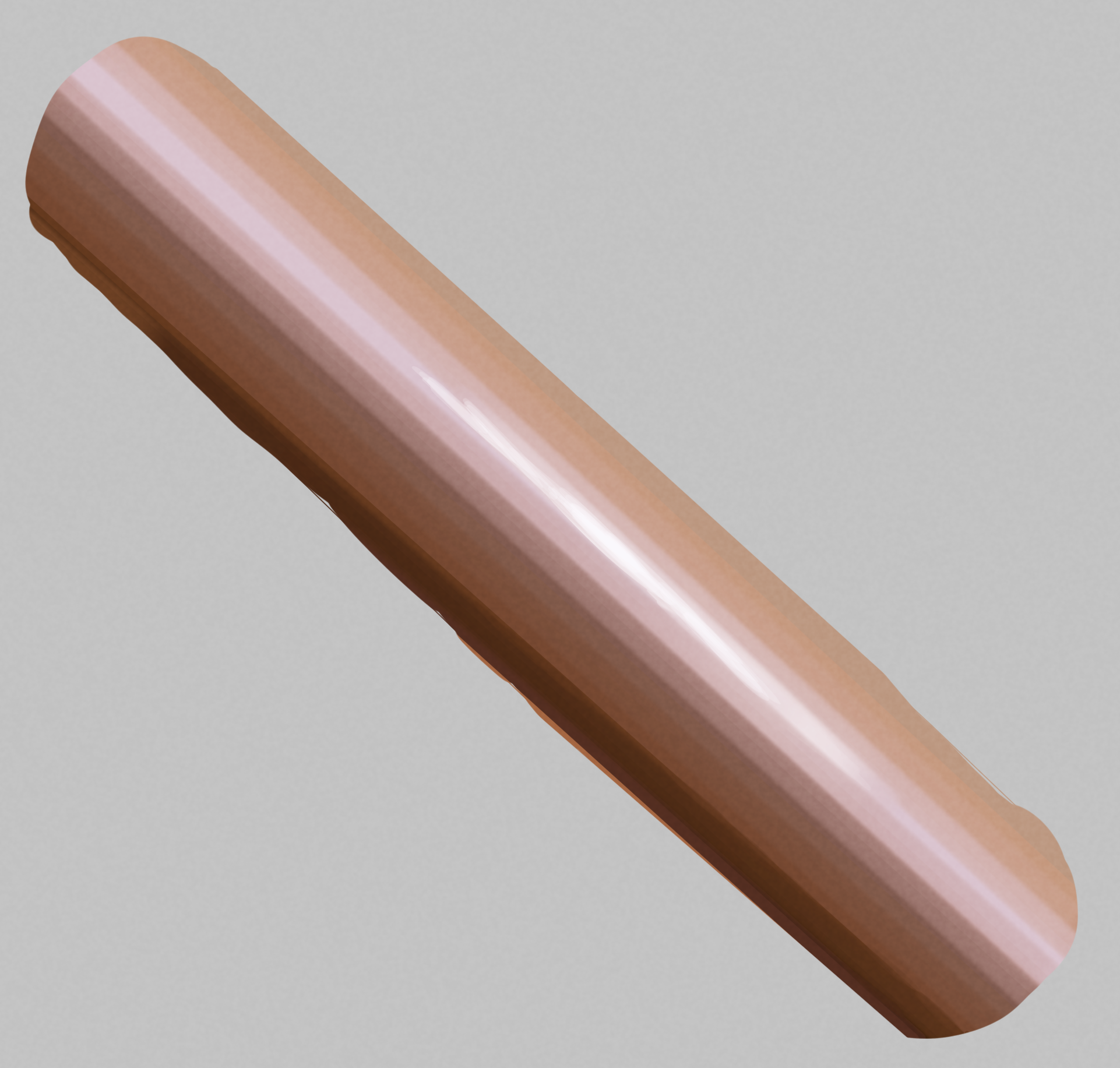

The simplest way to use this colour set is the same way I used it: use the colours in order from left to right or right to left, depending on which side you want the shadows cast. Depending on your light source, the lightest colour, labelled highlight, can be used more or less than the others, or not at all. See the drawing for an example!
The instructions are really best for cylindrical objects like pipes, so use them at your discretion!


"Pelbug"さんの別の素材

"カラーセット"の人気素材


新着素材


バッジ
-
 MVP ◆質問に対して適切な回答を数多く投稿し、コミュニティの運営に大きく貢献したユーザーです。MVPは3ヶ月に一度、その間に獲得したポイントを元に決定し、表彰を行っています。
 -
 NVP (New Valuable Player) ◆MVPに次いでコミュニティの運営に貢献したユーザーです。これまでMVPの受賞経験のない方から、獲得したポイントを元に決定し、表彰を行なっています。
 -
 公式エキスパート ◆優れた回答者の証であるMVP受賞者の中からさらに選ばれた、コミュニティで最も優良な回答者の証です。審査を経て当社から依頼し就任いただいています。※旧名称「エバンジェリスト」
 -
 セルシス公認モデレーター ◆モデレーターは、日本語とその他の言語が話せるセルシス公認のスタッフです。ソフトウェアや創作のエキスパートではないので、直接疑問を解決することはできませんが、みなさんがスムーズにコミュニケーションできるように、言葉やコミュニケーションの側面からサポートします。
 -
 セルシス公式運営に関連した公式アカウントです。