

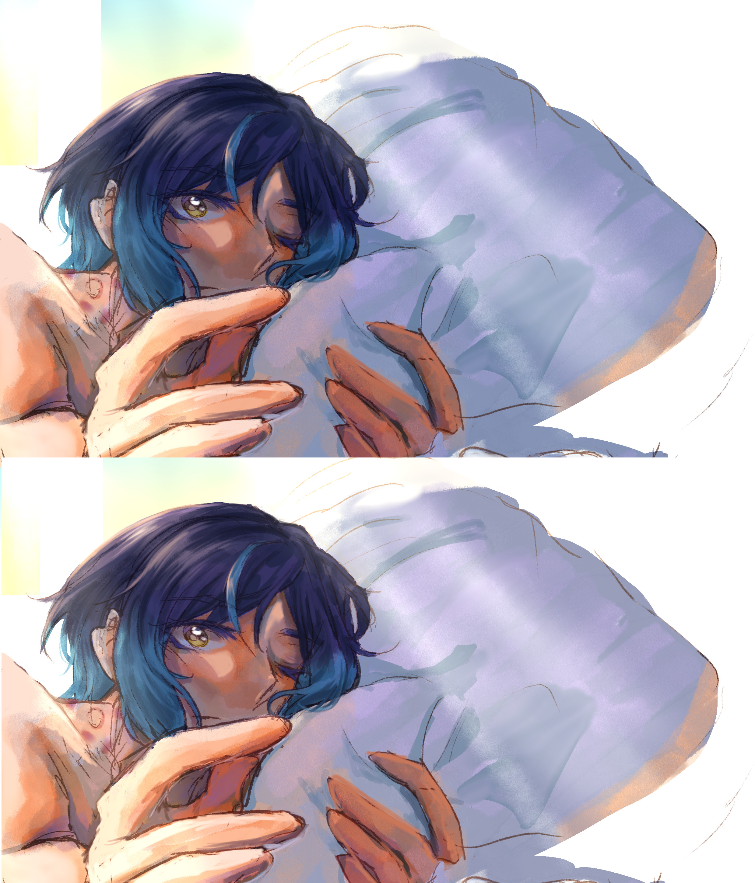
私は通常、この構成を最後の仕上げとして使用しますが、これによりアートがより温かみやすく見え、携帯電話の画面で奇妙に見えなくなります。カラーグレーディングの悪いモニター/ラップトップを持っている人に最適です!
[例から色を見本してみると、違いがわかります~]
I usually use this configuration as finishing touches as it'll make my art looks warmer and looks less odd in my handphone's screen. Perfect for people who have monitor/laptop with bad color grading!
[Try to swatch the colours from the example and you'll see the difference~]


"オートアクション"の人気素材


新着素材


バッジ
-
 MVP ◆質問に対して適切な回答を数多く投稿し、コミュニティの運営に大きく貢献したユーザーです。MVPは3ヶ月に一度、その間に獲得したポイントを元に決定し、表彰を行っています。
 -
 NVP (New Valuable Player) ◆MVPに次いでコミュニティの運営に貢献したユーザーです。これまでMVPの受賞経験のない方から、獲得したポイントを元に決定し、表彰を行なっています。
 -
 公式エキスパート ◆優れた回答者の証であるMVP受賞者の中からさらに選ばれた、コミュニティで最も優良な回答者の証です。審査を経て当社から依頼し就任いただいています。※旧名称「エバンジェリスト」
 -
 セルシス公認モデレーター ◆モデレーターは、日本語とその他の言語が話せるセルシス公認のスタッフです。ソフトウェアや創作のエキスパートではないので、直接疑問を解決することはできませんが、みなさんがスムーズにコミュニケーションできるように、言葉やコミュニケーションの側面からサポートします。
 -
 セルシス公式運営に関連した公式アカウントです。