

線画用のレイヤーテンプレート。 適切な設定と調整レイヤーが付属しています。 羊は含まれていません。 My layer template for line art. It comes with proper settings and an adjustment layer. Sheep not included.

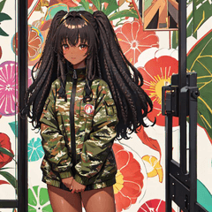
私のサンプル画像のレイヤー設定。 その設定はテンプレートとは少し異なります。
使い方:

最下層にいくつかのガイドラインを走り書きします。 これは33%の不透明度に設定されています。

次のレイヤーでより詳細なスケッチを作成します。 完了したら、ガイドラインレイヤーを削除して から、スケッチの不透明度を下げることができます。 視認性を高めるために、スケッチを青にすることを強くお勧めします。

線画レイヤーまでスキップし、安定したペンツールを使用してスケッチをトレースします。 このセットのレイヤーはラスターレイヤーですが、空である限りベクターレイヤーに変更できます。 線画レイヤーを参照レイヤーとして設定しています。

カラーレイヤーに移動し、参照レイヤーを使用するfaovrite充填ツールを選択します。 淡い色合いの紙のレイヤーは、欠落している色、特に白を見つけるのに役立ちます。

シェーディングレイヤーとハイライトレイヤーは、利便性のためにクリップされたレイヤーとして設定されます。 シェーディングは乗算に設定され、ハイライトは追加(グロー)に設定されます。

オーバーレイレイヤーは、アートに微妙に深みを加えます。

最後に、カラーバランス設定を好みに合わせて調整します。
追加のヒント:
- あなたは含まれている層のいくつかにする必要はありません。 それらは個人的な 提案です。
-これは、背景のない線画用に設定されています。 希望する場合は、ガイドラインレイヤーの下にさらにレイヤーを作成できます。
-カラーレイヤーにクリップされたレイヤーを追加できます。 セット内のそれぞれのレイヤーの下に特別なレイヤーモードを配置しない1つのシェーディングレイヤーと1つのハイライトレイヤーをお勧めします。
-テクスチャを追加するには、お気に入りの紙の画像素材を持ち込み、オーバーレイレイヤーの上のカラーレイヤーにクリップし、オーバーレイに設定し、不透明度を33%以下に下げます。
-カラー線画を使用している場合は、オーバーレイレイヤーをコピーして貼り付け、線画レイヤーの上にクリップできます。 最良の結果を得るには、100%に設定します。
-黒、グレー、白をオフにして、カラーバランス調整レイヤーでより良い結果を得ます。 これらは、色のヒントが付いたグレースケールカラーです。
The layer set-up for my example image. The settings for it are slightly different than the template.
How to use:
Scribble some guide lines on the bottom-most layer. This is set at 33% opacity.
Make your finer-detailed sketch on the next layer. When you're done, you may delete the guide line layer and then lower the opacity of your sketch. I strongly recommend making your sketch blue for better visibility.
Skip up to the line art layer and trace over your sketch with a stablized pen tool. The layer in this set is a raster one, but you can change it to a vector one as long as it's empty. I have the line art layer set as a reference layer.
Go down to the color layer and pick your faovrite filling tools that uses the reference layer. The lightly-tinted paper layer will help you look out for missing colors, especially white.
The shading and highlights layer are set up as clipped layers for your convinience. The shading is set to multiply and the highlight is set to add (glow).
The overlay layer adds more depth to your art subtly.
Lastly, adjust your color balance settings to your liking.
Extra tips:
- You do not have to some of the included layers. They are a personal suggestion.
- This is set up for line art without backgrounds. If you desire to have one, you may make more layers below the guide line layer.
- You can add more clipped layers for your color layer. I recommend one shading and one highlight layer without special layer modes placed under their respective layers in the set.
- To add some texture, bring in your favorite paper image material, clip it onto your color layer above your Overlay layer, set it to overlay, and reduce the opacity to 33% or lower.
- If you are using colored line art, you can copy and paste the overlay layer to clip over your line art layer. Set it to 100% for the best results.
- Use off blacks, greys, and whites for better results with the color balance adjustment layer. These are greyscale colors with a hint of color in them.


"MathewMii"さんの別の素材


"レイヤーテンプレート"の人気素材


新着素材


バッジ
-
 MVP ◆質問に対して適切な回答を数多く投稿し、コミュニティの運営に大きく貢献したユーザーです。MVPは3ヶ月に一度、その間に獲得したポイントを元に決定し、表彰を行っています。
 -
 NVP (New Valuable Player) ◆MVPに次いでコミュニティの運営に貢献したユーザーです。これまでMVPの受賞経験のない方から、獲得したポイントを元に決定し、表彰を行なっています。
 -
 公式エキスパート ◆優れた回答者の証であるMVP受賞者の中からさらに選ばれた、コミュニティで最も優良な回答者の証です。審査を経て当社から依頼し就任いただいています。※旧名称「エバンジェリスト」
 -
 セルシス公認モデレーター ◆モデレーターは、日本語とその他の言語が話せるセルシス公認のスタッフです。ソフトウェアや創作のエキスパートではないので、直接疑問を解決することはできませんが、みなさんがスムーズにコミュニケーションできるように、言葉やコミュニケーションの側面からサポートします。
 -
 セルシス公式運営に関連した公式アカウントです。